Friday: Winners!
Both the COTW and the COTY-May votes concluded last night.
First, the COTW winner is Scott M. with his Military Tribute Night jerseys. You can see those concepts on the CONCEPT OF THE WEEK page. The results of that vote are below.
Scott M. - 6
Kevin D. (AIR) - 4
Brady - 2
Elias - 1
Kevin D. (MAI) - 0
Next, the COTY-May vote ended and the winner is Justin C. with his Washington Capitals alternate jersey concept! You can see that concept on the COTY 2012 page. The results of that vote are below.
Justin C. - 6
Keens - 3
Mason H. - 3
Ryan - 2
Bobby - 1
-------------------------------------------------------------------------
Just because those votes are done doesn't mean that all the voting is over for the week. The Super Series Top 5 vote continues and we need those Committee Members, who have yet to vote, to vote!
Super Series Top 5 vote (ends Sunday @ 11:59pm EST)
-------------------------------------------------------------------------
This is the last call for blogs. If you want your blog included on this weekend's post, which will include a list of concept artists' blogs, email it in to me. Send it in even if you have sent it in before I was asking for blogs.
-------------------------------------------------------------------------
Union College concepts (by Kevin D.)
These jerseys are quite good. The home and road sweaters are also very "Nike Swift". The alternate is my favourite. Even though these are good, I took a quick look at the current uniforms, and I think I like those better. 8/10
Edmonton Oilers concept (by Brandon C.)
I don't think that the metallic oil drop logo works in orange. Something needs to be there to make it more metallic coloured. The jersey stripes aren't bad, but the logo and numbers are so unique I kind of expect the jersey to be as well. 7/10
Edmonton Oilers concepts (by Thomas L.)
These are nice, simple, and cool. I don't think the white trim is needed on the numbers though. There's no white space between the jersey stripes, so I don't think there should be white space between the numbers. 7/10
Buffalo Sabres concepts (by Evan L.)
Evan has placed the "goat-head" logo on the current sweaters. It's not terribly original and I think Sabres fans have expressed their love for the classic logo enough. There's also no TV numbers, which hurts this concept. 5/10
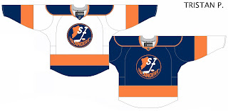
Staten Island Islanders concepts (by Tristan)
Tristan moves the Islanders to Staten Island here. Again, no TV numbers hurts this and there are uncoloured pixels at the tips of the collar. I like the idea of the logo, I just think it needs a bit more re-arranging. Check out the TUTORIALS link for help with the pixels. 6/10
New York Islanders concepts (by Ian)
I really like the home and road jerseys. I just think that the arms should be blue, not orange, on the road whites. The orange alternate looks good as well, but I would choose a slightly different striping pattern than the Coyotes' 3rd jersey. 7/10
Mississauga Steelheads concepts (by Brian R.)
Just like yesterday's Steelheads concept from Brian, I think this template is used too much in the CHL. The numbers and NOB also look a little pixelated. You can download that stuff directly to your computer on the TEMPLATES page, to get a cleaner look. 6/10
Ottawa Senators concepts (by NB14)
I think the alternate would be great if the wordmark was not gold, but white. The home and road concepts are put together well, but I personally would like to see white as the secondary colour and gold as the trim. 7/10
Phoenix Coyotes concept (by Brandon C.)
I think this is perfect as the Coyotes 3rd jersey! I've done a couple of Coyotes concepts looking like this myself. Nice work. 9/10
Phoenix Coyotes concepts (by Kyle C.)
In my opinion, this is very close to perfect. All I would do is make the numbers and NOB white instead of sand. In fact, just have the two colours switch positions on the numbers and NOB. I do get though that they match the order of the stripes. Too bad you took a shot at Doan, he's one of the good guys in the game. 9/10
Foo Fighters concept (by Sam N.)
This is really cool. Small concern is that the logo is using a bit darker shade of black than the jersey and thus you can see the square that it is in. This is pretty well put together and thought out. Funny, there is another Foo's jersey coming up in a week and a bit. 8/10
Montreal Maroons concepts (by Steven G.)
This is what Steven thinks the Maroons would look like if they were still around today. It's hard to argue with that. One concern, is the logo too similar to the Michigan Wolverines to be accepted as a NHL logo? It's close, but I say it would be accepted. COTW nom from me! 9/10
Boston Bruins concept (by DC Visual Arts)
This is really cool! It's the Bruins' bear based on the Celtics' logo. I won't even try to critique this as it clearly took a lot of talent. 9/10
Western Michigan Broncos concepts (by Kevin D.)
Congrats again Kevin on finishing another series! Excellent work across the board on these ones. They could be terribly plain jerseys, but the numbers, NOB, logo, and collars give them a lot of life. 8/10
Friday: Winners!
 Reviewed by Ryan
on
June 15, 2012
Rating:


.png)
.png)


5 comments:
DC's Bruins logo for COTW, if that's possible.
It is
I'll second the bruins logo. That's friggin awesome.
Second on Steven G. Maroons concept.
on the bruins concepts i would say use the current logo
Post a Comment