
Friday: No Joke
Hello folks, happy April Fools day! I'm not going to prank you today, instead I'm providing a sneak peak of a project I've been working on lately (bad timing, I know). Last year I created a template which was a hybrid of the NHLuniforms.com template and the Reebok Edge template from Sportslogos.net (cleverly called the "Hybrid Template"). Now after a year, I've started to notice some flaws, so I decided to create a new template.
 The biggest flaw of the old template was its lack of versatility, for example square shoulder yokes would look awkwardly small. So to make sure the new template was more versatile, I decided to create versions for every current NHL team jersey. I still have several more jerseys to recreate before I'm done and release this template to the wild, this is just a teaser for now, but I'm hoping to get this done in the next few weeks.
If you have any name suggestions for this new template let me know. So far I'm thinking of calling it either the Combo Template or Hybrid Template: The Sequel.
 The newest BCHL team, the Wenatchee Wild, currently wear Tampa Bay Lightning style jerseys. Here Vaughn opts for jerseys similar to the Oilers. I do think these are an improvement, although ideally I'd want to see something Wenatchee could call their own (but realistically most Junior A teams use existing templates to save money). The numbers on the black jersey are somewhat hard to read, I think a lighter colour would be better, and the logos look a tad large.


If you have any name suggestions for this new template let me know. So far I'm thinking of calling it either the Combo Template or Hybrid Template: The Sequel.
--------------------------------------------------
Today's Pairs Competition presentations are up on the HJC Design Blog. Jake and Josiah in the intermediate divison, and Hayden and Robin in the advanced division. Go check them out!
--------------------------------------------------
There's only one vote again this week. Last week I predicted the vote would be close and it was, only one vote separated first and second. Your vote could have been the difference maker, and it can again this week, so don't forget to vote.
COTW March 20-26 vote (ends Friday @ 11:59pm Eastern)
--------------------------------------------------
Wenatchee Wild, by Vaughn R:


Vaughn also sent in a grey third jersey. I'm a big fan of grey jerseys in general, and I like this one specifically because it uses only the bright colours from the Wild's colour scheme. The black numbers look a bit of place, however that wouldn't be an issue if they wore black equipment with this jersey. Congratulations on completing the series!
Rating: 7/10
Montreal Maroons, by Lucas D:

Next up Lucas updates the Maroons jerseys by giving them contrasting shoulder panels. Contrasting shoulder panels almost always look good, and this concept is no exception. However this might be a rare case where full hem stripes aren't the right option. I think they look awkward paired with the shoulder design, I'd prefer if the stripe went right to the bottom (like the 2004 All-Star game jerseys).
Rating: 7/10
Montreal Canadiens, by Ryan C:

The Canadiens jerseys won't be changing anytime soon, but it's still fun to see something new for them. Ryan gives them double arm stripes, a yoke stripe (perhaps inspired by their 1935-38 white jersey), and no hem stripes. I like everything except the no hem stripes part. Often I enjoy concepts with no hem stripes, but I think this concept would benefit from one (even just a small blue line along the hem would do). I wouldn't want to see the Canadiens wear these in real life, however these would be perfect for an AHL affiliate.
Rating: 7/10
Alabama-Huntsville Chargers, by Taylor R:

Taylor gives the Alabama-Huntsville Chargers are unique set of jerseys featuring a side-panel and underside-of-arm based striping pattern. I love the side panels, but with the arms I feel the design is being hidden away. If the design was on the outside of the arms it be perfect. Taylor's execution is almost impeccable, except for a slight spelling error in the team name.
Rating: 8/10
Fresno Falcons, by Josiah B:
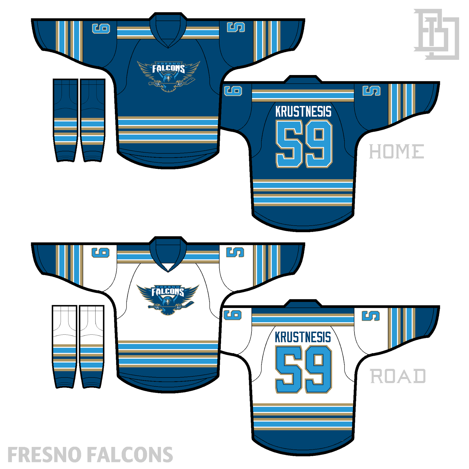
Fun fact, my first concept on HJC was a Winnipeg Falcons concept featuring this Fresno Falcons logo. Josiah uses it for its intended team, pairing it with a fairly vintage striping pattern. At first I was concerned the striping was too vintage for this logo and colour scheme, but I've decided they actually complement each other nicely. I don't really have any complaints, but I wonder how white numbers would look on the home jersey.
Rating: 8/10
--------------------------------------------------
That's all folks!
Friday: No Joke
 Reviewed by Steven Grant
on
April 01, 2016
Rating:
Reviewed by Steven Grant
on
April 01, 2016
Rating:
Reviewed by Steven Grant
on
April 01, 2016
Rating:


5 comments:
Taylor R. for COTW
I'll 2nd Taylor R.
Hybrid v2? I do like your template though, as I have recently switched to it, so I'm excited for the new version!
Ryan, I think your Habs set would be a great option for a future Outdoor Game. It needs hem stripes, though.
Every Team's Template? Has a nice ring to it. And that IS NOT Calgary's home template. I've seen Blue Jackets games vs them on TV, and one of the local high school teams in Columbus wears copies of them.
GO JACKETS!!! GO MONSTERS!!! GO BUCKS!!!
Post a Comment