
Wednesday: I Nominate X For COTW!
So with that whole disaster last week, after feeling the embarrassment of letting you, the readers, down, I would like to both apologize to you, and thank you.
Thank you?
Yes, thank you. Thank you for the cheeky comments. I genuinely enjoyed them, and it helped me laugh at myself and relieve the embarrassment. I felt better because "Laughter is the best medicine". So today I thank you and hereby nominate X for concept of the week.
There's only one catch: who is X? Stay tuned!
As you are reading this today, I am currently en route to Brooklyn! Game 4 is tonight and I can easily confirm that based on game 3, the black jerseys will NOT surface themselves in Brooklyn. However the Islanders tradition of rally towels continues.
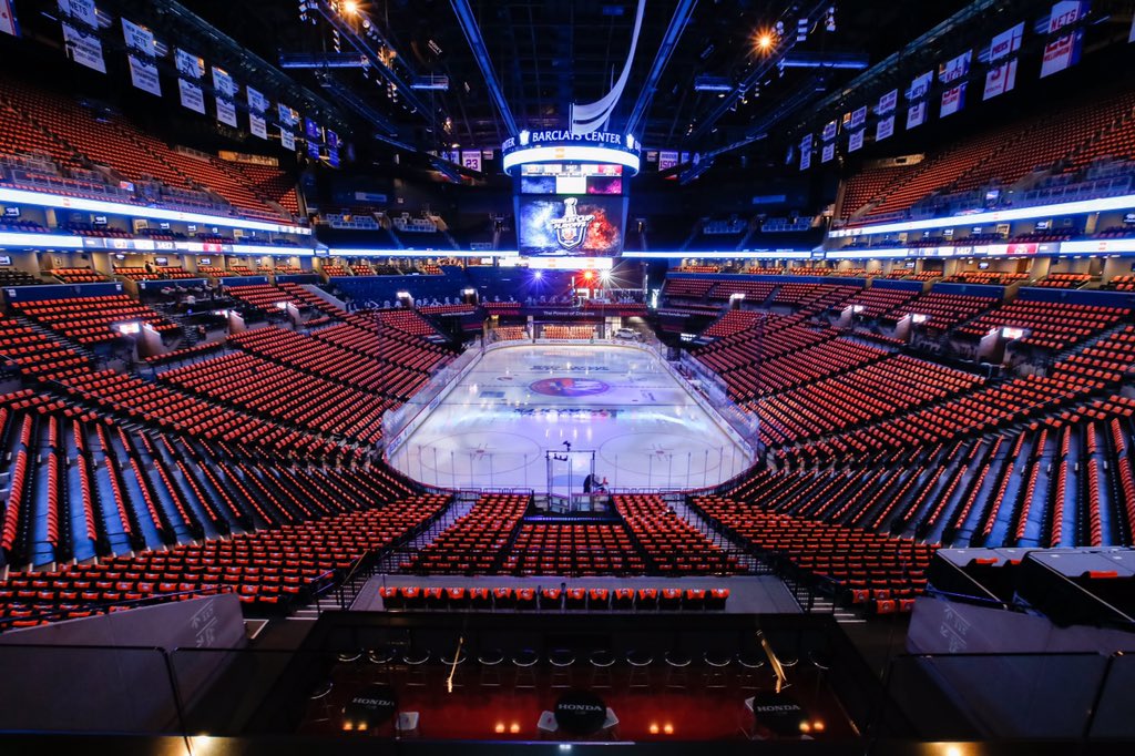
(Photo Credit: @NYIslanders on Twitter)
So orange towels in game 3. Usually we have blue towels for game 4. But boy is that a beautiful setup. Nothing like playoff hockey. Sorry Canada.
Speaking of third jerseys, I'm honestly surprised San Jose is wearing their home jerseys instead of their own black third jerseys, which they have done in the past. Minnesota have theirs as usual, and now Pittsburgh has theirs too, although calling them third jerseys is a bit of a disservice. "Future Home Jerseys" is a better term. Also Washington isn't using their alternate jerseys, officially confirming that unlike Pittsburgh, Washington will NOT be going full-time to their throwbacks.
Roller Hockey International is back from the dead!!!!
Well sort of. We have a cool competition here where you can give it some new life. I will take the credit of inspiring this when my Long Island Jawz concept was posted here. So now it's your turn! And I get a second chance. Try it out! Send them in!
We do not have any entries to post at the moment.
ON TO THE CONCEPTS!
Brooks F: Tallahassee Tiger Sharks (ECHL) Concept

Uh, wow. Can't get more 90's than this... From that perspective this is fantastic. I love the jaws around the sleeve numbers. The alternate jersey is very reminiscent of the Buffalo Turdburgers. It works for third division hockey, and 90's hockey for that matter. Execution is fantastic. This works for this team. But again, that 90's look. Wow.
Wow: 90%
John V: Winnipeg Jets Heritage Classic concept

A traditional look that the Jets have worn, but the roundel has been eliminated for simply the old script and the new jet recolored. I mean this isn't a new design, but is that a good idea for a Heritage Classic? Some would say yes. I say show me something different. Be creative.
Classic but not entirely original: 65%
Ryan C: Dallas Stars Alternate Concept

Personally I'm not a fan of roundel logos that are simply the main logo with text in a circle around it. I find them lazy. And it's not entirely your fault. The jersey here looks good, but I want to see some consistency with the separation of the white and green. Either do it, or don't do it. No in between, because it throws off the jersey. Interesting arm pattern that I enjoy. I love the use of that Texas logo on the shoulders.
Mixed feelings: 85%
Taylor R: Carolina Hurricanes Winter Classic Concept:

Taylor gives us a classic take on the hurricanes. The striping looks inspired from their current home jerseys, and for a team in the Winter Classic, that's a good thing. The black detailing is a good touch, but that logo is SPECTACULAR. The silver gets lost, so I question whether or not its even necessary. The one thing the silver does help with the parallelism between the striping and the logo. How this all comes together is great.
A storm is brewing here: 88%
Tyler MS: Team Germany (IIHF) Concept

Execution is the only thing that hurts this. Hem stripes should overlap and eliminate the stitching of the jersey. I do like how the white stripe outlines the German flag pattern. The white jersey helps keep that pattern too. Phantom yoke needs to go. Outline on the logo should be thicker, especially because of the yellow-on-white violation I talk about every week.
Definitely a good work in progress. Keep things up: 67%
Zeke G: Florida State (NCAA) Concept

If only the numbers letters and logos weren't so pixelated...So close. This looks amazing. The cream on white doesn't work that well either. I had high hopes for this until I looked with detail. Otherwise this is great. Maybe some more black. Black can work as a good trim color sometimes and this may be one of those times it could help more.
So close yet so far: 79%
Zeke G: North Dakota (NCAA) Concept

The grey gets lost on the striping. Ditch it or darken it. Also the main logo looks better in green on the white jersey. I like the font choice but needs to be placed in a cleaner manner. The North Dakota wordmark should not be used on the shoulders like that. Otherwise a solid look that can use some improvement.
Keep working at it: 78%
The winner of my COTW nomination is X! Also known as Brooks F and his Tallahassee Tiger Sharks Concept!
That will do it for a more normal Wednesday post. If anyone wants to meet me in Brooklyn, I'll be in section 229 as usual. Game 4 tonight! Let's go Islanders!
Until next week.
Thank you?
Yes, thank you. Thank you for the cheeky comments. I genuinely enjoyed them, and it helped me laugh at myself and relieve the embarrassment. I felt better because "Laughter is the best medicine". So today I thank you and hereby nominate X for concept of the week.
There's only one catch: who is X? Stay tuned!
As you are reading this today, I am currently en route to Brooklyn! Game 4 is tonight and I can easily confirm that based on game 3, the black jerseys will NOT surface themselves in Brooklyn. However the Islanders tradition of rally towels continues.
(Photo Credit: @NYIslanders on Twitter)
So orange towels in game 3. Usually we have blue towels for game 4. But boy is that a beautiful setup. Nothing like playoff hockey. Sorry Canada.
Speaking of third jerseys, I'm honestly surprised San Jose is wearing their home jerseys instead of their own black third jerseys, which they have done in the past. Minnesota have theirs as usual, and now Pittsburgh has theirs too, although calling them third jerseys is a bit of a disservice. "Future Home Jerseys" is a better term. Also Washington isn't using their alternate jerseys, officially confirming that unlike Pittsburgh, Washington will NOT be going full-time to their throwbacks.
Roller Hockey International is back from the dead!!!!
Well sort of. We have a cool competition here where you can give it some new life. I will take the credit of inspiring this when my Long Island Jawz concept was posted here. So now it's your turn! And I get a second chance. Try it out! Send them in!
We do not have any entries to post at the moment.
1st Quarter vote (ends Friday @ 11:59pm Eastern)
COTW Apr 10-16 vote (ends Friday @ 11:59pm Eastern)
RHI entries (due Friday @ 10:59pm Eastern)
ON TO THE CONCEPTS!
Brooks F: Tallahassee Tiger Sharks (ECHL) Concept

Uh, wow. Can't get more 90's than this... From that perspective this is fantastic. I love the jaws around the sleeve numbers. The alternate jersey is very reminiscent of the Buffalo Turdburgers. It works for third division hockey, and 90's hockey for that matter. Execution is fantastic. This works for this team. But again, that 90's look. Wow.
Wow: 90%
John V: Winnipeg Jets Heritage Classic concept

A traditional look that the Jets have worn, but the roundel has been eliminated for simply the old script and the new jet recolored. I mean this isn't a new design, but is that a good idea for a Heritage Classic? Some would say yes. I say show me something different. Be creative.
Classic but not entirely original: 65%
Ryan C: Dallas Stars Alternate Concept

Personally I'm not a fan of roundel logos that are simply the main logo with text in a circle around it. I find them lazy. And it's not entirely your fault. The jersey here looks good, but I want to see some consistency with the separation of the white and green. Either do it, or don't do it. No in between, because it throws off the jersey. Interesting arm pattern that I enjoy. I love the use of that Texas logo on the shoulders.
Mixed feelings: 85%
Taylor R: Carolina Hurricanes Winter Classic Concept:

Taylor gives us a classic take on the hurricanes. The striping looks inspired from their current home jerseys, and for a team in the Winter Classic, that's a good thing. The black detailing is a good touch, but that logo is SPECTACULAR. The silver gets lost, so I question whether or not its even necessary. The one thing the silver does help with the parallelism between the striping and the logo. How this all comes together is great.
A storm is brewing here: 88%
Tyler MS: Team Germany (IIHF) Concept

Execution is the only thing that hurts this. Hem stripes should overlap and eliminate the stitching of the jersey. I do like how the white stripe outlines the German flag pattern. The white jersey helps keep that pattern too. Phantom yoke needs to go. Outline on the logo should be thicker, especially because of the yellow-on-white violation I talk about every week.
Definitely a good work in progress. Keep things up: 67%
Zeke G: Florida State (NCAA) Concept

If only the numbers letters and logos weren't so pixelated...So close. This looks amazing. The cream on white doesn't work that well either. I had high hopes for this until I looked with detail. Otherwise this is great. Maybe some more black. Black can work as a good trim color sometimes and this may be one of those times it could help more.
So close yet so far: 79%
Zeke G: North Dakota (NCAA) Concept

The grey gets lost on the striping. Ditch it or darken it. Also the main logo looks better in green on the white jersey. I like the font choice but needs to be placed in a cleaner manner. The North Dakota wordmark should not be used on the shoulders like that. Otherwise a solid look that can use some improvement.
Keep working at it: 78%
The winner of my COTW nomination is X! Also known as Brooks F and his Tallahassee Tiger Sharks Concept!
That will do it for a more normal Wednesday post. If anyone wants to meet me in Brooklyn, I'll be in section 229 as usual. Game 4 tonight! Let's go Islanders!
Until next week.
Wednesday: I Nominate X For COTW!
 Reviewed by Unknown
on
April 20, 2016
Rating:
Reviewed by Unknown
on
April 20, 2016
Rating:
Reviewed by Unknown
on
April 20, 2016
Rating:


1 comment:
I'll 2nd Brooks F. for COTW
Post a Comment