
Monday: 3 Stars of the First Round
Welcome to another Monday post, here on HJC!!
Well my playoff pool, despite being well picked, wasn't entirely correct. I really thought the Rangers were going to do better, especially with Fleury possibly coming back. I was right about the Sharks, Stars, Caps and Lightning, but those were give ins to me. I was hoping the Panthers were going to show up, but they are a young team with an old goalie and overtime was their death nail. Lu, while always great through 3 periods, was tired by OT. Griess played really well, he has potential to be a starter in the NHL next seasons, but I don't wanna get ahead of myself.
Here are my 3 stars in the Playoffs this far
3. Michael Neuvirth
The guy has SERIOUS potential. The Caps let him go since they had Holtby, but he would be starting there otherwise. Mason is a backup at best and AHL at worst. Neuvirth...the guy stopped 103 of 105 shots he faced against Ovechkin, Backstrom, and the rest of the Caps high scoring line up. Had Neuvirth been in net since the beginning....the Flyers would have more likely to win had their offence shown up. He's the reason they made it this far, he's the reason the Flyers weren't eliminated in 5, and I think even Pens fans have respect for him after the performance he had.
2. John Tavares
I've always been skeptical of Tavares, not because he isn't great, I've just never seen him as elite. These playoffs are certainly chasing my mind on him. His play has gone from being a good point scorer, to also being a leader and mature captain. I think as he ages, Tavares only seems to get better. He's only 25 but right now is playing very similarly to Sakic, except much larger. The Islanders captain is not only scoring goals, but his play is elevating the rest of his team, Nielsen, Okposo and a lot of the playoff newbies are riding high of his success. Watch out, Tampa, I have high hopes now that the Islanders are out of the first round, that they keep going
1. Jamie Benn
The series I've watched the most of aside from St. Louis/Chicago has been by far Dallas/Minnesota, and while the Stars offence has had a lot of heroes, Jamie Benn has been near perfect. He's always benefited from having Seguin around, but with such...frankly lacklustre defence and even worse aging Finnish goaltending, he's had to be playing at 125%, and to be fair he has. Without Benn, I will say that Dallas would have lost the series
Any standouts you wanna give recognition. List them below.
Depending on when the Playoffs end, you'll need to get your picks in the next day or at least before the next round begins, so keep an eye out for that
Don't forget to get your COTW votes in, it's a Brooks v. Taylor, two HJC heavyweights, and artists we'll see a lot more times in the COTW vote
Also don't forget to get your RHI votes in, it's the rarely seen top 3 votes, so judge accordingly and get them votes in!!!!


Providence Bruins Concept (By: Lucas D.)


+ I really like the idea of the Blues using more yellow and white instead of relying on double blue, especially on the yellow numbers
+ The striping on the white jersey is perfect, that isn't to say the blue jersey's doesn't work, but it looks better
+ Good execution
- The shoulder patch is the one thing I'd change. That patch I've grown tired of, it's been around for almost a decade and I think a recoloured trumpet loo is the best thing the Blues can do
- I'd like to see a yellow note attempted, it could fail but if it works, it will really work
Rating: 8.5/10
Calgary Flames Concepts (By: Jared L.)

I mean...It's quite an inventive idea, but the execution falls flat. The image itself is quite small, and a lot of detail is missing. The numbers are hard to read on the yellow jersey, and the striping pattern...if there is one is two yellow patches on the arm, that's it. The colours are big and bold, but because they aren't really on the arms, the "flames", which with any more details look just like 3 scraggly fingers. There is no logo, and I can barely see the Calgary script in it. It's an ambitious idea..but one that needs A LOT more planning and re thinking, starting with an actual logo/striping pattern
Rating: 2/10
Calgary Flames Concepts (By: Jared L.)

+ I think it's neat to see the '98 Flames with a 2004 colour scheme
- I can appreciate the jersey is hand drawn, but you need to use some sort of basic template or better lay out the jersey, the arms on the red jersey are a blur
- The white jersey is exactly the same as it was in 1998, at least change something
- The numbers are hard to read since they're single layer and squished
Rating: 4/10
Chicago Blackhawks Concepts (By: Ryan C.)
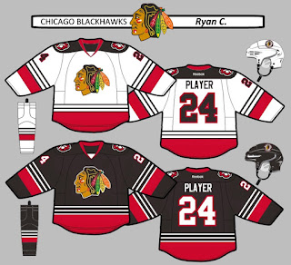
+ I really dig the white stripes on the black jersey, they compliment the red stripe and stand out nicely, a good dash of 30s for a generally 60s jersey
+ Black jersey is perfect, and the whit jersey is one thing away from being perfect
+ Good logo choices, the logo on the black jersey with the outline looks fantastic
+ Great execution
- The white jersey would benefit from more black in the striping, something as simple as black cuffs
Rating: 9/10
Kingston Frontenacs Concepts (By: Brooks F.)

+ The home and road are a good mix of original and old school Bruins, I really like that
+ Chest stripes really stand out, but don't hide the logos
+ The alternate is perfect, a more interesting version of their original yellow jersey
+ Good execution
- The only thing I can't read are the numbers on the white jersey, Making they white would help them to stand out, or a larger outline of some sort
- The inside of the G on Kingston should be yellow, not white
- Missing CCM logos
Rating: 8.75/10
Kitchener Rangers Concepts (By: Brooks F.)

+ Huge plus for making the soldier's head logo a primary
+ The striping is also a good mix of original and Rangers/Devils, I really like it
+ The alternate is really simple and modern, but still fits with the jerseys, that'd be my favourite jersey
+ Great execution
+ Good job leaving minimal Rangers ties in the logos and jerseys, the Kitchener Rangers need to move away from that ASAP
- The CCM logos are missing on the chest
Rating: 9.5/10 COTW Nom from me
Have a great week!
Well my playoff pool, despite being well picked, wasn't entirely correct. I really thought the Rangers were going to do better, especially with Fleury possibly coming back. I was right about the Sharks, Stars, Caps and Lightning, but those were give ins to me. I was hoping the Panthers were going to show up, but they are a young team with an old goalie and overtime was their death nail. Lu, while always great through 3 periods, was tired by OT. Griess played really well, he has potential to be a starter in the NHL next seasons, but I don't wanna get ahead of myself.
Here are my 3 stars in the Playoffs this far
3. Michael Neuvirth
 |
| Photo from sonsofpenn.com |
2. John Tavares
 |
| Photo from thehockeynews.com |
1. Jamie Benn
 |
| Photo from thescore.com |
Any standouts you wanna give recognition. List them below.
Depending on when the Playoffs end, you'll need to get your picks in the next day or at least before the next round begins, so keep an eye out for that
Don't forget to get your COTW votes in, it's a Brooks v. Taylor, two HJC heavyweights, and artists we'll see a lot more times in the COTW vote
Also don't forget to get your RHI votes in, it's the rarely seen top 3 votes, so judge accordingly and get them votes in!!!!
COTW April 17-23 vote (ends Friday @ 11:59pm Eastern)
RHI Top 3 vote (ends Friday @ 10:30pm Eastern)
----------------------------------------------------------
Tri City Americans WHL Concept (By: Lucas D.)

+ I mean, any team with a patriotic theme can pull off this striping, and the Americans are honestly the best fit for this if the Blue Jackets don't do it
+ Good colour balancing except for one thing, but I like how the blue isn't overpowering but is still very visible, Lucas uses JUST enough
+ Good execution, but with some errors that I'd expect Lucas to fix
- The WHL & Reebok logo on the chest are too small and should be farther away from the collar
- I would have gone with all blue numbers, the arms look too red with the red numbers
- The shoulders are really bare, and need something to spice them up. I get not wanting to use the eagle logo, but something would be better than nothing
Rating: 7.5/10
Arizona Coyotes Concepts (By: TG)

+ Right away, colours are balanced perfectly across the jerseys, this fixes the biggest flaw the current set has
+ The logo looks surprisingly good, I get why the Yotes ditched the running logo, but the head was certainly worth keeping
+ The numbers look great, the whole jersey does really well with the desert theme
+ Excellent execution
- The monochrome collar doesn't really work for me, I like the style of the collar on the current jerseys
Rating: 9/10
Providence Bruins Concept (By: Lucas D.)

+ I like the Pruins using yellow over black on their jerseys, and here, the yellow stands out really nicely on the white, something that isn't uncommon
+ Pattern is a good vintage Bruins pattern, but unique to the team and league
+ Good execution
- Shoulder patches seem to off put each other, I would just stick to the Bear logo
- The numbers would look better and stand out better against the yellow stripes if they were black
Rating: 8/10
St. Louis Blues Concepts (By: Ryan C.)

+ I really like the idea of the Blues using more yellow and white instead of relying on double blue, especially on the yellow numbers
+ The striping on the white jersey is perfect, that isn't to say the blue jersey's doesn't work, but it looks better
+ Good execution
- The shoulder patch is the one thing I'd change. That patch I've grown tired of, it's been around for almost a decade and I think a recoloured trumpet loo is the best thing the Blues can do
- I'd like to see a yellow note attempted, it could fail but if it works, it will really work
Rating: 8.5/10
Calgary Flames Concepts (By: Jared L.)
I mean...It's quite an inventive idea, but the execution falls flat. The image itself is quite small, and a lot of detail is missing. The numbers are hard to read on the yellow jersey, and the striping pattern...if there is one is two yellow patches on the arm, that's it. The colours are big and bold, but because they aren't really on the arms, the "flames", which with any more details look just like 3 scraggly fingers. There is no logo, and I can barely see the Calgary script in it. It's an ambitious idea..but one that needs A LOT more planning and re thinking, starting with an actual logo/striping pattern
Rating: 2/10
Calgary Flames Concepts (By: Jared L.)
+ I think it's neat to see the '98 Flames with a 2004 colour scheme
- I can appreciate the jersey is hand drawn, but you need to use some sort of basic template or better lay out the jersey, the arms on the red jersey are a blur
- The white jersey is exactly the same as it was in 1998, at least change something
- The numbers are hard to read since they're single layer and squished
Rating: 4/10
Chicago Blackhawks Concepts (By: Ryan C.)

+ I really dig the white stripes on the black jersey, they compliment the red stripe and stand out nicely, a good dash of 30s for a generally 60s jersey
+ Black jersey is perfect, and the whit jersey is one thing away from being perfect
+ Good logo choices, the logo on the black jersey with the outline looks fantastic
+ Great execution
- The white jersey would benefit from more black in the striping, something as simple as black cuffs
Rating: 9/10
Kingston Frontenacs Concepts (By: Brooks F.)

+ The home and road are a good mix of original and old school Bruins, I really like that
+ Chest stripes really stand out, but don't hide the logos
+ The alternate is perfect, a more interesting version of their original yellow jersey
+ Good execution
- The only thing I can't read are the numbers on the white jersey, Making they white would help them to stand out, or a larger outline of some sort
- The inside of the G on Kingston should be yellow, not white
- Missing CCM logos
Rating: 8.75/10
Kitchener Rangers Concepts (By: Brooks F.)

+ Huge plus for making the soldier's head logo a primary
+ The striping is also a good mix of original and Rangers/Devils, I really like it
+ The alternate is really simple and modern, but still fits with the jerseys, that'd be my favourite jersey
+ Great execution
+ Good job leaving minimal Rangers ties in the logos and jerseys, the Kitchener Rangers need to move away from that ASAP
- The CCM logos are missing on the chest
Rating: 9.5/10 COTW Nom from me
----------------------------------------------------
That's the post!
Don't forget to vote in the appropriate votes
Get your playoff picks ready for round 2
Also don't forget to get ready for the upcoming Tucson Contest!
Go Jets, Moose & Mooseheads/Playoff picksHave a great week!
Monday: 3 Stars of the First Round
 Reviewed by winnipegjets96
on
April 25, 2016
Rating:
Reviewed by winnipegjets96
on
April 25, 2016
Rating:
Reviewed by winnipegjets96
on
April 25, 2016
Rating:


3 comments:
The second Flames concept is actually a mashup of the '98 ones and the '04 ones.
I thin Reilly Smith has been outstanding
I second Brooks F. Kitchener Rangers concept for COTW.
Post a Comment