Friday: Shameless Self-Promotion
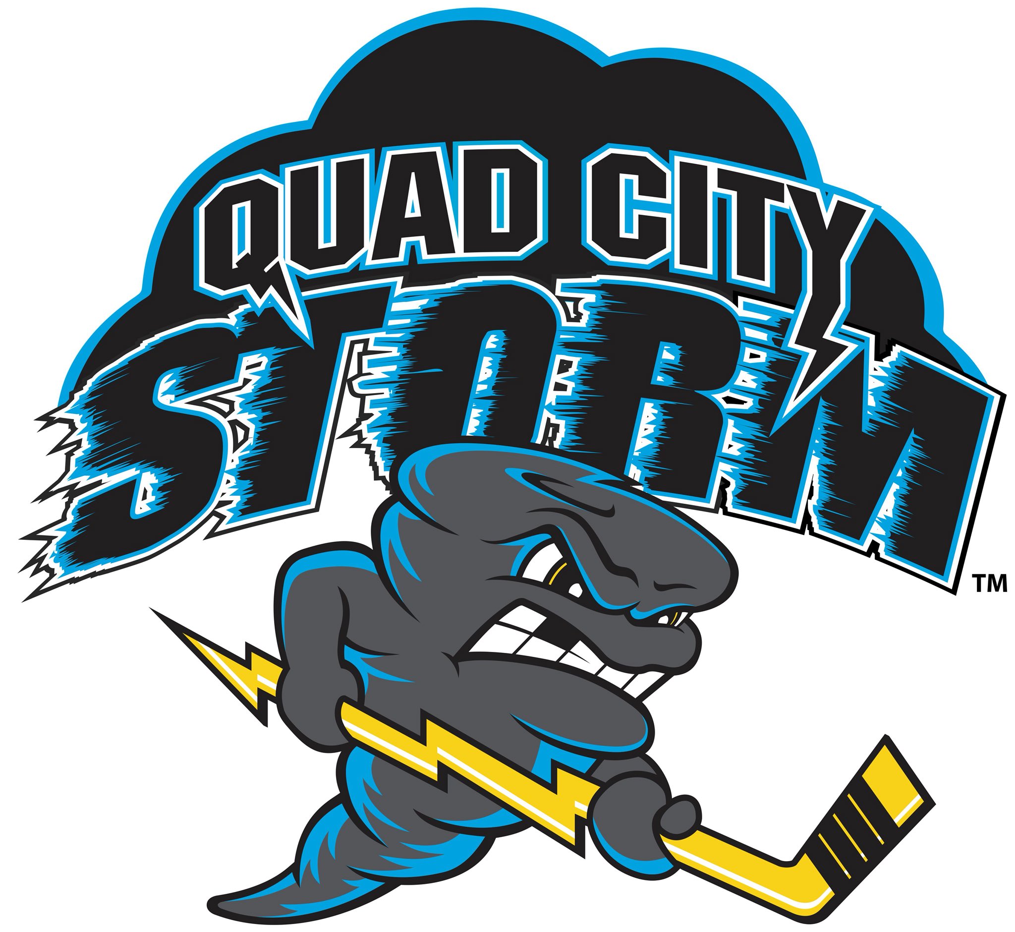
Hey y'all, and welcome to another Friday post here at HJC. The biggest news story in recent days has been the release of the Quad City Storm's new logo.
The team hasn't even played a game and they've already been through two logos. What a time to be alive. I will say that this design is an improvement, if only because the original logo was such a mess. I assume management heard the podcast where we ripped it apart and decided to make some changes in an attempt to appease the hockey design gods. In this iteration, the anthropomorphic tornado takes the forefront of the design, which is an improvement of the wordmark-heavy nature of the old logo. I like the addition of the mouth the the hockey player's trademark missing tooth, and the lightning bolt stick is a nice touch. The cloud/wordmark design in the background is, regrettably, pretty much the same as the previous design, except it has now been arched around the tornado. Overall, the new tornado is a much better look than the previous, and he gets bonus points for actually holding the stick properly, but that wordmark still looks like a late 90s amateur soccer team's logo. As it stands, it's nothing special, but not entirely out of place in the whirlwind world that is SPHL logo design.
On a more personal note, y'all may have noticed that we have had a lack of concepts lately, and while that is disappointing, it can be easily fixed. If you're a designer, start sending in more of your designs so you can see them here. If you're not a designer, give it a try. I was a reader of HJC for years before I finally tried making a concept of my own, and now I'm on staff. While it is a little difficult at first, you quickly get the hang of it, and there's really no feeling like seeing the final product of a design that you had in your head come to fruition. So that is my charge to y'all. Get designing, because this site is only as good as the readers who contribute, and there are more than enough hockey teams a the major, minor, and collegiate levels that could use a new look.
In voting news, we have the regular COTW vote for July 13-19, with polls closing friday at noon EDT. We are also in the Round Robin round of our yearly HJC Open, so be sure to get your votes in for that as well.
COTW July 13-19 vote (ends Friday @ noon EDT)
HJC Open Round Robin vote (ends Friday @ noon EDT)
Jersey Nerds Podcast (new episode every Monday!)
-----------------------------------
Now for today's concept!
TC Moore- Minnesota North Stars
This North Stars design comes to us from my favorite contributor to the site, me. This design was inspired by the rejected 80s black alternate for the North Stars, a design that I felt was somewhat salvageable. I liked the simplistic color blocking striping, but I wanted to eliminate the black so I could focus on the true stars of the color palette, green and gold. I still like the striping, but I wish I'd thrown in an extra shade of green so it was closer to the original design. I love the white cuffs on the green jersey, it adds a nice crispness to the look and ties in well with the main logo. Gear looks good on the whole, but the green stripe on the breezers, much like that on the jersey itself, would be nearly indistinguishable from afar. Final verdict: I'm still sure there's a way to salvage the black jersey's design, but this wasn't it. 7/10
That's all for me today, see y'all next week!
Friday: Shameless Self-Promotion
 Reviewed by TC Moore
on
July 20, 2018
Rating:
 Reviewed by TC Moore
on
July 20, 2018
Rating:


No comments:
Post a Comment