Story: Just When it Couldn't Get Much Worse in Ottawa...
...it does.
Source: Twitter via @Fffeisty
*This is an opinion article. The view expressed are a reflection of the writer, and do not necessarily reflect the views of the fellow writers. Especially not Jets96's, he actually likes the "SENS" script alt.*
For a team one goal away from a Cup Final appearance just 14 short months ago, things have gone from good to bad faster than a Tom Wilson suspension. Granted, for a lot of this, you can't find anyone to pin blame on. Some players don't play up to their level from a year ago, that's normal. Off ice drama surrounding a horrendous situation, so we don't need to review that in detail. Long story short, the team on the ice is a mess, and that's the way it is.
But there's another mess in Ottawa, and this mess doesn't have to be (ok all you smart alecks, get your Canadian government jokes out of the way now). The mess is the brand.
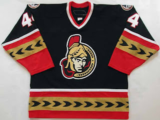
In my opinion, the issue all started back in the early 90's, when the team got swept up in the avant garde mentality of the decade, and wound up with a rather unappealing look:
Alternate Jersey from '97-'99, Road Jersey from '99-'07.
Source: The Goalie Archives
Further complicating the look, the away and alternate jerseys didn't go with this one or each other, either:
Away Jersey from '97-'07 (Note: Away Jersey from '92-'97 was the same, except the logo was slightly different)
Source: Hockey Hall of Fame
Alternate Jersey from '00-'07
Source: Reddit
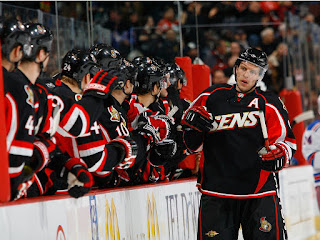
Speaking of the away, as that jersey had essentially been unchanged for all of team history, the team have may had been bored of same old same old. Looking ahead, the team was looking for something fresh and something consistent. Both of which were offered by Reebok in the switch to the Edge in 2007.
Source: NHL.com
Source: Zimbio
Well, at least it was consistent. I imagine some executive looked at the first design in the Reebok catalog and said, "sure, that's good enough." The avant garde mentality hadn't completely left the franchise, because the very next season, they came up with this:
Source: Gunaxin Sports
At this point, things aren't going spectacularly. But then, genius struck. Instead of looking forward, the team looked back. The design department got the Zamboni up to 88 miles per hour, and found a precedent way back in early 20th century. Bringing it back to the precedent, and simplifying the theme to fit a modern taste, the team gave us these beauties.
Source: SportsNet
These jerseys were universally well received, and were a huge hit from a selling standpoint. This beaut remained the alternate from '11 through '17, when Adidas's No Thirds mandate took effect. It only made sense to incorporate this theme into the main brand... so why didn't it happen?
I think the issue here was an inability to pull the trigger. The team had its legitimate concerns (for example, could a block O stand alone as a primary logo? Was red the de facto primary dark color?), and that kept them from taking the leap forward. I was hoping the switch to Adidas would encourage the team to make these changes while it was convenient, but alas, the team has clung to Reebok's one-size-fits-all design into the future. Another missed opportunity has been this offseason, as all signs point towards the team holding off on a third.
So now that we've seen what's led up to this point, let's get to what's happening now. Whatever has driven a sentiment for change, the team is testing the waters for it. Last week, the team released a survey to fans looking for input on all the sorts of aspects you'd expect, from game-day experience to potential frustrations with management, just to name a few. One question in particular stood out to everyone. The team, against all indication, is finally looking towards a branding change. But is change for the best? Well, judge for yourself from the 6 options presented to survey takers:
Source: Twitter via @Fffeisty
As has been pointed out ad nauseam, the organization of logos on the bottom row is (most likely) coincidental. Though the openness to a change in brand is surprising, the actual attempt at it is somewhat akin to their on-ice performance. Let's analyze each one of these.
Top Left (Former Primary): Going back to the 90's isn't the worst idea. The Coyotes just took the leap of faith with their throwback third, and Ducks' fans can't get enough Mighty. This isn't a terrible logo by any stretch of the imagination, but it's rather flat and lacks depth, making it dated in a way I don't feel will be as well received. I also feel it's weaker than its updated counterpart, which I'll get to in a little bit.
Top Middle (Current Primary): If it ain't broke, don't fix it? Among Ottawa's options is, of course, no change at all. The inclination to choose this logo isn't so much how good it is, in so much as how it fares against challengers. To its credit, I'm a big fan of this logo. The centurion's expression is both motivated and determined, well drawn in a simplistic style with being cartoony. The helmet and hood give this work of art dynamism and depth.
Top Right (Current Secondary): Among the reasons stated for not promoting this to primary, there isn't much to this. Adding the stripes in the background tie it to the former alternate jersey, but to be strong enough for an NHL primary might be a stretch to far. Personally, I fall on the side of this being a stretch.
Bottom Left (New): Here's where the confusion sets in. What the heck is this? A roundel with text in the outer ring, and a plain letter in the center. I have so many questions. If a plain O isn't good enough, how is a plain S? Would the text be large enough to be legible on a jersey? What do the stars mean? I'm not even sure this is meant to be a primary logo, it's so weak. It hardly pertains to the Sens, aside from obvious text that's trying to bash me over the head. I wish I could write as an authority on all things hockey design, but I'm so confused by this look, I'm left with so many questions I don't know what to make of it.
Bottom Middle (New): Here's a more meaningful logo that still falls short. This logo attempts to liven up the block O with abstract patterns based on the art of Native peoples. Unfortunately, the application is so subtle that it simply doesn't work. The artist here tried to cram in too many things, and they wind up so small the individual shapes are tough to distinguish. The red, being darker in shade, is also a rough background for black. This is an admirable idea, but its execution leaves too much to be desired.
Bottom Right (New): Here's another one out of left field. This is quite similar to the bottom left, so nitpicking differences is futile.
The logo that's screaming the loudest in Ottawa is the one standing out in its omission. Why isn't this one on the list?
Source: Sportslogos.net
The only explanation I can possibly fathom is their is some sort of legal problem we don't know about. Otherwise it's inexcusable that two S's with roundel text made the cut, but not this. A modernization of the original logo, this centurion has all the fierceness of the current logo. I have to admit, and this is an unpopular opinion (especially among the writing staff), but I do prefer the current logo to this. The current logo's depth gives it the edge for me over this one, which is a little too flat. However, if the team brings back chest stripes, I would want this to be the crest logo. This would look better on a striped background, due to the background distinguished by the golden roundel.
My take on all of this? There's reason for hope, but I'm looking for Ottawa to remain disappointing. For a team with that's had so much potential for so long, it's even more frustrating to see them insist on a generic jersey design. The logo survey gives me reason to hope management will take a more attentive ear to fans demanding better from a club with so much. But given the higher ups' inattentiveness thus far, I'm only left to assume it will continue. Ottawa has to deal with a lot on their hands on the ice, but while the team isn't even at camp, now is the time to push forward in clearing up what they'll wear. If Ottawa lends an ear to fans, takes time to understand its history, and brings on the right group of designers from Adidas, the sky's the limit.
Are you more optimistic for the team than I am? Are you a Sens fan yourself? I'd love to hear from you on your beloved team. Let me know what you think, and keep your stick on the ice.
Story: Just When it Couldn't Get Much Worse in Ottawa...
 Reviewed by Ben Shaffer
on
July 25, 2018
Rating:
 Reviewed by Ben Shaffer
on
July 25, 2018
Rating:


No comments:
Post a Comment