Tuesday: Buckeye Beatdown
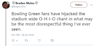
Hi folks, welcome back to another exciting edition of the Tuesday post here at HJC. I certainly had an exciting weekend; I traveled to Columbus to watch Bowling Green make themselves at home in Ohio State with an 8-2 spanking. Things did not go well for the poor Buckeyes, who, according to the hacks in charge of the USCHO poll, were ranked 4th in the nation. In their best period, they gave up a shorthanded goal on a 5-on-3 powerplay. I had plenty to cheer about, with BG scoring an even strength, powerplay, and shorthanded goal in a span of 4 minutes, chasing both the starting AND backup goalie out of the game, and sophomore forward Max Johnson scoring a hat trick. If the on-ice action wasn't bad enough, Ohio State fans even managed to be outcheered on their own campus, leading to one of the best tweets in the history of tweeting (from the OSU student paper hockey correspondent):
via Twitter
But enough about my hockey adventures, let's get back to the blog. Vote, get your 90's entries in, sit back relax, and enjoy the show.
COTW Oct. 19-25 vote (ends Friday @ 12pm ET)
90's NHL ReDesign Competition (ends Friday at 12pm ET)
Jersey Nerds Podcast (new episode every Tuesday)
Speaking of 90's Competition, we've had two new entries as of Monday night. Here they are:
Burkus C.
Chase C.
_________________________________________________
Brooks F.- Kunlun Red Star
This is the first concept I've reviewed for a Chinese team, so props to Brooks for going outside the box. The team's current set has massive yellow-on-white syndrome, so already the crisp color distinctions are an upgrade. One aspect of the color I could do without is the red gradient; the way it's used in the star of the logo is to create a sense of depth along clear ridge lines. There's no depth created by the gradient here. The sharp angles make a nice theme that blends well with the logo, but given the angles on the body are going to be mostly hidden under the arms, this greatly diminishes the effect. I love the font of the numbers, and it's a shame that the nameplate's font doesn't match.
Grade: C-
Burkus C.- Ohio State University Buckeyes
Speaking of Ohio State, Burkus starts a B1G series at Ohio State. The design incorporates a plethora of colors, but too many at once. The home and road attempt to throw three main colors all at once, with an additional color added for accent. There's no hierarchy here, and without it, there's chaos. The alternate is the most successful, with a clear order and concise blackout theme. The logo selection is perhaps the strongest aspect of the design; the Buckeye sticker on the lower shoulder below the numbers makes perfect sense to keep the white roundel in a field of black. I assume the helmets would be as existing, but it would be nice for a helmet to be included in this template to know for sure.
Grade: C-
Burkus C.- Color Rush, Winnipeg Jets vs. Vancouver Canucks
Burkus' current series continues to western Canada, pitting Winnipeg against Vancouver. Very few teams could pull off white for a color rush; the team that owns the whiteout would be the most likely candidate. What Winnipeg can't pull off is white pants; a stormtrooper look is far too difficult to find teammates on the ice, as most recently, the Leafs lamented on in last year's Stadium Series. Otherwise, the simple, red and blue stripes make for a great jersey and sock combo. Vancouver's isn't the most original, but screams Canucks without being flamboyant. The pants break up an otherwise consistent theme, with the white stripes separated by a thin green stripes. The only other change that would benefit the design is thicker green stripes to more clearly bring them across.
Grade: C+
Lucas D.- Oakland Athletics
Lastly, baseball may be over, but Lucas keeps the sport in our minds with his MLB series, journeying to the Bay Area. Beyond being a excellently adapted crossover with a ball jersey, there isn't much to comment on here. On that subject, while not directly taking the design from the jersey to the sweater, the theme of the jersey is interpreted on the new template. This is a much more sophisticated way to create a crossover than throwing the A's sleeve and stripes down the front over the buttons directly on.
Grade: B
That said, my COTW nomination goes to Lucas D.'s Oakland Athletics. That's it for this week. See you next time, and keep your stick on the ice.
Tuesday: Buckeye Beatdown
 Reviewed by Ben Shaffer
on
October 30, 2018
Rating:
 Reviewed by Ben Shaffer
on
October 30, 2018
Rating:


2 comments:
I sent in an entry for the 90s competition before Monday night, so why is mine not in there?
It's on...wait for it... Monday's post.
Post a Comment