The Definitive Ranking of Third Jerseys in the Edge Era (Pt. 1)
Hey y'all, TC here. Finals are over for the semester and I've hit a wall in one of my designs, so you know what time it is! Story time with Uncle TC! For this article, I'm going to rank all of the third jerseys released during the Reebok Edge era (2007-2017). While compiling this list, I came up with a few rules to make it easier for me to write and y'all to read. First, this is a list of original designs only, nothing that is a direct copy of a previous uniform can be included. Second, no one-and-done sets, meaning no special event uniforms. Third, no uniforms that were previously worn as special event uniforms and then reinstated as a third. Finally, no third jerseys that would later be turned into the primary set, a surprising number of teams did this after feeling out the Edge system, so it makes the list way too long. While I call this the definitive list, because it is for me, keep in mind that this is just my opinion. If you disagree, let me know in the comments. Maybe I'm not seeing what makes one so good or so bad, feel free to point it out and change my mind. Now that all of that is out of the way, let's start with the worst so we can get to the first.
26.- THE TURDBURGER (Buffalo Sabres 2013-2015)
You had to know this one was gonna start us out. When a jersey is so bad that it inspires a nickname so perfect that I merely had to google "turdburger" and it came up, you know it's awful. It's just a nightmare of a jersey. Also referred to as "The Apron", this design manages to change its identity completely from yellow on the front to navy on the back. The awkward silver piping, made of material similar to the Predators' pre-edge jerseys, clutters up the design, and when combined with the grey on the cuffs and in the numbers, creates three different shades of grey on the same jersey. The "Buffalo" text above the crest is unnecessary at best, and becomes distracting and unreadable at a distance. As a disclaimer, I must say that this jersey has become the unofficial jersey of HJC, as half the writers, myself included, own one. Whether that's because it's so-bad-it's-funny, or the fact that we all got it for less than $20, no one can really tell. What I can tell you is that this is truly the worst third jersey of the entire Edge era, if not the entirety of professional hockey.
25.- Phoenix Coyotes 2008-2014
As those of who you listened to last week's podcast know, I ranked this as my all-time worst Edge jersey of all time, only because I knew someone else would have the Turdburger covered. I hate the amorphous "striping" on this jersey, with red blobs surrounded by almost imperceptible sand colored piping. Beyond that striping, it just looks bare, it's essentially a plain black jersey from the elbow up, and the use of two different shoulder patches is frustrating to me. I don't hate the full-bodied coyote crest as much as I used to, but it's still not a favorite of mine. My main problem with this jersey is that it would be fine as a warmup or practice jersey, but I just don't think it's strong enough to be worn in a game.
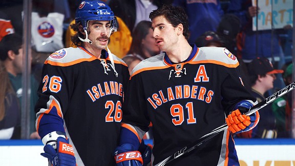
24.- New York Islanders 2011-2014
Jets is gonna hate me for this, but so be it. This is the most classic example in my mind of black-for-black's-sake. It introduces not just one but two colors, black and grey, that had previously never been used into the Isles' color scheme. It also uses the script-over-number design on the front, which I think is a little to amateur looking for an NHL team. I actually don't mind the striping pattern, and wouldn't hate seeing it on another Isles third in a better color scheme, but it's not enough to save this design for me.
23.- Colorado Avalanche 2009-2015
The first entry on this list from the Avs is their blue diagonal script alternate worn from 2009-2015. I may be biased because as a Rangers fan I hate seeing other teams rock our look, but that's not the only reason that this jersey ranks at this place on the list. I don't hate the use of the Avs' light blue as the main base of a jersey, but it forces them to include more black, and I really think they overuse it already on their primary set. I also hate the weird curved striping on the arms that get cut off by the black pit stains that were for some reason so popular on this template. The lack of a hem stripe and use of their usual font was a frustrating choice, as those are more modern looks on a jersey that seems to be trying to look more traditional. The fact that the font used on the lettering on the font doesn't match the font used for name and numbers annoys me, and the "Avalanche" text on the back collar is completely unnecessary. Luckily, this isn't the only entry the Avs have on this list, as they traded this one out for a much better set that we'll see later.
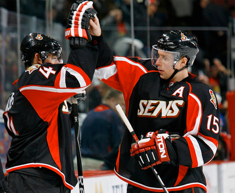
22.- Ottawa Senators 2008-2011
Coming in at number 22 are the Ottawa Senators, coming in with an example of what happens when you throw a traditional design together with a modern design and somehow miss the mark on both. I'm never a fan of teams using a nickname script as a main crest, and this is no exception. The main body and under arm look like a traditional modern jersey that fits the Edge template fairly well, with the exception of the red on the front side panels that is inexplicably missing from the back. The striping on the top of the arms is oddly curved around the arm, making the proportions of it different based on what angle you view it from. The red on the back of the black collar was a bad look, and now seems like a horrible premonition of what would come with the switch to the Adizero system. What really caps it off for me is the use of their traditional font, which looked bad enough on their primary set, but somehow looks even more out of place on this monstrosity.
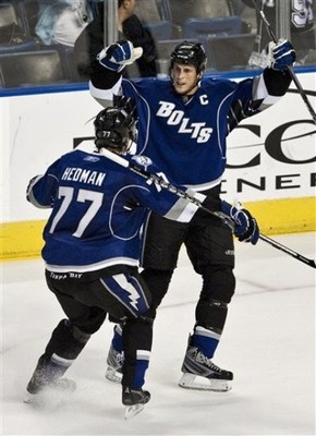
21.- Tampa Bay Lightning 2008-2014
The Lightning come in at number 21 with the first iteration of their "Bolts" alternate(we'll see the other one later). Again, this is a design that uses a wordmark of the team's nickname, and tops that off with trying to make it a diagonal text jersey as well. This one pulls out all of the bells and whistles of the Edge system, with strange rounded piping, pit stains that cut off the striping, and color blocking instead of more traditional striping. The inclusion of the "Tampa Bay" text on the rear hem stripe is unnecessary, and brings unwanted attention to players... derrieres. The one saving grace of this set is the return of the "victory stripes", a staple of the Lightning's identity for their first 15 years. The main problem with this set is that it worked for the first few years' color scheme, but after the Lightning rebranded in 2011 and eliminated black and silver from their primary set, it just didn't fit with the identity of the team. Proof of that was the fact that the shoulder patch on this jersey wasn't changed to their new logo until a year after the change had been made on the primary set.
That's all for this week's entry, check back next Thursday at 2:30 for Part 2 of this series.
The Definitive Ranking of Third Jerseys in the Edge Era (Pt. 1)
![]() Reviewed by TC Moore
on
December 14, 2017
Rating:
Reviewed by TC Moore
on
December 14, 2017
Rating:


2 comments:
Actually, the Isles did use grey during the fisherman years.
The Sens jersey is my least favorite. It boggles my mind that other teams later used that template.
Post a Comment