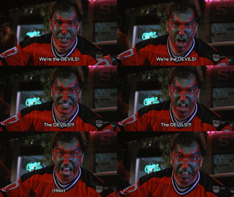
Tuesday: Gotta Support the Team
Howdy folks, welcome back to HJC for the Tuesday post. We've got a motley group of concepts today, but before we get to those, I want to expound on our current competition.
In keeping with our current NHL theme of contests, we head to the Garden State for a New Jersey Devils redesign. Between us on the writing team, we chose the Devils because they're one of the first teams that came to mind when thinking of teams receiving downgraded looks from Adidas. In my opinion, they were the biggest losers. The jersey went so wrong, in fact, this happened:
The team seemed to be making changes for the sake of change, even if coming at the expense of good design. There were few changes between the old and new, and all of them were a downgrade. I'm excited to see what our designers come up with. Our most recent competitions have seen some pretty spectacular entries. The LA Kings competition was undoubtable the best of the year to me. I'm also excited to share my entry; I came up with a pretty elaborate idea, so if I can execute it well, it should turn out nice. We'll see how it stacks up against yours.
Also, if you're looking to get involved in the blog more than concept submissions, come play a game with us! We have a new segment in our weekly podcast, Guess the Jersey. All you need is a Skype account and availability on Friday at 11 PM. Email concepts@hockeyjerseyconcepts.com for a chance to play.
As always, be sure to vote for the weekly COTW poll, and leave us a mailbag question for the podcast while you're at it.
COTW Nov 24-30 vote (ends Friday @ noon ET)
New Jersey Devils ReDesign entries (due December 15 @ noon ET)
Let's get to those concepts!
Cole W.- Regina Pats
Cole starts us off today in the WHL with the Regina Pats. This is largely based on the current look, so much so, I don't think the few changes made were worth submitting. The best addition is the matching pants striping, though it's a bit too thick. On execution, the numbers on the back are too large. Overall, it's a good look, but here at HJC, we're interested in promoting creativity, not tweaking existing looks.
Grade: F
Jack S.- Boston College Golden Eagles
We head east to Boston for Jack's BC concept. Since this is college, a white jersey isn't necessary for home, so long as it's a light color. The Eagle's current white jersey suffers from "yellow on white" syndrome, and this is certainly one way to solve that. What I like most about the concept is on the away jersey, how the striping matches the pattern in the logo. Continuing that on to the home would have improved the set, too. A shoulder patch would have greatly helped this design from coming across as too dull. I commend Jack for including the Hockey East logo, but the placement on the collar isn't working, as it's too small and inconspicuous. It should be on the front, upper left of the chest. It's a standard on HJC to include the sleeve numbers (aka TV numbers), so be sure to double check your submissions before sending them in. While it's not strictly necessary, including socks and equipment (pants and helmets at least) improves submissions, too. I like this look, but execution errors and omissions hold back its full potential.
Grade: D+
Jets96- Chicago Blackhawks
The Monday writer Jets shows us his look for the Blackhawks. Not that this has anything to do with the grade it's receiving, but THANK YOU for making this an alternate and not another outdoor game specialty. Much appreciated. On to the critique, this is an extremely strong design forged by the striping pattern. Designers, take note: the best possible thing you can do is create a simple theme, and stick to it exclusively. See how Jets applies it here: he takes the two colors of strongest contrast, applying them in a simple 3 thin-stripe pattern that emphasizes the sharp divisions. He also leaves a good amount of blank space, so the stripes don't overpower the jersey. This might be nitpicking, but the look is weakened by the logo and pants for not following the pattern. Both come across as solid blobs, with too few elements that would match the striping pattern, which is visually lighter and alternated colors.
Grade: A-
Nick B.- Ottawa Senators
Nick finishes today's post with a team that rivals the Devils for biggest Adidas losers, the Ottawa Senators. Like Jets' concept above, the striping is the best aspect of this design. Going with the barber pole pattern is always a solid choice for the Sens. Minimizing the stripes to one on the hem and two on the arms helps keep with the modern aesthetic, without coming across as dull. The logo has a good amount of gold on it, which isn't present anywhere else; it sticks out awkwardly and breaks the theme. The collar is problematic as a design element; an incomplete red ring makes it look unfinished and just doesn't look good. An issue I have with all of Nick's concepts, this template hides the shoulder. A shoulder patch would have made a lot of sense on this concept to add more interest and fill space, but there's no way of showing one.
Grade: B-
My COTW nomination goes to Jets' Chicago Blackhawks. That'll do it for today. Good luck to your Devils concepts, and leave us a mailbag question. See you next week, and keep your stick on the ice.
Tuesday: Gotta Support the Team
 Reviewed by Ben Shaffer
on
December 05, 2017
Rating:
 Reviewed by Ben Shaffer
on
December 05, 2017
Rating:


1 comment:
I'll second Jets for COTW
Post a Comment