The Definitive Ranking of Third Jerseys in the Edge Era (Pt. 3)
Hello again, and welcome to the third entry in our definitive ranking of the third jerseys of the Reebok Edge era. If you missed the first two entries, you can find part one here and part two here. As always, the rules for this list are as follows: First, this is a list of original designs only, nothing that is a direct copy of a previous uniform can be included. Second, no one-and-done sets, meaning no special event uniforms. Third, no uniforms that were previously worn as special event uniforms and then reinstated as a third. Finally, no third jerseys that would later be turned into the primary set, a surprising number of teams did this after feeling out the Edge system, so it makes the list way too long. Once again, if you disagree with any of my rankings, feel free to voice your opinion in the comments section. Now let's keep this list rolling.
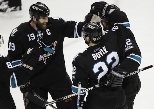
15.- San Jose Sharks 2008-2017
15.- San Jose Sharks 2008-2017
The Sharks enter this list with their only entry to the third jersey program during the Edge era. I love the elimination of orange from this jersey, I just don't think it's that strong of an accent color. I also love the shoulder patch on this jersey, I like the simple striping pattern, but I really hate the lack of hem stripe, which proved to be horrible foreshadowing for what their primary set would become. The full bodied shark logo as a main crest is alright, but it's not really anything special. The real detraction for me is the player numbers on the front, I really hate that design choice and it's no different here. While they did eliminate it for the final two years of this jersey, it still wasn't enough to negate the previous seven years with them.
14.- Calgary Flames 2013-2016
When I first saw this jersey, I loved it. I thought it was a great fauxback look and managed to pull off a script logo very well. I'm also a fan of the shoulder patch that they created for this jersey, it incorporates the colors well and is a great design that ties in to the city of Calgary. The problem with this jersey, however, is in the details. The mismatched arm and hem striping is frustrating, especially since they're so close and it's an easy fix. An additional problem with the arm striping is that it inexplicably stops on the under arm instead of continuing all the way around. My final problem with this jersey is the awkward angling of the yoke on the front, I don't understand what purpose it serves, but I'm not a fan of the way it looks. While this is a good looking jersey, there are so many small details that take away from it, leading it to fall so low on this list.
13.- Predators 2009-2011
Coming in at number thirteen is the Predators' third used from 2009-2011. Turning to a more traditional look than their horrid primary set at the time really paid off for the Preds. I love the recolored version of their primary logo, it simplifies it and makes it look much sleeker. The navy looks great, and the white cuffs and hem do a good job of adding a little balance to the color scheme. The striping pattern looks simple, but upon closer inspection it is a black and navy checkerboard pattern (sublimated a la the Hurricanes' warning flag striping), a nice nod to Tennessee's love of the checkerboard pattern. I love the tie-in with the state identity, and I think using the black and navy makes it much more subtle and palatable than if they had tried another color pairing. My only real gripe with this jersey is the shoulder patch, I've never been a fan of the skull logo, and this is no exception. Overall, a very good look for the Preds that could have worked as a primary set when paired with the white version that was shown but never made it to the ice.
12.- Florida Panthers 2009-2012
The Panthers come in at number twelve with a great looking quasi-fauxback jersey. I'm a sucker for a double blue color scheme, and this jersey pulls it off fantastically. I love the use of navy as a base, and the light blue on the cuffs, yoke, and hem look great. The simple white striping is a good way to avoid making this look too busy. I really like the "FLA" shoulder logo, it's a great way to pull in the state identity with the abbreviation and the sun peeking out from behind it. I'm normally not the biggest fan of roundel logos as a primary logo, but I think it works well here with the more classic looking jersey. While the light blue was a new addition to the Panthers' color scheme, I think they managed to pull it off on a great looking jersey that I wouldn't mind seeing make a return.
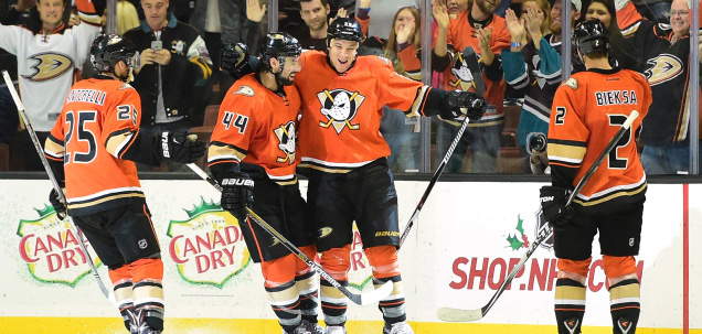
11.- Anaheim Ducks 2015-2017
Our final jersey for this entry of the series is the Ducks' orange third worn for the past two seasons. As a child of the 90s, I love the return of the original logo, and it actually looks good in the Ducks' new color scheme. The arm striping does a good job of looking like the primary striping, but being distinct enough to make it its own. I love the choice of orange as the primary color, and this jersey does a great job of keeping the gold and orange separate. The orange and gold color scheme is hard to work with, but this jersey actually makes it look pretty darn good. The webbed D logo works well as a shoulder patch here, and the hem stripe, while not matching the arms, is a subtle nod to the pattern used on the Ducks' original jerseys. All in all, a great way to merge the identities of the Ducks, both Mighty and otherwise.
That's all for this week's entry! Come back next Thursday at 2:30 EST as we finally crack the top ten!
The Definitive Ranking of Third Jerseys in the Edge Era (Pt. 3)
![]() Reviewed by TC Moore
on
December 28, 2017
Rating:
Reviewed by TC Moore
on
December 28, 2017
Rating:


1 comment:
On the Calgary jersey, the yoke is supposed to resemble the shoulders of a western style shirt. Like you see cowboys wearing at rodeos, like the Calgary Stampede...
Post a Comment