The Definitive Ranking of Third Jerseys in the Edge Era (Pt. 2)
Hello again, and welcome to part two of my definitive list of third jerseys introduced during the Reebok Edge era. As stated in last week's part one, the rules for this list are as follows: First, this is a list of original designs only, nothing that is a direct copy of a previous uniform can be included. Second, no one-and-done sets, meaning no special event uniforms. Third, no uniforms that were previously worn as special event uniforms and then reinstated as a third. Finally, no third jerseys that would later be turned into the primary set, a surprising number of teams did this after feeling out the Edge system, so it makes the list way too long. Once again, if you disagree with any of my rankings, feel free to voice your opinion in the comments section. Now let's pick up where we left off.
20.- Atlanta Thrashers 2008-2011
20.- Atlanta Thrashers 2008-2011
Coming in at number 20 is a jersey I saw in action many times in my hometown of Atlanta, the Thrashers' red "motocross" jersey. This jersey is just a mess. The greatest thing about hockey jerseys is that, unlike other jerseys, the main focus of the front of the jersey is the team's main crest. This jersey throws that out the window, replacing it with a number topped off with the team's name, depicted in one of the worst fonts to ever grace a jersey. The awkward white "stripe" on the arms almost makes it look like a contrasting upper arm, but it awkwardly curves in the underarm, making it still look predominantly red. The gold stripe underneath it is barely noticeable, and the side panel design looks like it was based on the arm striping before they decided to eliminate the navy and they just never got around to changing it. The shoulder patch isolates the head from the Thrashers' primary logo, which I would have thought would work well as a shoulder patch, but it just ends up looking strange here. Even with this awful uniform, though, I'd still love to have the Thrashers back. #BelieveinBlueland
19.- Carolina Hurricanes 2008-2017
Next up we have the Carolina Hurricanes with the only alternate uniform in franchise history (including their time as the Hartford Whalers). This is one of the few black alternates that actually makes sense, considering black is still a pretty heavy part of their color scheme. That being said, I'm not the biggest fan of this jersey. I don't like that alternate logo as a main crest, it's fine as a secondary logo, but it's not strong enough to be the main focus of a jersey. The warning flag hem stripe frustrates me, as I know how good it can look, but it just falls flat here. The arm striping is alright, but really not anything special. I think the worst part of this jersey by far is the recolored primary logo as a shoulder patch. The Hurricanes decided to use a black on black version of their logo on a black jersey, making it incredibly hard to see, especially from a distance or as a player is moving, essentially rendering it useless. One can only hope that with the new Adizero thirds coming out next season the Canes decide to learn from their mistakes and move away from this design.
18.- Boston Bruins 2008-2016
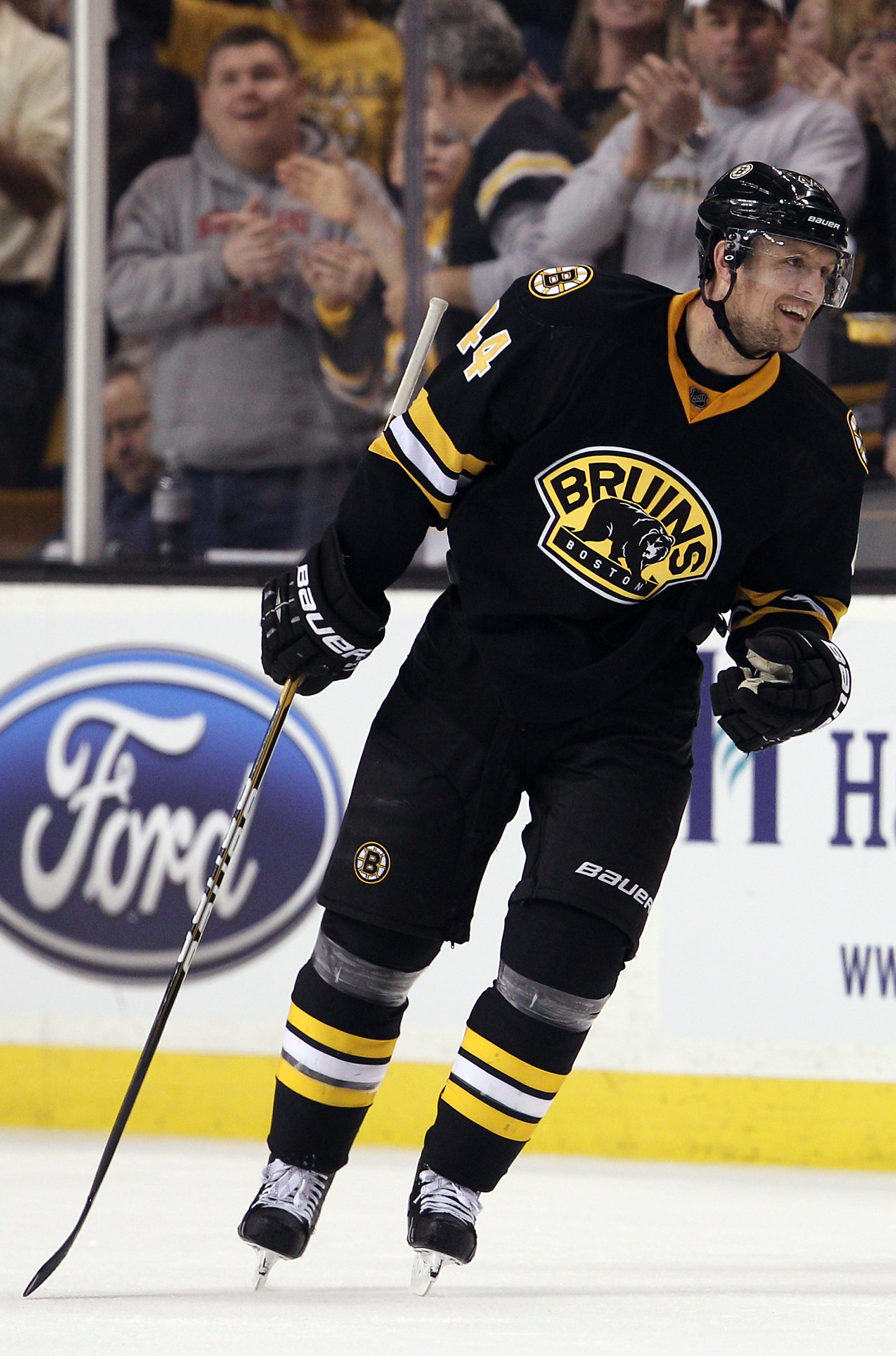
Our next entry comes to us from the Bruins, a team with a spotty track record when it comes to third jerseys. While at a glance it doesn't look exceptionally bad, for me it ranks this low out of sheer laziness. It takes the striping pattern from the primary uniform, but eliminates the hem stripe and the signature Bruins yoke. After that, it's just a swap of the shoulder patch and the main crest, and while I think that logo makes a great shoulder patch, it just doesn't work for me as a main crest. Again, while it's not exceptionally bad, it's essentially a worse version of their home set, and that laziness combined with the fact that all of the changes are downgrades puts this jersey so low on the list.
17.- Tampa Bay Lightning 2014-2017
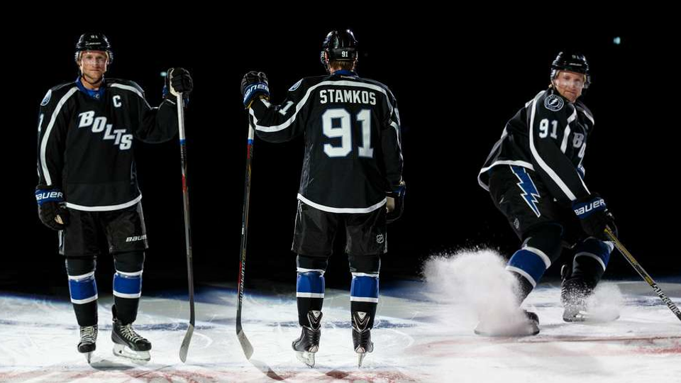
Now we come to the Lightning's second entry on this list, their black "Bolts" jersey. The lightning chose to stick with the diagonal nickname wordmark, a design that still doesn't look good on this iteration. The jersey relies heavily on black despite the fact that the team had completely eliminated it from their primary uniforms by this point, which is a bit of an odd choice. The full length phantom yoke and minimal hem striping do little to break up all of the black, and the blue collar and cuffs (which are covered by the gloves) don't add much either. It's not a bad looking jersey, but it's a little too minimal for my liking and doesn't fit the team's identity that well.
16.- New York Islanders 2015-2017
Our final jersey in this week's entry is the Islanders' "Brooklyn" alternate, used to celebrate the team's move to the Barclays Center. Once again, the Isles have forayed into black-for-black's-sake, though this time they have the loose reasoning that it celebrates their cohabitants of the Barclays Center, the Brooklyn Nets. I actually think that this one works better than their previous black jersey, because it doesn't try to force the blue and orange into the color scheme, allowing the black and white to reign supreme. The striping on the arm, in classic Isles four-stripe fashion, is a little too thin, and it just ends up getting lost in the shuffle when players are on the ice. The basic white hem has a little spot where it rises up on the sides to create a space to show off a black "B" logo for Brooklyn. While this isn't a bad idea, it ends up being something that you only notice when you really examine the jersey, and it really just gets lost in execution. This jersey also features a split-collar design, something that now acts as horrible foreshadowing to the Adizero system. Overall, it's not a bad design, but most of the design choices it makes just don't translate on the ice.
That's it for this week, check back next Thursday at 2:30 for part three!
If you missed last week's entry, you can find it here.
The Definitive Ranking of Third Jerseys in the Edge Era (Pt. 2)
![]() Reviewed by TC Moore
on
December 21, 2017
Rating:
Reviewed by TC Moore
on
December 21, 2017
Rating:


/cdn.vox-cdn.com/uploads/chorus_image/image/52663085/623535160.0.jpg)


1 comment:
I have to disagree. The Hurricanes alternate was a fantastic jersey, both in the striping pattern, and the fact that it fit in with original edge set very well...
Post a Comment