
Friday: Crossovers, Colleges, Coworkers and Contests
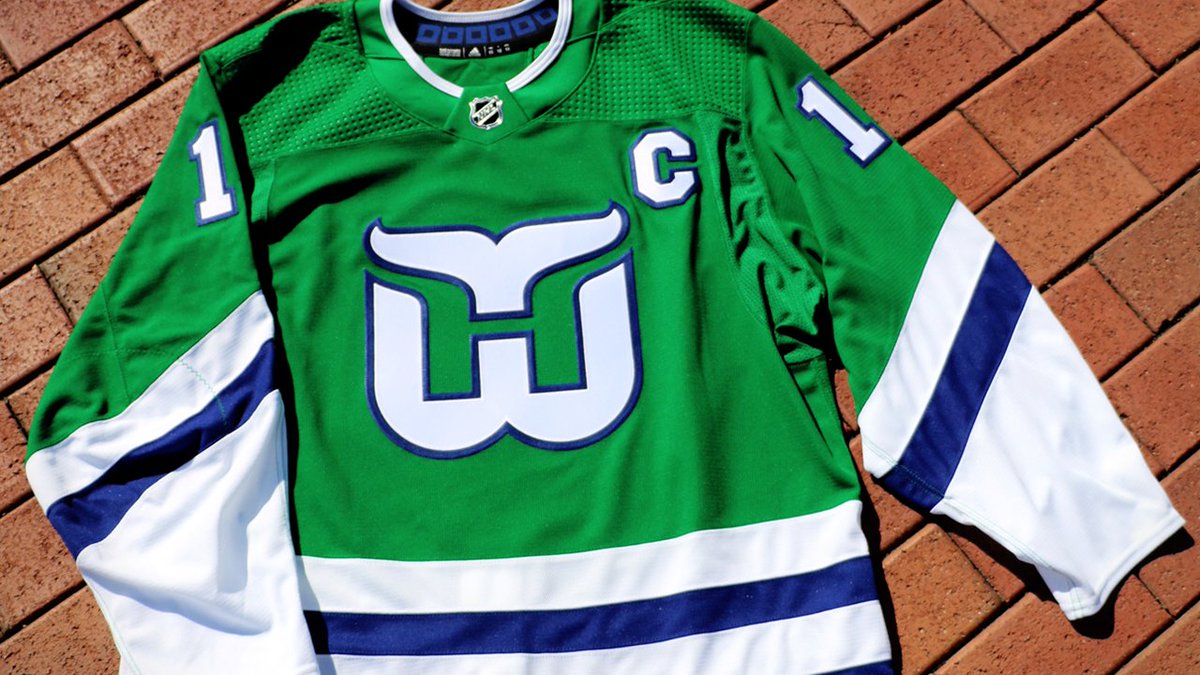
Hey y'all, and welcome to another Friday post here at HJC. Yesterday, the Carolina Hurricanes finally decided to give the fans what they've been clamoring for for years, some Hartford Whalers throwbacks.


Twitter
The design, which will be worn against former Whalers rival Boston on December 23 and March 5, seems to be a pretty direct throwback to the Whalers' iconic late 80's jerseys, with small alterations to the collar to better fit into the Adizero system as well as a recolored version of the Canes' warning flag hanger effect (and for those of you who will say it's their original design instead of late 80's, it's not because there is no Pucky shoulder patch and the hem stripe goes all the way to the bottom). While I do love these jerseys, and that logo is the greatest use of negative space I've ever seen, I'm not sure that I like this coming back. For one, the Hurricanes have spent most of their existence trying to distance themselves from the Whalers, so bringing back this jersey kind of seems like an attempt to cash in on the nostalgia fad that's sweeping the NHL rather than paying tribute to the Whalers. Secondly, I feel like it's too little too late. If the Canes had brought this back a couple years ago for an anniversary or the like, I would have been on board, but with the recent flurry of throwbacks, it kind of just seems like just another team jumping on the bandwagon. At this point, the only way to really win me back with these is to slap Pucky on the shoulder and pair it with some Cooperalls.
In voting news, we have the regular COTW vote for September 21-27, with polls closing Friday at noon EDT.
COTW Vote Sep 21-27 (ends Friday @ noon EDT)
New Jersey Nerds Podcast every week on Google Play, iTunes, Stitcher and Spotify!
--------------------------------------------------
Now on to today's concepts!
Adam G.- New York Knicks

Our first concept today is the first of two NBA crossovers from Adam today, this one for the New York Knicks. Here, Adam adapts the Knicks' bare bones striping pattern to a hockey template, and while I like how classic it looks on their usual set, it leaves me wanting a little more here. I think maybe adding a yoke would help liven up this set. The collars are done well, but I'm not sure about the use of grey on the trapezoid when it's only used as a contrasting color in the main crest and nowhere else in the set. As for the logos themselves, I usually prefer to see all ties to other sports eliminated in crossover concepts, so the very basketball heavy logos don't really work for me. Gear looks good, but the striping on the breezers should be flipped so it matches the hem stripe when players are sitting down. Final verdict: a decent attempt, but it's a little too plain for me. 7/10
Adam G.- Sacramento Kings

Next up from Adam is a design for the Sacramento Kings. I love the Kings' color scheme, it's basically the same that the Los Angeles Kings had during the majority of my childhood, and the purple really brings out the regal theme of the team name. I really like the striping pattern, but I would have swapped the black and while stripe so that the silver isn't blending in with the white and the black isn't blending into the purple. The dreaded split collar here isn't working, I'd say just make them both silver all the way around. Same logo notes as above. Font choice is solid, but the numbers on the back look a little small. The alternate is what really shines here for me, I love the use of the crown/ mountain range design for the hem and cuffs, it looks spectacular. The logo works well with the ups and downs of the hem design, but once again, I wish the basketball had been eliminated. Gear all looks solid, so good work there. Final verdict: a great alternate, and with a small tweak the primary could be great two. 7.5/10
Ben S.- Rochester Americans

Up next is the first of two AHL designs from our very own Ben S., this one for the Rochester Americans. Holy bald eagle, Batman, this set screams America. I love the matching striping on the primaries, they work spectacularly on both while still looking unique on each. The blue tokes look great, and the single star shoulder patch is a nice touch. Font choice is great and the gear looks solid. As for the alternate, it strikes me as reminiscent of the old New York Americans sweaters of the 20's and 30's, but is just different enough to hold its own. The script logo looks great, and the stars around the yoke are a great choice as well. Final verdict: U-S-A! U-S-A! 9/10 and my COTW NOMINEE!!!!!
Ben S.- Rockford IceHogs

Ben's next concept of the day is a design for the Rockford IceHogs. The Hogs currently wear clones of the jerseys that their parent club Blackhawks wear, and Ben manages to tie into that design while also giving the Hogs their own identity. The matching striping pattern looks great on the primaries, and the inclusion of blue is a great way to tie in the Hogs' color scheme. It's a design that's close enough that you know they're affiliated with the Blackhawks, but still not a direct copy, and that's a tough line to straddle. The alternate seems to be inspired once again by the Blackhawks' barber pole sweaters from their early years, but is still a unique design. While it is a solid design on its own, I kind of wish that Ben had included blue in it as he'd done so well with it on the primary set. Other than that, it's a solid, original barber pole design, and the number treatment works really well with it. Final verdict: a great looking set for the IceHogs that manages the difficult task of paying tribute to a parent club without directly copying them. 8.5/10
Burkus Circus- Utah Grizzlies

Next up is Burkus Circus with his design for our Utah Grizzlies contest. The first thing that jumps out at me is that logo, it's terrifying. That logo is an alternate that was used for one season by the previous iteration of the Utah Grizzlies, who are currently known as the Cleveland Monsters of the AHL. The decision to make red a secondary color perplexes me, since it's mainly used as an accent color in the logo. I think the gold would have done a much better job. While the striping pattern looks different on each primary, it's actually the same design recolored, a design choice that I actually really like when it's pulled off well. I like the yoke on the white jersey, but I think the black would work better without it. The alternate looks great, I really like the black and gold with that simple striping pattern, it looks really crisp. While the logo choice on the alt isn't the strongest, the Grizzlies don't really have a deep barrel to pull from, and I actually prefer it to the one used on the primaries. Final verdict: a decent design for the grizzlies, but I'm not a huge fan of the prevalence of red. 6.5/10
Chris W.- UNCG

Next up is Chris W.'s design for the UNCG Spartans. The Spartans' new logo set looks fantastic, and Chris did a great job of using them in this set. I like the Ancient Greek inspired striping, but it's something we see in almost every concept for a team named the Spartans or Trojans (I personally have been guilty of a UNCG concept with similar striping). Furthermore, the yellow outline on the white jersey would just blend in on the ice. I do really like the design in the yoke, I must say that's a first for me. I really like that Chris switched up the design on the alternate rather than just recoloring it from the primaries, it looks sharp and shows a great amount of creativity. While I like the idea of the spears at the cuffs, I feel like it makes the jersey just a little too busy. As for the set as a whole, while I'm not usually a fan of italicized fonts, I think it works really well with the logos, and the gear looks great. Final verdict: a solid set for the Spartans, but it's very similar to previous designs I've seen, an the alt has one too many things going on. 8.5/10
Lucas D.- Los Angeles Dodgers

Our final concept of the day is Lucas D.'s design for the Los Angeles Dodgers. I really like the striping on this one, and the colored upper arm works really well with it. The use of red numbers in the white parts of the jersey is a great nod to the Dodgers' actual uniforms, so kudos there. Font choice works well with the logo, and the gear looks good, but I would have made the collar on the white jersey blue all the way around. Final verdict: a solid look for the Dodgers, and it shows a great attention to team history. 8/10
That's all for me this week, see y'all next Friday!
Friday: Crossovers, Colleges, Coworkers and Contests
 Reviewed by TC Moore
on
September 28, 2018
Rating:
Reviewed by TC Moore
on
September 28, 2018
Rating:
Reviewed by TC Moore
on
September 28, 2018
Rating:


2 comments:
I’ll nominate Chris’s UNCG concept for COTW
Seconding Chris's UNCG for COTW.
Post a Comment