Friday: Fresh New Threads
Hey y'all, and welcome to another Friday post here at HJC. They say that when it rains it pours, and with the bevvy of alternate jerseys that have been released, officially or otherwise, in the last few days, I'm inclined to agree with them. I'll start off with my favorite from the latest crop of releases, the Winnipeg Jets.
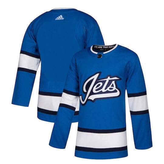
I love the Jets' decision to go for an aviator blue alternate, I think it's the most logical decision for them. The simple striping is a good look, and ties into their main set, as it is just a single, thickened up version of their current striping. The Jets script looks great and gives it a nice vintage feel. While it is a good looking jersey, I can't help but feel that a yoke, or at the very least a shoulder patch, would really liven up this jersey. 8/10
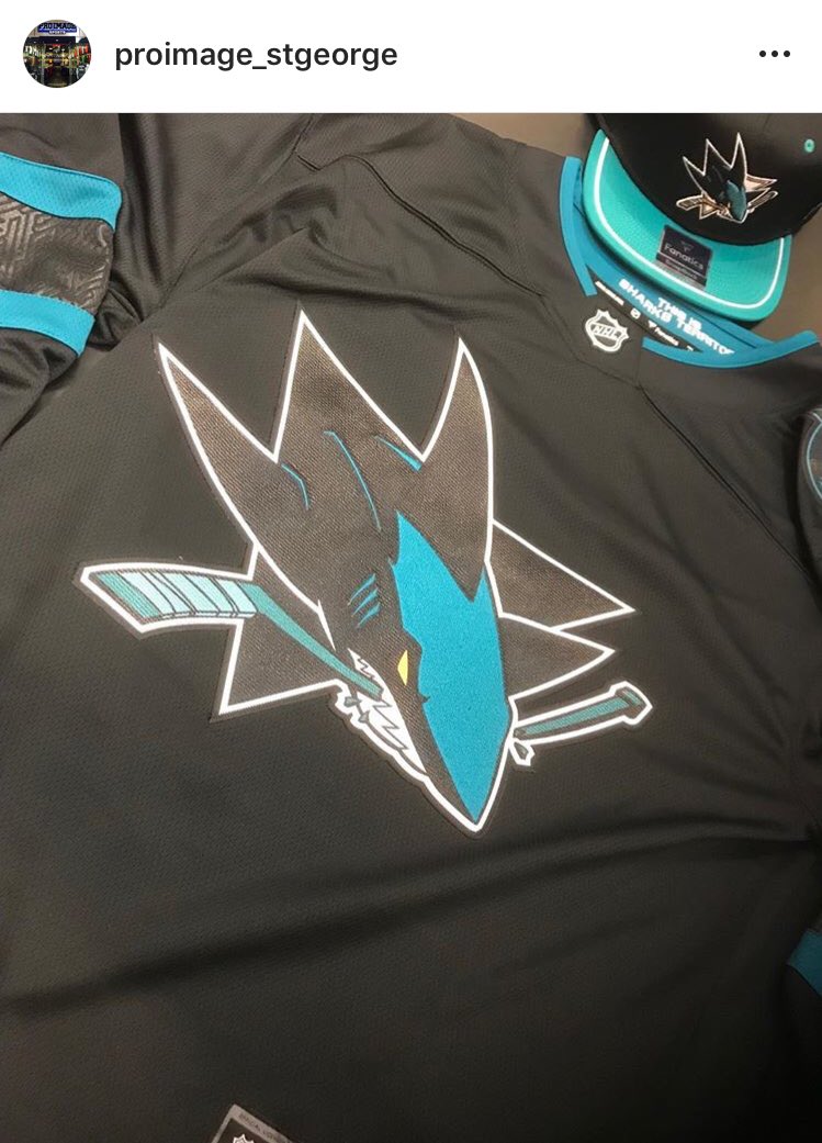
We've also gotten a look at the Sharks' new alternate, and I must say that I'm a tad disappointed. Naturally, the team went back to black and teal for their alternate, which I think is actually a smart move on their part. Front and center is a recolored version of their primary logo, which looks okay, but for some reason keeps orange in the eye despite eliminating it from the stick. The most frustrating part of this is that they have their pick of the fantastic Tiburones logos to use, and yet still choose to keep their ordinary logo as the primary. In typical Sharks fashion, their is no hem stripe and only one shoulder patch to keep the jerseys as light as possible. The most intriguing part about this jersey is the sublimated pattern in the arm striping that some have posited to the team's ties to Silicon Valley and others have added could be a celebration of the area's Latino heritage. While it is a pretty neat looking design, it's a bad sign for a jersey when the most interesting thing about it is a black-on-black sublimated pattern that will be indistinguishable on the ice. 6/10
Finally, the Avs announced that they were playing it safe with their alternate, just carrying over their alternate design from the end of the Reebok era. It's a good looking jersey no doubt, but it's another example of a team just playing it safe and using an old design instead of trying something new and failing. Although with some of the original designs that have come out this season, I can't really blame them. No need to grade, as there's nothing new here.
In voting news, we have the regular COTW vote for September 7-13, with polls closing Friday at noon EDT. We also have the Utah Grizzlies Redesign Competition going on, so be sure to get your entries in by Friday at noon EDT.
COTW Vote Sep 7-13 (ends Friday @ noon EDT)
Utah Grizzlies ReDesign entries (due Friday @ noon EDT)
New Jersey Nerds Podcast every week on Google Play, iTunes, Stitcher and Spotify!
-----------------------------------------------
Now on to today's concepts!
Ben S.- Grand Rapids Griffins
Our first concept of the day comes to us from our very own Ben S., who brings us a new set for the Grand Rapids Griffins of the AHL. I really like the use of the colored arms on the road jersey, it's a nice nod to the parent club Red Wings, and the additional striping does a great job of tying in the team's colors and giving them their own distinct feel. I also like the return to the team's old color scheme, I think the navy works much better than their current black. The hem stripe treatment is done well, especially on the white jersey, and the tri-colored color is pulled off beautifully. The recolored logo is genius, as the red wings on the griffin are a great way to bring more red into the color scheme and a fantastic, yet subtle, nod to the parent club. The alternate is where you begin to lose me. I do like the pattern in the striping, it gives it a nice regal look. I was never the biggest fan of this coloring for that alternate logo, I felt it needed some white to break up all those bold colors, and I think that translates to the jersey as well. With so many deep colors in the design, I think it needs some white in there to break it up. Gear for all looks good, but I'm not sure about the Gothic letters on the helmet given that they're not traditionally a part of the design. Final verdict: a very good primary set, but the alternate brings this one down a bit. 8/10
FC Macbeth- Malaysia
Next up is FC Macbeth with a design for Malaysia. This design seems to be based off of the Malaysian flag, which looks startlingly familiar... I really like the candy striping on the arms reminiscent of the flag, it's a good look and the inclusion of the blue at the top of the sleeve is a smart choice on the white jersey. Name and numbers look great, and FC has done a good job of working around the TV numbers. The shoulder patch and main crest look a tad big, and the main crest has a lot of loose pixels around it that need to be cleaned up. Gloves and breezers look good, but once again FC has miscolored the helmet by putting color in the air vents. Furthermore, the white jersey should have a white helmet. Socks for the blue jersey look good, but the striping could stand to be a little lower, and the other socks should be predominantly white, not red. Final verdict: a good idea for Malaysia, but execution holds this one back. 7/10
Lucas D.- Chicago White Sox
Our final concept of the day is Lucas D.'s crossover design for the Chicago White Sox of the MLB. Regular readers will know that I usually abhor black and white color schemes in hockey, as it makes a game played on a white surface visually boring, but this set pulls it off well in a sharp, understated look. The simple striping pattern looks really good here, although the silver does blend into the white a little bit. The collar is done really well, matching across the two jerseys, and the numbers do a great job of matching the logo. Gear looks good, but the helmet logo looks a tad small. Part of me wishes there was a shoulder patch, but the Sox really don't have a viable secondary logo to use as one, so I can't really complain. Final verdict: a clean, crisp set that actually makes black and white look good. 8.5/10 and my COTW NOMINEE!!!!!
That's all for me this week, see y'all next Friday!
Friday: Fresh New Threads
 Reviewed by TC Moore
on
September 14, 2018
Rating:
 Reviewed by TC Moore
on
September 14, 2018
Rating:


1 comment:
Heh, at least my design is miles better than our jersey.
Post a Comment