Saturday: Happy Thursday!
Well, it's still not October but HOCKEY IS BACK... in a sense. Around the league many of the NHL's prospects have begun 4-team prospect tournaments that give us the first look at the up and coming NHL class. As early as yesterday, young studs Miro Heiskanen and Rasmus Dahlin were flying up the ice sporting the Victory Green and Navy Blue of the Stars and Sabres.
What is is back? Your once-in-a-every-few-years-or-so chance to join the writers gang here at HJC. It's a wonderful group of guys and honestly so much more entertaining than I expected when I signed on nearly a year ago. Interested? Click the button on the side of the page for details.
REMINDERS:
COTW Vote Aug 31-Sep 6 (ends Friday @ noon EDT)
COTW August Vote (ends Friday @ noon EDT)
New Podcast every Monday!
_____________________________________________________________________________
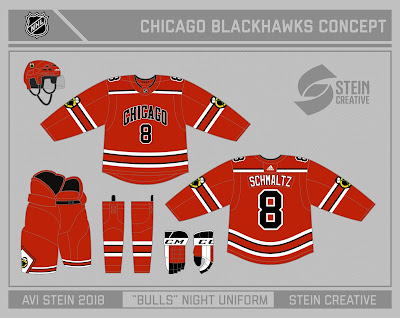
Avi S.- Chicago Blackhawks (Bulls NIght)
The Hawks are one of those teams that no designer really knows what to do with. With such a storied history, its hard to see their look as anything but untouchable at this point. But... when all is lost, might as well blow it up an see where things fall. Avi does that here with this Bull's Night concept to support Chicago's NBA team. The Bull's jersey piping translates beautifully into traditional hockey striping and the iconic Bulls pants works surprisingly well on the breezers. The attention to detail is really strong here as well, with the Hawks adapting the #OB and NOB treatment of the bulls here. I always love the tomahawks on the arms, but I think the main crest logo would be better with one small change. Since the Bulls don the word "Bulls" on the front of their jerseys I'd adapt either "Blackhawks" or simply "Hawks" to do the same here. Also, there's a lot of red going on already, so I'd consider swapping to black equipment instead.
Overall Rating: 8.5/10
A look that certainly takes no bull, but one that needs just a bit more to really sell me.
Ben S.- Binghampton Devils (AHL)
Ben's AHL series takes us to Binghampton for a look at the Devils minor league affiliate. I love the adaptation of the old devils hidden red stripe pattern here, especially with the addition of the white cuffs. The road is the real star of the show here, with the simple red and black striping allowing perhaps the most "minor league" logo of them all to really establish itself in the set. On the home, the only change I would make is to drop the white of the yoke and let the striping stand alone. It's just a touch too busy as is. I could take or leave the alternate honestly, but if the hem has touched up to play off the arms better, I think it'd be a real winner (and a black helmet would make much, much more sense). The one thing I would change overall here is moving the NHL Devils logo back to the shoulders. It just looks out of place on the chest and really does not sit well against the yoke striping on the primary set
Overall Rating: 8.75/10
A great example of how an AHL team can steal a couple pages out of their parent's book while still establishing their own identity.
Jordan R.- LRK Panevezio Pirati (Fictional LHL)
Domo Arigato, Mister Pirato. We already established last week that I don't want to try and pronounce the names of these teams, or even type them for that matter, so we're gonna call these guys the Pirates. Just like Ben's concept above, Jordan uses the exact same pattern on both jerseys to creat two distinct looks, however this time with a full-length yoke. Both jersey work beautifully as the red and gold striping needs a good deal of black to play off of in order to be effective. The color balancing is great and the primary logo is a thing of beauty. Even the numbers, which normally would be of too unique a font for me to support, look great and fit the logo really well.
Overall Rating: 10.0/10
In terms of negative things to say, Jordan has left me speechless. Time to throw a Pirati Party. Beautiful work.
That's all for today folks.
This week's COTW Nomination heads to Jordan's LRK Panevezio Pirati Concept
Like what you see? Hate what you see? Want to see something different?
Let us know in the comments and be sure to shoot your designs to concepts@hockeyjerseyconcepts.com to make your mark on our daily posts.
We'll see you all next week!
Got Questions? Send 'em our way by stuffing the HJC Mailbag.
Saturday: Happy Thursday!
 Reviewed by JB Designs
on
September 08, 2018
Rating:
 Reviewed by JB Designs
on
September 08, 2018
Rating:


No comments:
Post a Comment