
Friday: let's get this weekend started!
Hello everyone, Colin here on another friday!
HJC is now up and running everyday of the week, so my weekend kick-off posts aren't the end of the fun anymore. I am looking forward to seeing the winner of the Red Wings untouchables comp, and maybe even getting some time to make a some concepts myself (it has been far too long!).
As always, here are your voting reminders


.png)


HJC is now up and running everyday of the week, so my weekend kick-off posts aren't the end of the fun anymore. I am looking forward to seeing the winner of the Red Wings untouchables comp, and maybe even getting some time to make a some concepts myself (it has been far too long!).
As always, here are your voting reminders
COTW vote Feb 18-24 (ends Friday @ 11:59pm EST)
Untouchables-Detroit Top 5 vote (ends Friday @ 11:59pm EST)
Al
Also, mark your calendars for the next HJC live chat in a couple weeks (March 16, 9pm EST)
Lets get to today's concepts!
Seattle Metropolitans (by Charles W.)

Like: the full striped look. so old school, so cool. I also like how the away jersey is not just a recolour of the home sweater.
Dislike: the collar design, I would try to go with something less modern.
Suggestion: add a thicker outline around the crest on the home sweater for visibility.
Rating: 7/10.
Anaheim Ducks (Casey R.)

Like: the application of the three different colour stripes. a really neat twist on a tried and true look.
Dislike: the arm stripes seem a tad out of place.
Suggestion: ditch the stripes on the sleeves altogether. keep the cuffs, and use oversized TV numbers.
Rating: 8/10.
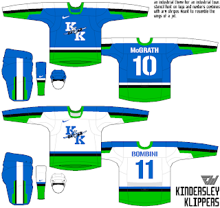
Kidersley Klippers (Eric W.)

Like: the fact that I have actually been to Kindersley. I also really like the unique striping pattern on the sleeves and pants.
Dislike: The colour scheme does not seem to fit the industrial vibe of the town.
Suggestion: try a darker, more metallic colour scheme.
Rating:6/10.
EHC Red Bull München (Stephen T.)
.png)
Like: those HELMETS! I love it when there are designs on the helmets!
Dislike:how there is no red jersey... this team is called Red Bull, they should have a RED sweater.
Suggestion: make the hem stripes thicker, it would especially make the white sweater look less empty.
Rating:7/10.
St. Louis Blues (Felix T.)

Like: The main crest is a really cool logo concept.
Dislike: How everything is place based on the sublimated gateway arch... sublimation is supposed to be a background element, and on this sweater it changes is the main focus at the cost of having other elements placed awkwardly.
Suggestion: use the winged B crest as a shoulder patch, it isn't strong enough to be the centre of attention. Also add some stripes on the arms.
Rating: 5/10.
La Ronge Icewolves (Eric W.)

Like: the arm striping is especially great. I am a huge fan of the reverse colour sleeves, and those are done well here, with a unique arm stripe design to boot!
Dislike: the teal pants. plain black would look better.
Suggestion: simplify the pants striping (plain would look fine),and the striping on the side panels of the sweater. The arm striping is awesome, the rest of the sweater is not cohesive with that. bring some cohesion into the striping design by changing up the side panels.
Rating: 7/10.
Chicago Blackhawks (Tyler G.)

Like:how interested I am by this jersey, despite the simplest colour scheme ever. really good, classic but interesting striping pattern.
Dislike: the phantom yoke seems a bit out of place on a vintage-ish sweater, but does look good here.
Suggestion:making the outer ring of the circle logo white with black lettering could add a mit more pop.
Rating: 8/10.
Philadelphia Flyers (Caleb F.)

Like: how the airforce vibe is brought into the sweaters with the chevron arm stripes. also, the curved hem stripes are done well here (I often dislike curved hem stripes, but these are done well here)
Dislike: how the cuffs are fully white on the home sweater, and orange on the road sweater.
Suggestion: make the sleeve stripes continue all the way to the end of the sleeves (making the cuff not all one colour, but effectively half an half.
rating: 8/10 and a COTW nom from me.
Friday: let's get this weekend started!
 Reviewed by Unknown
on
March 01, 2013
Rating:
Reviewed by Unknown
on
March 01, 2013
Rating:
Reviewed by Unknown
on
March 01, 2013
Rating:


2 comments:
I'll give Tyler's Hawks a COTW, I really like how the phantom yoke fits in.
Lived in Kindersley for a few years and I've seen several different Klipper jerseys. I think these would be perfect with a darker green. I actually think the shade of blue used is great. Love the stencil lettering. Just a darker green, and they would be an upgrade from the current ones.
The Ice Wolves jerseys are awesome. A huge improvement from their current ones, especially the road ones, which I think are awful.
Post a Comment