
Tuesday: Blackhawks and More
Hello all. The live chat looked
like it was a ton of fun again, I sure hope I can make the next one. I
couldn't make this one because I was busy at the Canucks/Millionaires game,
which was also a lot of fun. The Millionaires jerseys looked great in person,
even the cream colour pants looked good. Enough about that though, let's
get to today's post.


.png)

.png)
.png)


--------------------------------------------------------------------------
Don't forget to vote for the COTW.
With seven concepts nominated, we'll need a good amount of votes.
COTW Mar 11-17 vote (ends Friday @ 11:59pm EST)
--------------------------------------------------------------------------
Here are the Macon Whoopee Redesign
contest entries that have come in during the last 24 hours...
(by Alan H.)

(by Stephane S.)
(by Alan H.)

(by Stephane S.)

--------------------------------------------------------------------------
New Jersey Devils (by Patrick G.)

I think this would make a nice fashion
jersey, much better than the NHL's actual fashion jerseys. To be used as
a third jersey I think it would need a couple of changes. I think the red would have to be more
prominent in the striping, because from a distance the striping just looks
black and white. I also think actual
logo should be used, as teams normally don't recolour logos unless they have
to. 7/10
Edmonton Oilers (by SnowMonster)
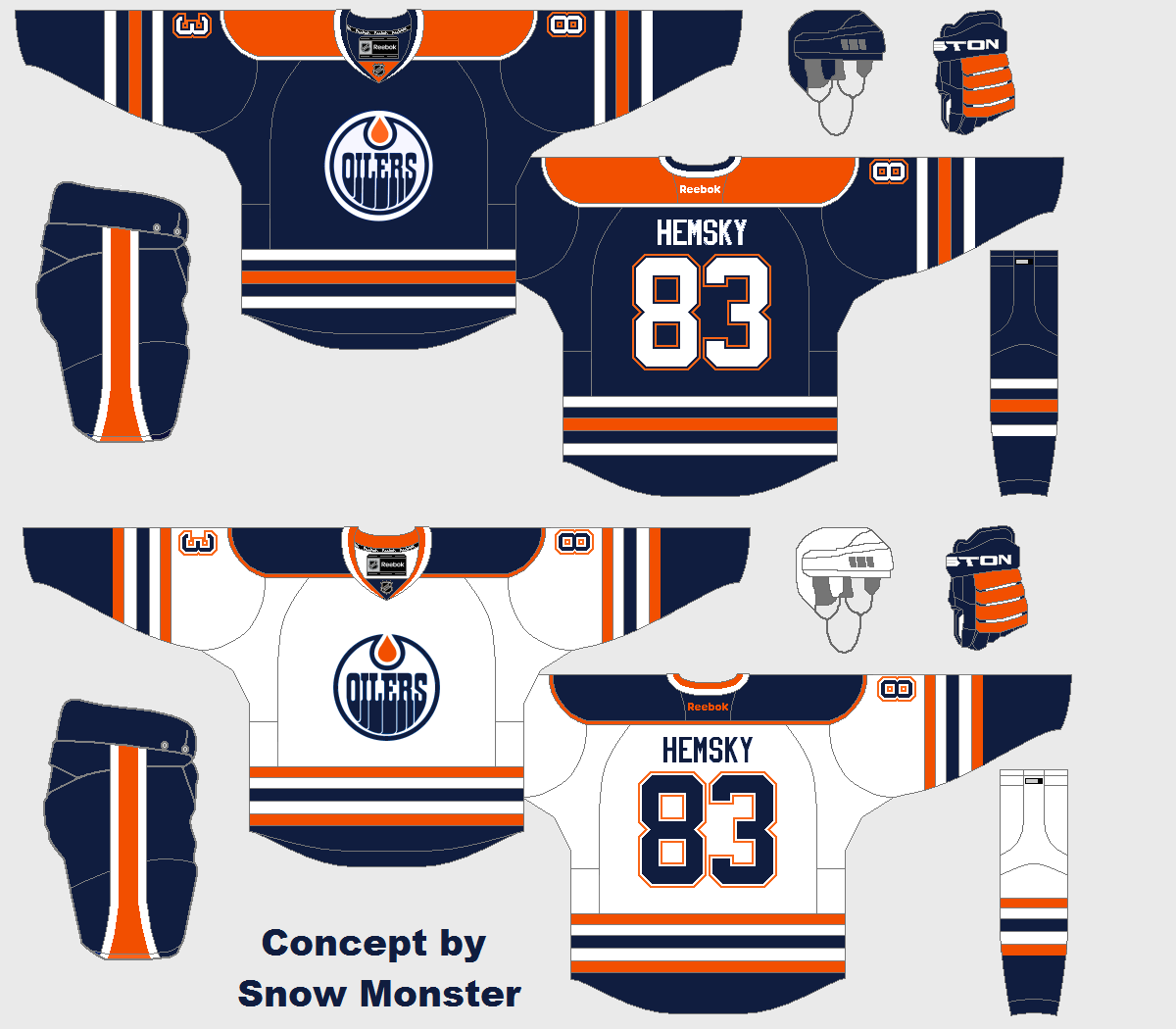
SnowMonster makes some changes to the
Oilers current jersey, making them less bright.
I'm so-so on that move, but there are a some changes I do like. The white numbers on the blue jersey look
great, and the standard Reebok collar looks better than what the Oilers
currently wear. I just wish the ends of
the sleeves were still orange on the blue jersey, especially now since the
white jersey has coloured sleeve ends.
7/10
Kamloops Blazers (by Ted N.)
.png)
These are meant to be alternates to
Ted's Blazers concept from yesterday.
I'm a big fan of the striping pattern used, it looks great on both
jerseys. I think I like the orange
jersey better, the light blue one is kind of weird since there is no light blue
anywhere except the jerseys base colour.
It reminds me of the light blue fashion jerseys the NHL made in the
90's. I don't like how the logo is
recoloured on the orange jersey (unnecessary logo recolours are a big pet-peeve
of mine). I also don't think the orange
letters work on the blue jersey, navy blue or white would work better in my
opinion. 7/10
Minnesota Fighting Saints (by
WinnipegJets96)

WinnipegJets96 brings back the Saints
jerseys with a few minor changes. They
look good, just like they did in the 70's.
My biggest issue here is that the hem, sleeve, and sock stripes are all
slightly different. Also the horizontal
jersey stitching near the hem stripe should be right up against the hem. I also don't phantom shoulder yoke, it's too
modern of an element to be used on such a retro concept. I do using the "S" logo as a
shoulder patch though. 7/10
Nashville Predators (by Brady S.)
.png)
Whoa, that checker-pattern sure stands
out. I'm a fan of Nashville using a
checker-pattern, but I think using a sublimated pattern would look better. Setting that side, the rest of the striping
pattern looks good. Using yellow as the
base colour for the light jersey is a cool choice, I know a lot of people would
be a big fan of that. 8/10
Uconn Huskies (by David K.)
.png)
I don't think there is anything I don't
like about this jersey. The striping,
number font, and logos all look great.
The whole look is very solid. I
really don't have much more to say about this, but Ryan labelled it as
"part 1", so stay tuned for part 2.
8/10
Chicago Blackhawks (by Dylan A.)

We finish off today's post with two
Chicago Blackhawks concepts from Dylan.
These are two alternate jersey options.
The top one is a black version of their current home jersey, and the
second one is closer to their road jersey.
They both look really good. My
only issue is that two different shades of black were used (it's most noticeable
on the top jersey's sleeve stripes).
8/10
Chicago Blackhawks (by Dylan A.)

Dylan also made these two throwback
concepts. I love the vintage looking
striping pattern, which has the feel of the Blackhawks original jerseys, but is
slightly different. I also like that it
doesn't have a name on the back, it adds to the retro look. Again my only issue is that two shades of
black were used. Still I'll give this a
COTW nomination. 9/10
Tuesday: Blackhawks and More
 Reviewed by Steven Grant
on
March 19, 2013
Rating:
Reviewed by Steven Grant
on
March 19, 2013
Rating:
Reviewed by Steven Grant
on
March 19, 2013
Rating:


9 comments:
I LOVE Stephane's sponsor on his Whoopee jerseys!
I agree, I hope we get more jokes in this contest. Brady S. for COTW
I find it funny that Stephane's MW shoulder patch s interlocking. I hope that was intentional
Dylan A.'s vintage Hawks for COTW!
@DBro: it was! So happy someone saw it! Did you notice the placement of the team's name?
@Stephane, very subtle!
Stephane's sponsorship patch had me dying! Hahaha great work! Dylan's (black and white) Hawks for COTW.
That has to be the funniest concept ever Stephane!
@Stephane, I did notice that! Classic!!!
Post a Comment