
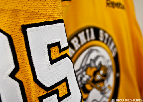
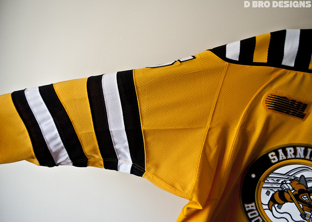
Wednesday: Sarnia Sting Jersey And A Lot of Red!
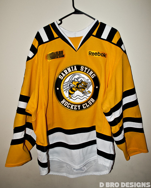
If you visit the site every day or any Wednesday for the past few weeks you'll know I mentioned that I was going to Sarnia to enjoy a Sting game and receive my jersey and recognition for winning their design contest last spring! The jersey I got is very nice and an authentic jersey as opposed to a replica which they sell in their merchandise shop.....something I made...is being worn by a CHL team and sold... I saw so many people wearing a jersey I made... It was one of the greatest things ever! I'll post a few pictures here and you can also check more pictures out on my Flickr where they are uploaded or my Facebook.
Here's todays Macon Whoopie entries -
Jordan R.

Alex J.

And the rest of today's concepts!

- Alan's entry into the Hamilton contest a few weeks ago and these really fit the team name.
- I like the changes made to the logo. To me it doesn't interfere with the legibility of the name and it also fits with the branding Alan is trying to put out there.
- The jersey design is crazy. I like crazy jerseys but this one should be toned down.
- I feel that the striping should be simplified. You can keep the tiger stripe theme and still be simple. Sometimes less is more. But if you really wanted to keep this striping I'd pick a more dull yellow instead of this very bright one. Might make it look better.
Rating: 6/10
Seattle Metropolitans Concept - (Spirit104)

- Spirit brings us a very modern Metropolitans jersey. Could this be a peak into the future of the NHL in the northwest?
- I like the use of vintage white in this concept. I also like the idea of a nod to the candy cane jerseys of the teams past.
- I don't care for how the logo and the numbers are boxed in. It's a clever idea to have the candy cane pattern in there but it makes the logo and numbers seem to get lost and makes the bottom of the jersey seem very plain and out of place.
- Very simple way to fix this in my opinion. On the arms make the red stripe vintage white, and ditch the small white outlines. To keep your chest stripes just use one green and one white stripe, like on the arms. The piping could also go but to me it doesn't hurt anything.
Rating: 6/10

- Snow Monster is back and he's modernizing the Rangers in what seems to be a popular subject matter lately.
- I like to see Lady Liberty on the front of a jersey. Although, it just doesn't seem like the Rangers without the diagonal script. I also notice that the Winter Classic "Rangers Shield" is back as a shoulder patch and I like that. I love the white jersey's striping. It's very angular which fits with the Lady Liberty logo.
- I like these logos but not on a home and away set. Also, something about the striping on the blue doesn't sit right with me.
- Personally, I would take one of these jerseys and call it an alternate and make a new home and away closer to their current jerseys. But as for the blue jerseys striping, Maybe get rid of the phantom arm length yoke and have the stripes go all the way around the arm. But leave the white jersey, I personally love that one
Rating: 7.5/10
Augsburger Panther Concept - (Bastian)
.png)
- Bastian continues his onslaught of great concepts with this Augsburger concept.
- This concept is very stripe heavy and I like to see that. I also love any concept that feature green prominently.
- The color scheme comes off very "Holly Jolly" as a result of the large amount of red, white, and green. I feel there should be some black in there to kind of break out of that Christmas-y feel I'm getting. There's black in the logo and equipment so I feel like some black should be in the jerseys somewhere. I'm not feeling the yoke stripes in their current position.
- Just work some black into the jerseys. I'd either rotate the shoulder stripes to go from the back of the jersey to the front or get rid of them completely. The way they are now makes the jersey seem very busy to me. Still, great work though.
Rating: 8/10
Anaheim Ducks Concept - (Darren H.)

Detroit Red Wings - (Darren H.)

Ottawa Nationals Concept - (Jets96)


- Darren rebrands the Ducks while keeping the current color scheme, and even the current home jersey striping for a third jersey.
- I like bringing back the duck mask. One of the better logos of the 90's and any reference to a goalie is good in my book. I also love the new simple striping and the move to make orange the new primary color. That third is also really good. I love the D as a main crest.
- My only complaint on the home and away is the bronze collar insert. I'd probably go orange for both jerseys. And on the alternate, I'm not a fan of the front numbers.
Rating: 8/10

- Darren takes on the challenge of redesigning my hated Red Wings.
- I actually like what Darren has done with the striping. It has more character than there current solo stripe. I also like the "D" shoulder patch
- I do, however, miss the red arms on the white jersey. The black also doesn't seem necessary.
- Ditch the black, it's not needed, and the red yoke on the white jersey. Also make the white jersey's arms red and stripes white.
Rating: 8/10
Ottawa Nationals Concept - (Jets96)

- Jets resurrects the Ottawa Nationals and gives them new modern jerseys.
- Normally I'd think this template and striping is odd and wouldn't like it. But with this logo I like it. I don't know why. Maybe it's because the "ON" logo has this very modern look that I feel like was ahead of it's time. It looked futuristic to me on its old jerseys. I also like the use of the leaf from the logo on the shoulders.
- The sock striping seems to simple for this jersey set. I'm sure it could be matched up a little better with the jerseys.
- I'd just play with the socks a little more and find a better match.
.png)
- Bastian designs new All Star jerseys for the WHA
- I like that Bastian keeps the jerseys very simple when the temptation to make a gaudy All Star jersey is tremendous. I love the sublimated stars. I didn't see them at first and I was like, "What?! All Star jersey with no stars?!" So when I finally saw them I loved them
- Nothing wrong with this set
- I wouldn't change a thing. Brilliant All Star jerseys.
Rating: 9/10 I have to nominate these for COTW!!!
Wednesday: Sarnia Sting Jersey And A Lot of Red!
 Reviewed by DBro Alexander
on
March 20, 2013
Rating:
Reviewed by DBro Alexander
on
March 20, 2013
Rating:
Reviewed by DBro Alexander
on
March 20, 2013
Rating:


3 comments:
WHA All-Star jerseys look like the Rochester Americans look. Can never go wrong with that!!
Jet's Nationals for COTW
I'll second Bastian's WHA jersey for COTW.
~CPM
Post a Comment