
Wednesday: Concepts to Brighten Up Your Day!
Hey everyone, Happy Hump Day. Let's liven your Wednesday with some jersey concepts!
But first... the Macon Whoopie Competition is now in it's voting phase, as well as the usual COTW.....So here's your color coded reminders...


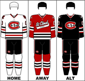
St. Cloud State (NCHC) Concept - (Adam H.)


But first... the Macon Whoopie Competition is now in it's voting phase, as well as the usual COTW.....So here's your color coded reminders...
COTW Mar 18-24 vote (ends Friday @ 11:59pm EST)
Whoopee ReDesign Top 5 vote (ends Friday @ 11:59pm EST)
Now let's get to the concepts!
Team Canada Concept - (Stephen T.)

- Stephen redesigns Canada's national team jerseys.
- I am a fan of the leaf on the shoulders but honestly that's really it. I like the logo/wordmark you used but don't like it's placement. It definitely looks like a Nike move though.
- Like I said, the placement of the main logo/wordmark is way too awkward. I feel like it would be hidden while a player is in action. Another problem with the logo is any sort of arm stripes would look odd with it, and the lack of stripes makes this jersey pretty boring.
- Find a better placement for the logo if possible and try to add some other design element to liven up the jersey.
Rating: 6/10
Denver University (NCHC) Concept

- Adam now gives us a new set for the Denver University Pioneers. Despite the school using a lot of black in it's branding the current jerseys don't include black. So Adam puts black where it should probably belong.
- So first off, I gotta admit there's not a whole lot that I see as an upgrade to their current look, however, I do like the sublimated mountains on the home and away. I do like the fauxback though, maybe lose the faux-white on the tips of the cuffs and hem.
- I feel like the new striping pattern is too thin. I wouldn't mind seeing fewer, thicker stripes than more thin ones. I feel like if you're going to add black it should be equally between the two jerseys, and as a trim color. The home doesn't have enough black and the away doesn't have enough white in my opinion.
- Basically, just find a way to thicken the stripes on the home and road and balance the colors better and this set will improve by a lot. Execution note, the inside of the collars should match the yokes.
Rating: 6/10
Kingston Frontenacs (OHL) Concept - (Dylan W)

- Dylan simplifies the Frontenacs current look and offers us this white jersey which I will assume is meant for a new alternate jersey.
- I think the Frontenacs current set is very stripey and a little too busy. But this is a very clean look and better looking so I wouldn't mind seeing a set based off of this jersey. I also like keeping the current "K" and not using the Bruins inspired K logo. The jersey already looks very "Bruins-y" so that would be overkill in my eyes.
- I feel like the stripes under the yoke are too thin and aren't necessary. The name on the back doesn't need the yellow outline either. Not enough contrast between the white and yellow. And personally, it bugs me that the hem striping and the arm striping doesn't match.
- Ditch the thin yoke stripes and use plain white or yellow letters for the name for sure. As for the striping. Either make all the striping thinner so you can fit the yellow stripe on the hem and keep the jersey hem itself white or maybe make it all yellow, OR, get rid of the black hem and move the yellow and black down and keep the hem white, that way it's like the top half of the arm striping on the hem.
Rating: 7/10
NHL 100th Anniversary Jerseys - (Stephane S.)

- It's always nice to see a Stephane concept. The NHL celebrates it's 100th birthday in a few years and only two current teams were in the league for it's first year....The Leafs and Canadiens. So Stephane suggests the two clubs wear jerseys modeled after their 1917 jerseys.
- I like the authenticity between the two jerseys. I checked nhluniforms.com to see what the actual 1917 sweaters look like and these are exactly what they looked like besides the names on the back.
- I wish I could see the patch on the jersey bigger. Maybe feature it somewhere on the image somewhere. I feel like the numbers on the Habs jersey looks odd. Maybe center it on the stripe.
- Not necessarily the most creative concept because it's just adapting old jerseys to a new template but the idea behind it is nice. I wonder if they'd wear these as a third jersey, or only against each other or other Original 6 teams. Feature that patch, let's see what it looks like!
Rating: 7/10

- Adam gives us a new set for St. Cloud State who currently looks like this. Not a lot of creativity from SCS.... Canadiens logo and Blackhawks jerseys...tsk tsk...
- First off, I'd like to point out that Adam's skills have vastly improved since his first concept he sent in a few months ago. Bravo Adam. As for the jerseys here, I like this new template for the team automatically since it's somewhat unique and not a Blackhawks clone. And I really like the throwback. A few teaks, some more red, and you could base a set off of a red version of this.
- I'm not too big on the different pants for each jersey. I'd stick with the black pants for the home and away and swap the red and white in the striping. I also don't care for the colored name bars or the striping stopping at the numbers.
- Do what I suggested with the pants and make the striping go under the numbers and all the way around the jersey and this looks better. And for the sake of keeping all the colors on each uni, I'd color the thin black stripes in the alternates arm striping red. And an execution note, the inside of the collar on each jersey should match the yoke.
Rating: 8/10
Hamilton Tigers Concept - (Austin E.)

- Austin shares with us his vision for a modern Hamilton Tigers set.
- I love the sublimated stripes on the home and away. And that pawprint shoulder patch is awesome. I like how you didn't go overboard with the stripes which I'm sure the temptation was there with a team named the "Tigers". You saved all the over-the-top striping
- The logo It's very clean and simple which is nice but could use a thicker outline and change up the details in the face and stripes. Better than anything I would have come up with though so I applaud the effort. I feel the alt. could lose the top stripe above the logo and number. And unless it is just a one off throwback it'll need a name. There's three arm stripes and two hem stripes as well, which bothers me,, but that's just me, most might not see that as a problem.
- Just ditch that one stripe I was talking about. I like this concept a lot.
Rating: 8/10
Chicago Blackhawks Third Jersey Concept - (Brandon C)

- Brandon gives us his idea for a Chicago Blackhawks third jersey.
- I like matching the striping on the black jersey to the home red jersey. I'm a fan of the team actually doing it as opposed to their black jersey matching the white away. I like that the collar has the same striping as the rest of the uniform. (Although I believe the red would be just a tiny bit thicker) The current logo looks nice in the roundel as well.
- Not a huge fan of the shoulder striping and lack of shoulder patches.
- Do something about those shoulder stripes and add the "C" to the shoulders and it's all good.
Rating: 8/10
Buffalo Sabres Nike Swift Concept - (Jordan R.)

- Jordan is back with another "Swift-ification", this time for the Sabres!
- Believe it or not I like the use of a darker, Vegas gold, as opposed to the normal Buffalo yellow. I don't really care for the blue jersey having three gold stripes and the white having different colored stripes, but it's actually a good nod to the Sabres jerseys of the past. And the idea of having a black, red, and white alternate? I love it!
- I don't care for the logo used. The Buffalo head looks awkward. Wouldn't necessarily mind it as a shoulder patch.
- I would just swap the logos between the main crest and the shoulder patches.
Rating: 8/10
Buffalo Sabres Concept - (Brian B.)

- Brian gives us a new third jersey for the Buffalo Sabres
- Huge fan of this look. I love the logo that focuses on just the swords and not the buffalo. I also love the move to bring back the 90'-00's buffalo head in new colors as a shoulder patch. No dumb piping that clutters up the current set. I also like the simple white name and number.
- Only possible thing I could say I don't care for is the fact that silver outlines the white stripes on the arms, hem, and socks, and only because I didn't notice it at first due to the low contrast.
- Quite honestly, you could do without the silver in the striping.
Rating: 8.5/10 COTW nom from me!!!
Wednesday: Concepts to Brighten Up Your Day!
 Reviewed by DBro Alexander
on
March 27, 2013
Rating:
Reviewed by DBro Alexander
on
March 27, 2013
Rating:
Reviewed by DBro Alexander
on
March 27, 2013
Rating:


3 comments:
@ D-Bro: There's a silver trim around the numbers too.
gahh...i couldn't see that.
Like I said, I personally don't care for it, but it doesn't hurt the design at all. I still really like it
Stephane for COTW
Post a Comment