
Wednesday: Third Jersey Madness!
Happy Wednesday everyone! I hope everyone is enjoying their NHL as we are basically at the halfway point. I'm looking forward to my history making Blackhawks take on the Av's tonight in what NBC Sports is billing as a "Rivalry" which as a lifelong Hawks fan I've never considered the Av's a big rival. Does anyone else's favorite team have a game on one of NBC's "Rivalry Wednesdays" against a team you don't see as a rival?
Only ONE voting reminder for you today... I know I know, it's sad
COTW Feb25-Mar3 vote (ends Friday @ 11:59pm EST)
Here's todays Tigers Entries...
Jon L.


Ryan T.

Jesper W.

And now today's concepts! FIVE of eight either are or include a new third jersey for a team!
Ottawa Senators Concept (Caleb F.)

- Caleb tries his hand at a new Sens jersey and I'm digging it. It has the look and feel of the Senator's original jerseys, but red. I've always liked Ottawa's original white jerseys with the black cuffs, and a red version looks great.
- I like the use of the 2d Senator head. It's a superior logo to their current one in my opinion. It's a shame that it's an official logo but they really don't use it for anything major. I already stated I'm a fan of the red base with the black cuffs.
- I feel like the stripes on the arms and hem could be a bit thicker like they were on the original jerseys.
- Execution note, the Reebok vector should be the wordmark. And besides that the only thing I would suggest changing is the stripes' thickness.
Rating: 8/10
Call of Duty MW3 Hockey Jersey (Brian B.)

- If I'm not mistaken this was entered in HJC's video game jersey contest last year, which yours truly won ;) Brian shows his affection towards Call of Duty with this Modern Warfare 3 jersey.
- The Modern Warfare series' branding has always been very digital-like. And Brian transfers that into the jersey very well. The very slight gradient from black to green looks very good and the number also has that digital blue which makes it look like a 1 glowing on a screen. I like the shoulder patches and the skull in the collar insert as well. Good call on replacing the Reebok on the back with the developer's logo.
- Only thing I see that bugs me is after the green stipes on the arms and hem, there is a thinner black stripes followed by a dark green cuff and hem. Same on the socks. I would either make that last green a bit lighter and swap it with the black to make a gradient, or lose it altogether and make the cuffs and hem solid black.
Rating: 8/10
NHL All Star Game Jerseys (Derek H.)

- Derek simplifies the look of the NHL's All Star jerseys in this concept, ditching the pinstripes and randomly colored panels of years' past.
- I like the simple look. The past few All Star games featured jerseys that got a bit more gaudy every year and I like Derek's move to the simple stripes with some stars (a staple in all star jersey design)
- I don't care for the differences between the arm stripes and hem stripes. For example, on the blue jersey, the shoulder and arm stripes go "Light blue, White, Light Blue" but the hem is "Light Blue, Dark Blue, Light Blue" with white stars. I think it would look better if the hem stripes matched the arms and went "Blue, White, Blue" with blue stars. Same applies to the red jersey.
- Only changes I would make would be what I mentioned about the striping. It could be applied to the pants as well. Also, the player's actual team should at least be featured on the shoulders.
Rating: 8/10
Winnipeg Jets Third Jersey (J3)

- I know there's quite a few people who would like to see a gray jersey in the NHL and J3 shows us how it should be done.
- I love everything about this jersey. The striping is classic. The shoulder stripes look fantastic. and I love that Jets' logo.
- The only thing I don't think I care for is the number font, but I can't really see it well so I don't know if I can whine about it.
- A few execution notes, I feel like the shoulder stripes might end a little before you have them ending. Maybe at the stitching where the arm and torso meets. Also, a back view would be nice, to have an idea of the fonts used. The pant's stripe should also have a thin blue line separating the red and gray. I wouldn't mind seeing SOME white used, maybe as the thin stripe in the middle of the two thick ones, but I just really love seeing a lot of different options.
To J3 (and everyone else who doesn't ID your concepts) - You should consider putting a watermark or at least some sort of I.D. on your concepts. Especially one like this. If this kind of image gets out there and people see it you really want your name on it and maybe even a way to contact you. I put my name and three different contact options on my concepts (Facebook, Tumblr, and Twitter)
Rating: 9/10 COTW NOM FROM ME!
Toronto Maple Leafs Third Jersey (J3)
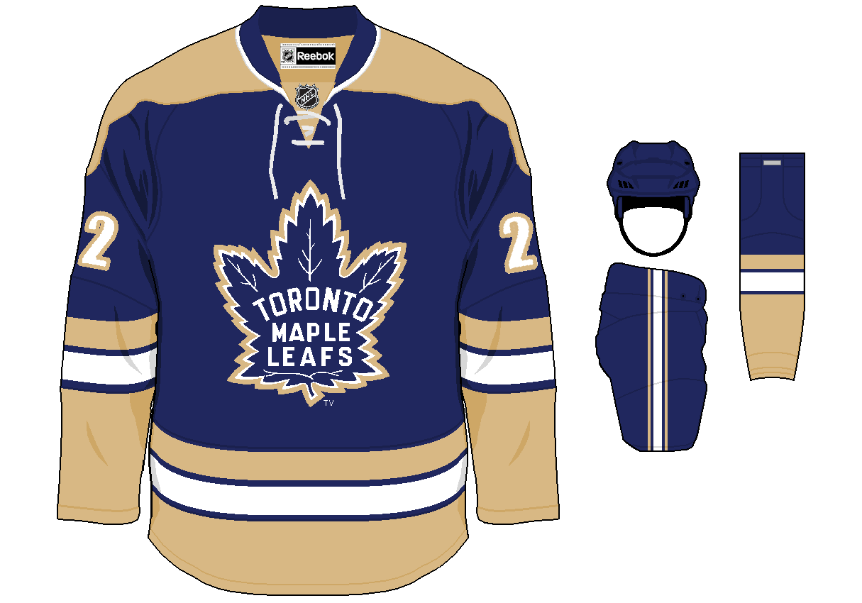
- J3 now takes his talents to the Maple Leafs and designs a new third for them.
- I like the new striping being introduced to the Leafs here.
- Gotta admit, I'm not a huge fan of the addition of the tan to the color scheme. At least in the quantity used. I would maybe like it more if it was used as a trim.
- I would suggest swapping the tan and white in the striping. Also try adding an outline to the yoke, so either tan with a white line or vice versa
Rating: 7/10
Braunschweiger Penguins (Martin L.)
.png)
- Martin here is showing off his team's jerseys. A quick google search and I actually found the Facebook the team has. None of their photos show them wearing this jersey so it looks like this is a concept of what they would like to wear.
- I would simplify the logo a little big. There's a lot going on in that small space.
- The color scheme, while nice, doesn't really say "Penguins" It would work, however, if you added some blue and/or green into the logo for example, in the penguins scarf and gloves.
- Make some of those small changes and this would be a nice jersey. Get some made and show off some pictures!
Rating: 7/10
Detroit Red Wings Concept (Dylan W.)

- Mr. Wonka shows off his Red Wings rebrand from the Untouchables contest.
- I like the new striping. It sort of reminds me of the spokes in the actual logo, however this new logo replaces those with the "D", a move I'm not particularly fond of.
- I also don't care for the numbers on the shoulder with a logo on the arms. I'd only put numbers on the shoulder if there is no shoulder logo to be used.
Rating: 7/10
Dallas Stars Concept (Mason H.)

- Mason puts a few logos together to make a new one for the Stars.
- I like the striping on the home and away, especially the arms where they meet the star.
- The logo doesn't look too great. Maybe just have the star fit perfectly in the Texas outline and ditch the "D".... Or maybe put the D in the star and ditch the outline of Texas. The shoulder stripes also seem out of place. While I like the "D" on the third jersey, it could be a bit thicker. Isn't Dallas known as "The Big D"?
- I'd say most importantly fix the logo. Even the best jersey design can be brought down by a bad logo.
Rating: 7/10
Tampa bay Lightning Third Jersey (Spirit104)

- Spirit104 ditches blue entirely for this Tampa Bay alternate.
- I like the new striping. It's classy and looks good in black and white. Black had always been a big part in the Lightning's new scheme, and while I still prefer their current blue and white with minimal black, I feel like this could fit nicely into their brand and I'm sure they could find some promotions to work with the jersey.
- There's nothing I really dislike here. Even though I don't really care for the lack of blue, I think the jersey looks classy and works with Yzerman's desire to make the team look like an Original 6 team.
- Only possible thing I could suggest here is maybe make the victory closer together. But then again, in action you really wouldn't notice them unless the team did something work raising their arms for.
Rating: 8/10
Wednesday: Third Jersey Madness!
 Reviewed by DBro Alexander
on
March 06, 2013
Rating:
Reviewed by DBro Alexander
on
March 06, 2013
Rating:
Reviewed by DBro Alexander
on
March 06, 2013
Rating:


3 comments:
@ DBro Alexander: It wasn't. I made that CoD concept, this year.
spirit 104 for COTW I love that jersey for some reason, very well exectuted!
@Brian My bad, I remember there being a few MW3 jerseys in that contest
Post a Comment