
Friday: A Whopper post, with plenty of Whoopee entries!
Happy friday everyone! Colin here, glad to be back bringing you the friday post. Last week I had some computer issues, and couldn't do the post. Thanks to Jets96 for covering for me last week.
One huge reason that I was so disappointed to miss last week's post is because I went to the Canucks vs Predators game last week (the night before I would have posted). It was also the night before the Canucks donned their Millionaires jerseys, and they had the sweaters on display. Since I am "that Vancouver guy" and the sweaters haven't really been broken down here at HJC, I am going to do a quick rundown of what I liked and didn't like about them.
Firstly what I liked:
- the simple fact that the Canucks did this, and wore these Millionaires sweaters outside of a winter/ heritage classic, and from a team really outside of their history.
- the fact that the Canucks went the whole way and didn't re-use equipment, and had maroon gloves, helmet, socks, and vintage white breezers made up. It would have RUINED the uniform if the Canucks used blue gloves, or their normal white helmets. (big kudos to the goalies for getting on board and getting Millionaires masks made up!)
- the arm striping. If you look carefully, you will see that the arm stripes are not all the same width. as much as I do think the tiny stripe on the cuff is basically useless, because it was covered by the gloves, I do like the subtle unevenness of the stripes, it looks good, and adds some old-timey authenticity. (pardon the bad pic, taken through glass on my phone)
- the faux-felt application of the main crest. super cool.
What I didn't like about these sweaters:
- I noticed that there is a big inconsistency in the logo, and to me it seemed like the Canucks design team just got lazy. If you look at the R on the crest, you will notice a slight difference between the logos released in the media versus the actual logo on the sweater. The R on the sweater is just helvetica font, where the R on the real Millionaires logo, and on the logos used in the media (and even the patch worn on the Canucks 3rd jersey) is closer to what the Millionaires actually wore.
- the collar of the sweater bother me a bit. I am glad it's not a lace-up (that wouldn't be authentic), but the V neck bothers me. It would have been cool if the Canucks could have worked with Reebok to get a crew neck, or even a slight turtle-neck. That would have been really cool and authentic.
Here are the daily voting reminders...
One huge reason that I was so disappointed to miss last week's post is because I went to the Canucks vs Predators game last week (the night before I would have posted). It was also the night before the Canucks donned their Millionaires jerseys, and they had the sweaters on display. Since I am "that Vancouver guy" and the sweaters haven't really been broken down here at HJC, I am going to do a quick rundown of what I liked and didn't like about them.
Firstly what I liked:
 |
| photo: canucks.com |
- the fact that the Canucks went the whole way and didn't re-use equipment, and had maroon gloves, helmet, socks, and vintage white breezers made up. It would have RUINED the uniform if the Canucks used blue gloves, or their normal white helmets. (big kudos to the goalies for getting on board and getting Millionaires masks made up!)
 |
| photo: Colin May |
 |
| photo: Colin May |
- the faux-felt application of the main crest. super cool.
 |
| photo: canucks.com |
- I noticed that there is a big inconsistency in the logo, and to me it seemed like the Canucks design team just got lazy. If you look at the R on the crest, you will notice a slight difference between the logos released in the media versus the actual logo on the sweater. The R on the sweater is just helvetica font, where the R on the real Millionaires logo, and on the logos used in the media (and even the patch worn on the Canucks 3rd jersey) is closer to what the Millionaires actually wore.
- the collar of the sweater bother me a bit. I am glad it's not a lace-up (that wouldn't be authentic), but the V neck bothers me. It would have been cool if the Canucks could have worked with Reebok to get a crew neck, or even a slight turtle-neck. That would have been really cool and authentic.
-------------------------------------------------------------
Here are the daily voting reminders...
COTW Mar 11-17 vote (ends Friday @ 11:59pm EST)
Macon Whoopee redesign contest entries (entries due Friday @ 11:59pm EST)
-------------------------------------------------------------
Here are today's Whoopee redesign entries:
Keens:

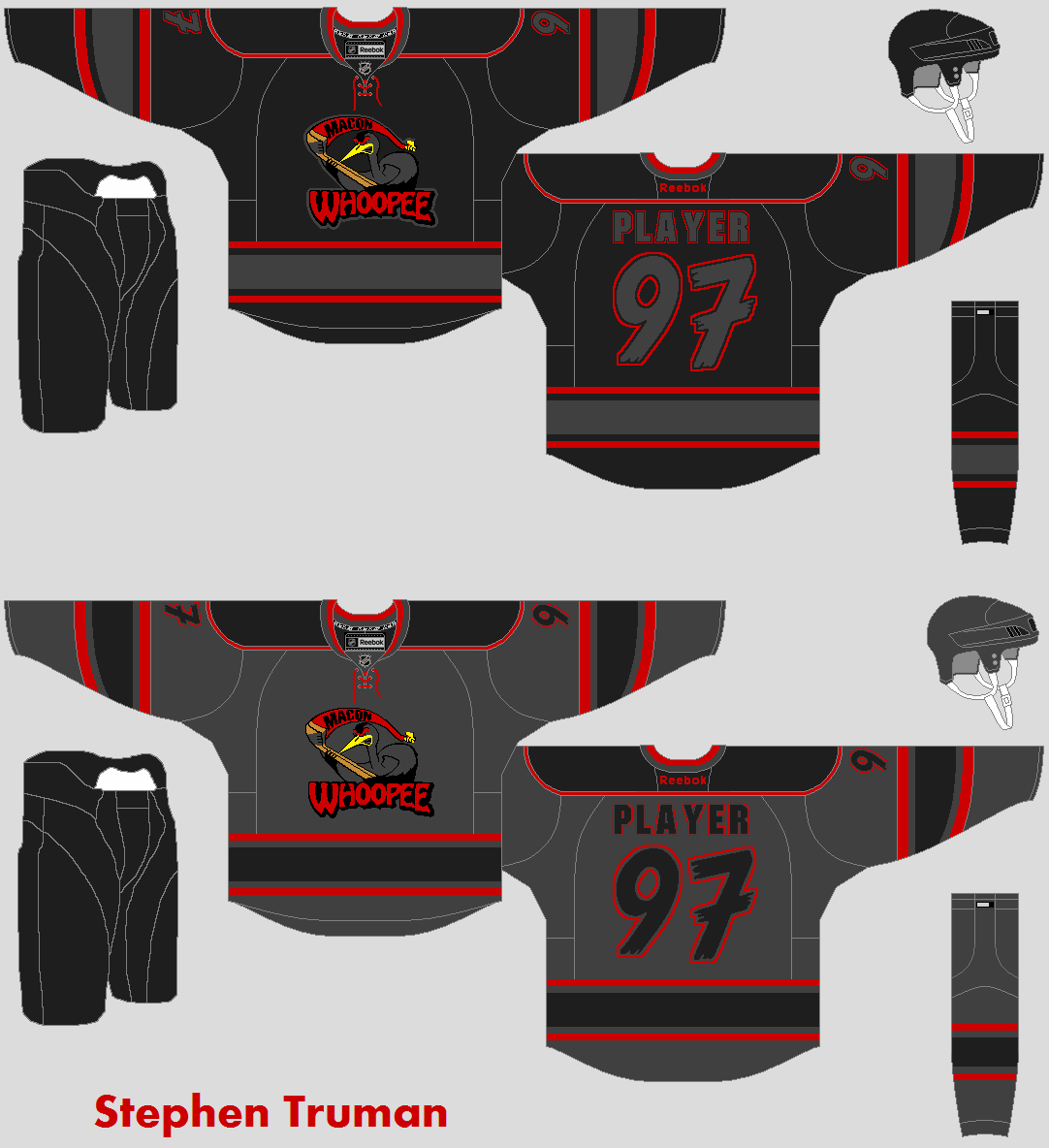
Stephen T:

CPM:
 Matt R:

Alex H:

JrY:

-------------------------------------------------------------
Keens:

Stephen T:
CPM:


Alex H:

JrY:

-------------------------------------------------------------
FINALLY, on to the concepts!
Moncton Wildcats QMJHL concept (Darren H.)
.jpg) LIKE: eye-catching presentation! simple clean striping design. authentic jersey patches don't make the sweater seem too crowded. Also, the collar is pretty cool, haven't seen anything like it before'
LIKE: eye-catching presentation! simple clean striping design. authentic jersey patches don't make the sweater seem too crowded. Also, the collar is pretty cool, haven't seen anything like it before'
DISLIKE: not huge fan of the logo, but that's not your fault. It is a little too 90's toon logo for my liking. Also, the white shoulder patch should not be used on the white jersey.
CHANGE: the inside of the neck on these sweaters need some attention. 1) they should be coloured in. 2) there shouldn't be an NHL logo on the tag for a QMJHL team.
RATING: 8/10.
WHA Michigan Stags concept (Bastian S.)
.png) LIKE: how well the logo is reflected in the striping pattern, and in the font.
LIKE: how well the logo is reflected in the striping pattern, and in the font.
DISLIKE: how dark the home jersey is.
CHANGE: Maybe use yellow instead of black for the home sweater, that would brighten it up a bit.
RATING: 8/10.
Pittsburgh Penguins concept (Caleb)
 LIKE: as much as people dislike the two-tone blue look for the pens, I like it here. I wouldn't want to see it full time, but it looks good here with the gold.
DISLIKE: No TV numbers! I also don't like how the yellow stripe sits right against the dark blue.
CHANGE: Add TV numbers. put a thin white stripe between the dark blue and the yellow (like you have between the yellow and light blue).
RATING: 6/10.
Minnesota Wild concept (Charles W.)
 LIKE: I love the wheat coloured for the away sweater. That NEEDS to happen. I also like the striping on the yokes, it reminds me of the IIHF jerseys a lot of teams used in 2006.
DISLIKE: I don't like the North Stars Kelly green and yellow, it doesn't work with the Wild logo for me.
CHANGE: If you are wanting the wild to drop red (I don't think that would be a great move), I would suggest using the existing gold and forest green that the wild currently wear.
RATING: 7/10.
St. Louis Blues concept (by Caleb)
 LIKE: THis is a clean look for the Blues. I like that the dark blue-note is used on a white jersey, it looks really good. interesting yoke and striping. I also like the oversized TV numbers.
DISLIKE: not much, the logo seems a bit low, and there are some loose pixels around the TV numbers, but that is nit-picking.
CHANGE: I always like to see a bit of effort taken to customize the sweater to a certain player's NOB, that always shows extra effort has been made.
RATING: 7/10.
Sherbrooke Phoenix QMJHL concept (Dylan Wonka)
 LIKE: I always like it when an element from the logo inspires the striping pattern of a sweater. I think the hem striping is particularly awesome. I also really want to commend Dylan for taking his concept outside the box, and really pushing it.
DISLIKE: not so much a dislike as "I wish this were more polished," the cuffs aren't working for me right now, they do need to be thought out a bit better.
CHANGE: obviously I would suggest editing this sweater. you have a good thing going on the torso, but as you rethink the cuffs, consider how they will look not only from the front and back, but also from the sides. I would also continue the lightning bolts all the way up the cuffs.
RATING: 7/10.
WHA Minnesota Fighting Saints concept (Bastian)
.png) LIKE: Great colour scheme, and that is really showed off well with the simple, yet unique striping pattern. I also like the wordmark on the front, good choice. The logo is really good, but not strong enough to be a main crest, so good job featuring it on the shoulders.
LIKE: Great colour scheme, and that is really showed off well with the simple, yet unique striping pattern. I also like the wordmark on the front, good choice. The logo is really good, but not strong enough to be a main crest, so good job featuring it on the shoulders.
DISLIKE: Not much. I don't think a shoulder yoke is necessary for the home sweater.
CHANGE: I would give the numbers an outline or 2, they are fine as is, but an outline could make them more cohesive with the rest of the sweater, and striping pattern.
RATING: 8/10.
St. Louis Blues concept (Darren H.)
 LIKE: the simplicity of the home sweater, and the way it works with the dark blue logo. I also like the fact that the same blue-note is used for both home and away. Also the alt is awesome, I love the arched word-mark over the trumpet logo.
DISLIKE: the logos seem a tad large.
CHANGE: colour in the inside neck panel.shrink the logos on the home and road a bit. Also, especially for uniform sets like this (especially for ones that are as good as this!) it is always nice to see your vision for the entire uniform. Including equipment and socks really helps us to see the whole picture.
Rating: 8/10, and a COTW nom from me!
Moncton Wildcats QMJHL concept (Darren H.)
.jpg)
DISLIKE: not huge fan of the logo, but that's not your fault. It is a little too 90's toon logo for my liking. Also, the white shoulder patch should not be used on the white jersey.
CHANGE: the inside of the neck on these sweaters need some attention. 1) they should be coloured in. 2) there shouldn't be an NHL logo on the tag for a QMJHL team.
RATING: 8/10.
WHA Michigan Stags concept (Bastian S.)
.png)
DISLIKE: how dark the home jersey is.
CHANGE: Maybe use yellow instead of black for the home sweater, that would brighten it up a bit.
RATING: 8/10.
Pittsburgh Penguins concept (Caleb)

DISLIKE: No TV numbers! I also don't like how the yellow stripe sits right against the dark blue.
CHANGE: Add TV numbers. put a thin white stripe between the dark blue and the yellow (like you have between the yellow and light blue).
RATING: 6/10.
Minnesota Wild concept (Charles W.)

DISLIKE: I don't like the North Stars Kelly green and yellow, it doesn't work with the Wild logo for me.
CHANGE: If you are wanting the wild to drop red (I don't think that would be a great move), I would suggest using the existing gold and forest green that the wild currently wear.
RATING: 7/10.
St. Louis Blues concept (by Caleb)

DISLIKE: not much, the logo seems a bit low, and there are some loose pixels around the TV numbers, but that is nit-picking.
CHANGE: I always like to see a bit of effort taken to customize the sweater to a certain player's NOB, that always shows extra effort has been made.
RATING: 7/10.
Sherbrooke Phoenix QMJHL concept (Dylan Wonka)

DISLIKE: not so much a dislike as "I wish this were more polished," the cuffs aren't working for me right now, they do need to be thought out a bit better.
CHANGE: obviously I would suggest editing this sweater. you have a good thing going on the torso, but as you rethink the cuffs, consider how they will look not only from the front and back, but also from the sides. I would also continue the lightning bolts all the way up the cuffs.
RATING: 7/10.
WHA Minnesota Fighting Saints concept (Bastian)
.png)
DISLIKE: Not much. I don't think a shoulder yoke is necessary for the home sweater.
CHANGE: I would give the numbers an outline or 2, they are fine as is, but an outline could make them more cohesive with the rest of the sweater, and striping pattern.
RATING: 8/10.
St. Louis Blues concept (Darren H.)

DISLIKE: the logos seem a tad large.
CHANGE: colour in the inside neck panel.shrink the logos on the home and road a bit. Also, especially for uniform sets like this (especially for ones that are as good as this!) it is always nice to see your vision for the entire uniform. Including equipment and socks really helps us to see the whole picture.
Rating: 8/10, and a COTW nom from me!
Friday: A Whopper post, with plenty of Whoopee entries!
 Reviewed by Unknown
on
March 22, 2013
Rating:
Reviewed by Unknown
on
March 22, 2013
Rating:
Reviewed by Unknown
on
March 22, 2013
Rating:


4 comments:
Darren's Moncton Wildcats for COTW
Darren, I don't know how dude, but I've absolutely loved every concept from you so far. They look amazing and super sharp, good job dude!
I'll second Darren for COTW
When someone comes back to this post and says "hey what happened? Darren got seconded". Kyle didn't make it clear which of Darren's concepts he is nominating.
Post a Comment