
Friday: a good friday for concepts
Hello everyone, hope you all are enjoying the Easter long weekend! I have a lot on my plate today, so I am going to keep this post quite short, but that doesn't mean that you guys can't comment. I think it would be really cool if some of you could give some feedback on these concepts in the comments. Rather than just nominating, add suggestions or tell us something you like about a concept.
-------------------------------------------------------------
Here are the daily voting reminders...
.png)

.png)


.png)

notCanucks.png)
-------------------------------------------------------------
Here are the daily voting reminders...
COTW Mar 18-24 vote (ends Friday @ 11:59pm EST)
Macon Whoopee Redesign Top 5 votes (ends Friday @ 11:59pm EST)
-------------------------------------------------------------
On to the concepts!
NCHC University of Nebraska at Omaha (by Adam H.)
.png)
I really like the striping pattern on the home and road, perfect for a college team. I think the OMAHA down the arm also suits the college look well. The faux-back is cool with all the stripes, but there are too many on the pants. A bit baffled by the adidas on the socks, these are clearly edge jerseys, and if this is really an adiadas school, the 3-stripe look will definitely be in place. 7/10.
Colorado Avalanche (Brian B.)
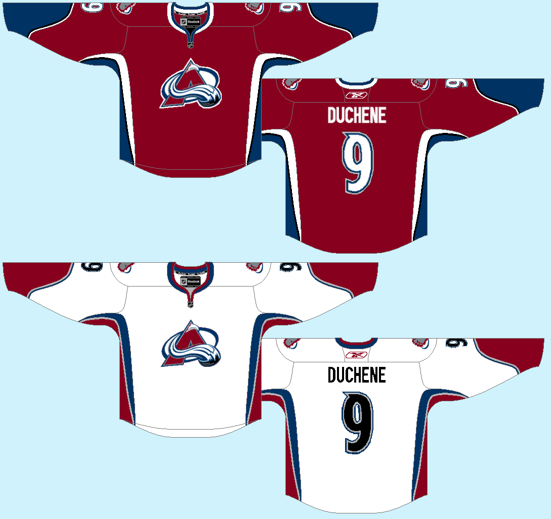
I'm not too sold on the Avs in this burgundy shade, the darker one is more to my liking. I would use a different colour for the numbers on the road sweater. Black is barely used, and seems a bit out of place for the numbers. 6/10.
NCHC Western Michigan University (Adam H.)
.png)
LOVE the faux-back (especially the lucky horse-shoe C!). I like the home and road unis, but would like to see more black on the white sweater (maybe make the cuffs black, or incorporate some black into the striping). Not sold on the brown pants, and having 3 sets of pants for a college team seems a bit unrealistic (from a cost standpoint). I think these unis would look better with black pants with a simple striping pattern. 7/10.
Colorado Avalanche (J3)

love how the hem stripes mirror the logo, but would like the cuffs to mirror the hem stripes a bit more. I love this logo, but think it would look better with a black dot in the middle of the C, it would make it pop a bit more. There are quite a few loose pixels (around the NHL shield), just be careful of that and fix that up. 7/10.
Edmonton Oilers (Stephen T.)

I have never really been a fan of this colour scheme for the Oilers, that being said, these are solid sweaters. I really like the gloves for this uniform set, they look really cool. But all of this screams to be in the classic Oilers blue and orange. 7/10.
San Jose Sharks (Will F.)

Not too sure how people in San Jose will feel about an LA Sharks logo/colour scheme for their team, but I'll set that aside. I like the SAN JOSE under the logo, really cool placement, but it should definitely be on the away jersey. I would like to see the striping pattern match between the hem and the arms, other than that pretty good. 6/10.
Buffalo Sabres (Jets96)
.png)
I really like this logo, but don't like the colour scheme, but I will leave the colour scheme aside for my comments. Not a huge fan of the silver hem, or the BUFFALO on the front (it might look better across the back). Black numbers might look better on the white jersey, and maybe add a yoke on the white jersey to make it look a bit less empty. 7/10.
Los Angeles Kings (Kyle C.)

If these unis had have happened, LA could not have eliminated purple from their colour palate. these unis are modern, but also have a classic vibe to them. The logo is perhaps a bit too big, but other than that, no real complaints. 8/10.
Vancouver Millionaires (Steven G.)
notCanucks.png)
LOVE THESE. The arm striping is really cool, unlike anything I've ever seen before. I really have no complaints, these would be amazing for the Millionaires if they were still playing today. 8/10, and a COTW nom from me.
Enjoy the weekend everyone!
Friday: a good friday for concepts
.png) Reviewed by Unknown
on
March 29, 2013
Rating:
Reviewed by Unknown
on
March 29, 2013
Rating:
Reviewed by Unknown
on
March 29, 2013
Rating:


5 comments:
Steven G's Vancouver Millionaires concept for COTW.
As for the Adidas on Adam's concept. Adidas owns Reebok I believe so I can see Adidas branding on Reebok jerseys...But he left the jersey free of all branding so I just assume the jersey is to be adapted to whatever company the school uses.
Adam's Omaha concept for COTW. I really like the striping and simple red/black/white colors on this one and Adam puts a lot of work into these, you can tell. Logo is a bit big and not too crazy about the modern art deco fonts. I like it though.
~CPM
I'll 2nd Adam's Omaha concept for COTW, I love the Atlanta Thrashers esque arm script and the throwback.
Alex, the problem with that is that Adidas doesn't use the Adidas brand for hockey. Even schools that are Adidas in other sports (such as Michigan) use the Reebok branding for hockey.
Post a Comment