Tuesday: Singing the Blues
Merry Christmas internet! Welcome back to another Tuesday at HJC, this week hosted by Ben, the regular Tuesday writer. Thank you to Bpoe for covering last week while I packed for my vacation to the Gateway to the West, St. Louis:
Here's the daily concepts!
Burkus Circus- Team South Korea
Burkus has certainly accomplished his goal of out-doing the long sleeved t-shirts Nike designed for the games, and I've been a fan of his series thus far, but this is a weak link in the set. First, while I like wordmarks on the crest, but this one isn't strong enough to carry the design. The idea to tie in the black lines of the flag into the design was great, but the application leaves something to be desired. The black doesn't work well with that dark shade of blue, and the red stripe to separate the field of white is far too thin to matter. The thickness of the white socks and jersey stripes should be similar, if not the same, for consistency. I don't see a compelling reason for the variations in the fonts as well. The white jersey has legibility issues as well; numbers should never be the same color as a solid-colored background behind them.
Grade: D+
Nolan K.- Lewis and Clark Association Lightning
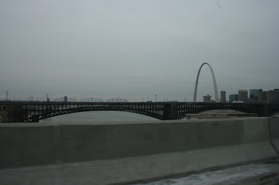
Photo by author
Though the Blues were at home during my trip, tickets were out of my price range since Nashville was in town, in a hotly contested matchup for supremacy in the Central. Even more disappointing coming from Cleveland, the temperature never went over 20 degrees (that's -7 for those of you up north, eh). It was still a great trip, and I took some awesome pictures of the city.
Back to the blog, our next competition will be our annual Concept of the Year logo. You can see examples of previous winners and a full list of the rules on our contest tap at the top of the desktop version of the site. Only one vote is ongoing this week, our weekly COTW. Stay tuned: voting for the best concept of 2017 begins soon!
COTW Dec 22-28 vote (ends Friday @ noon ET)
COTY Logo Entries (due January 12 @ noon ET)
Here's the daily concepts!
Burkus Circus- Team South Korea
Burkus has certainly accomplished his goal of out-doing the long sleeved t-shirts Nike designed for the games, and I've been a fan of his series thus far, but this is a weak link in the set. First, while I like wordmarks on the crest, but this one isn't strong enough to carry the design. The idea to tie in the black lines of the flag into the design was great, but the application leaves something to be desired. The black doesn't work well with that dark shade of blue, and the red stripe to separate the field of white is far too thin to matter. The thickness of the white socks and jersey stripes should be similar, if not the same, for consistency. I don't see a compelling reason for the variations in the fonts as well. The white jersey has legibility issues as well; numbers should never be the same color as a solid-colored background behind them.
Grade: D+
Nolan K.- Lewis and Clark Association Lightning
This association is a youth organization in Lewiston, Idaho, with teams up to U18, competing under the identity of the Lighting. Noah gives the teams a fresh look with a rebrand. The colors on this set work extremely well; the blues are a good contrast, the orange is a good complement, and all go nicely with the white. The striping is a good way to handle a three color set, though yoke stripes on the white jersey would have made the look more consistent throughout the set. One thing this look could have done without is the off-color fabric behind the laces; there's no reason to draw attention to that part of the jersey so proximately. An additional problem is the crest on the blue jersey. Since it's in the same spot as the white jersey, it becomes off-centered with the colored-in white portion. One last execution issue is the numbers on the back seem to be spaced too far apart.
Grade: C
TC Moore- Seattle Mariners
TC continues his MLB crossover series, finishing today's post in Seattle. The logo choices bring this look down. Three is too many, as the detailed logos clash against the simplistic striping. The S and M logos should have been switched, in my opinion, with the compass omitted, or at least relegated to the equipment. While the logos are a bit much, I do like the striping pattern, especially how the white and yellow are separated. The numbers and name are a bit hard to read in that shade of yellow on the white jersey.
Grade: C+
That'll do it for the first Tuesday of 2018. Here's hoping for lots of terrific designs in this year of concepts. Have a great new year, keep your stick on the ice.
Tuesday: Singing the Blues
 Reviewed by Ben Shaffer
on
January 02, 2018
Rating:
 Reviewed by Ben Shaffer
on
January 02, 2018
Rating:


4 comments:
The laces on the white jerseys are meant to be white, I made them a shade of grey to show they were there. Clearly I made the shade too dark to make the point clear, so sorry.
FYI on game day any left over seats for the Blues are 1/2 price at the box office. I haven't taken advantage yet but hopefully they will have a game when I go down to get the team store exclusive hat based on the Gretzky Era hat designed by Fabbri
The Mariners' trident logo is loads better than the S. Come at me
Phil knows what's up
Post a Comment