Land Ho! Potential Islanders Adidas Alternate Leaks
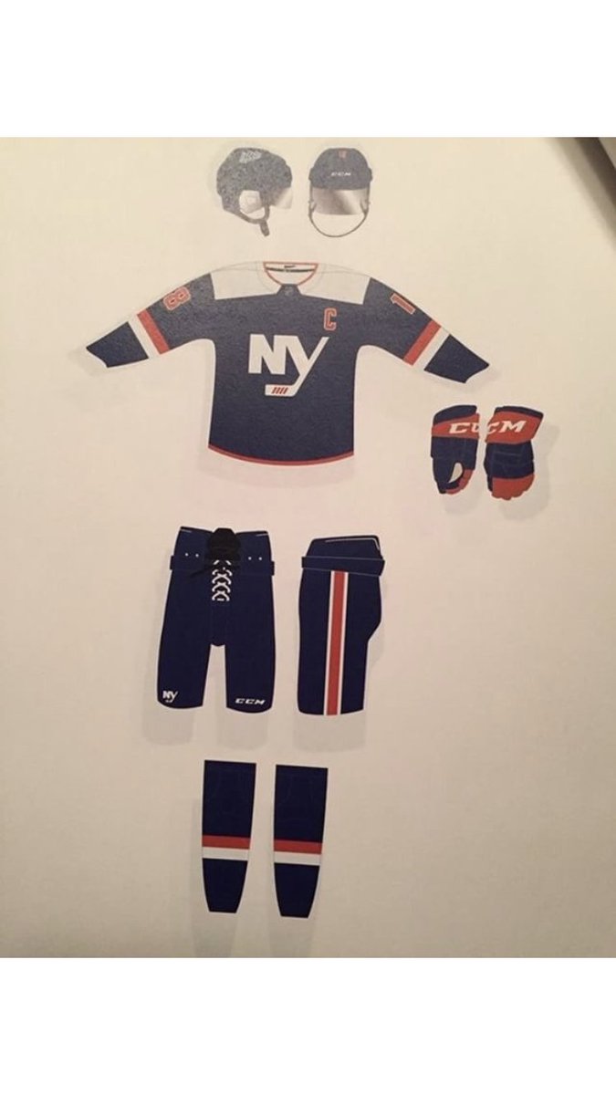
If what we've seen is to be trusted, that appears to be how Islanders' brass are approaching the first alternate jersey to be worn by the team under the Adidas brand. Amidst fan base clamoring for the Fisherman alternate to return or those who would be satisfied by anything that wasn't black, according to a potential leak, the Isles appear to be returning to a different look they've sported in the past, namely their 2014 Stadium Series jersey.
Via Eyes on Isle's Fan Blog
The numbering adopts a new look as well, swapping orange and white and using what would appear to be a new font for the Isles. Perhaps the subtlest change here comes in the crest logo, where the classic Islanders 4-stripe look is moved from the lower shaft of the stick to the blade, transitioning beautifully into a blade tape design. Following the growing hanger effect trend, the Isles offer a tribute to their return to the island with a Long Island outlined emblazoned on the inside of the collar.

Via Twitter (@TwoTurtleDuffs)
Have the rumours of an Orange Isles Alt been officially put to bed? Is a new look Isles script on the horizon? I guess we'll just have to wait and see, but at this point all signs appear to point to plausible...
Love it? Hate it? Let us know in the comment section.
Land Ho! Potential Islanders Adidas Alternate Leaks
![]() Reviewed by JB Designs
on
September 01, 2018
Rating:
Reviewed by JB Designs
on
September 01, 2018
Rating:


2 comments:
Great big pile of "meh."
I might be the only one but I really enjoyed the orange alternate the Islanders came out with a decade ago. Kinda wish they brought out a new orange jersey here but what we potentially got is “meh” at best. Don’t love it, but also don’t hate it either. I’m glad the white shoulder yoke is coming back here and I’m also intrigued to see a full res image of that new wordmark on the helmet but all in all this jersey if it turns out to be legit gets a 6.5 from me!
Post a Comment