
Thursday: Crossover Galore!
Welcome to the Thursday post!
If you haven't read the...interesting...jersey news we got today, check it out in the news ticker!
Here are your coloured voting bar reminders, today is your last full day to do so!
On with today's concepts!
Oakland Raiders NFL Concepts (By: TC Moore)

As a Chiefs fan I should hold some sort of distain for this concept, and I do, but TC has done a fantastic job taking the NFL's most out of date and yet classic teams, and making it work for hockey. First and foremost the jerseys are fantastic, especially since they add colour to a team that has a colour scheme they dramatically underuse. The quasi 3-D numbers are a really nice touch. The altered logos are fantastic. I do feel the white jersey right look better with some colour swapping to help darken the parts not boarding black, but it's not terrible. The alternate is okay, I think it does a good enough job being a grey alternate, but I think introducing yellow like the 60s logos had in them would have been a much more interesting move!
8.75/10
Ontario Reign AHL Concepts (By: Ben S.)


If you haven't read the...interesting...jersey news we got today, check it out in the news ticker!
Here are your coloured voting bar reminders, today is your last full day to do so!
COTW Vote Aug 31-Sep 6 (ends Friday @ noon EDT)
Utah Grizzlies ReDesign (ends Friday @ noon EDT)
New Jersey Nerds Podcast every week on Google Play, iTunes, Stitcher and Spotify!
On with today's concepts!
---------------------------------------------------------------------------
Oakland Raiders NFL Concepts (By: TC Moore)

As a Chiefs fan I should hold some sort of distain for this concept, and I do, but TC has done a fantastic job taking the NFL's most out of date and yet classic teams, and making it work for hockey. First and foremost the jerseys are fantastic, especially since they add colour to a team that has a colour scheme they dramatically underuse. The quasi 3-D numbers are a really nice touch. The altered logos are fantastic. I do feel the white jersey right look better with some colour swapping to help darken the parts not boarding black, but it's not terrible. The alternate is okay, I think it does a good enough job being a grey alternate, but I think introducing yellow like the 60s logos had in them would have been a much more interesting move!
8.75/10
Ontario Reign AHL Concepts (By: Ben S.)
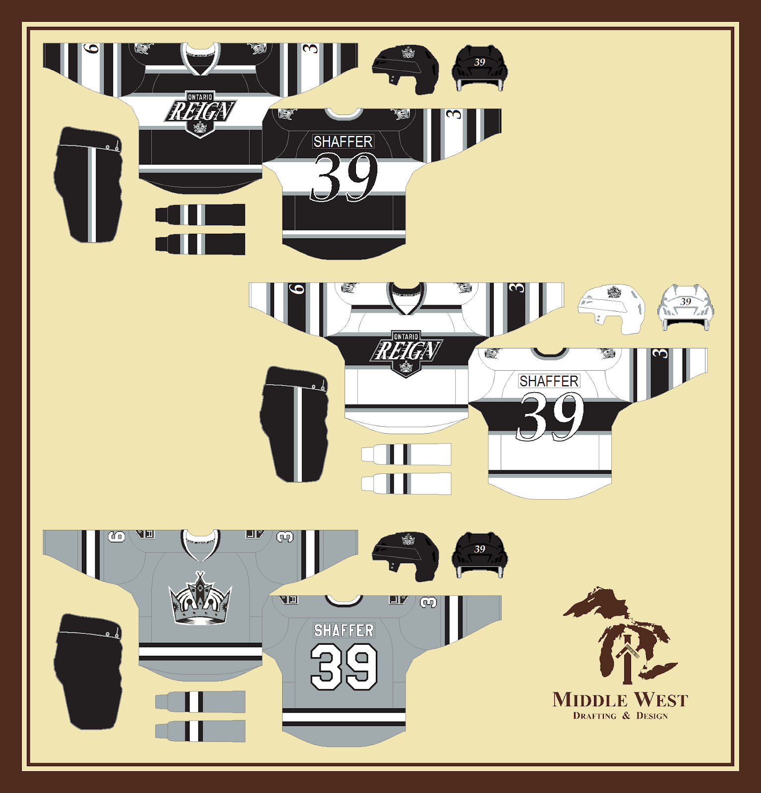
The Reign are interesting in that yes they do rip off the King from multiple eras, but at the same time, it works really well and have one of the most successful AHL brands and teams as a result. Here I think the Chevy logo works really well in a chest stripe, and with such a vintage striping pattern that reminds me more of 1958 than 1988. The numbers both being rounded and italicized matches the script in the logo perfectly. The alternate is nothing specially, it looks good but may as well be a Kings jersey. That being said past the 2014 SS, the team has no intention of using this type of design so the Reign may as well.
9/10
2020 Winter Classic Concept (By: BurkusCircus)

I'm officially a fan of the isolated cannon being an alternate logo for the Jackets. This seems to be the best form to do it in. The striping reminds me a lot of if Winnipeg and Toronto blended, but I think it works, especially with the very obviously grey primary logo. Also a huge fan of the striping logos. The Caps jersey would work if it were a lot simpler. The reason being the W logo works best IMO when there's not ton of colour. I don't think the candy cane striping is horrible, but it might work better sans yoke, that would be the quickest fix.
8.5/10
Providence Bruins AHL Concepts (By: Ben S.)

The Pruins (ew) try to base their identity around the Bruins jerseys of the past the team doesn't throwback to, namely the mid 50s Bronco Horvath (Bruins great if you don't know him you should) jerseys, sort of Post Kraut line/Pre Buyck, Orr, Esposito, Cheevers. The jerseys are really well done, but the numbers to me are too small and too low set. Further more I'd like to see the colours toyed with on the road to try to balance the colours better, I think this shade of gold is dark enough it won't cause yellow/white blending. The alternate is a mix of the last 2 Bruins alternates, and with it seeming the Bruins are ditching the updated 20s logo for a throwback to the Bourque era, this is a solid move!
8.5/10
Toronto Raptors NBA Concepts (By: Adam G.)

If you want to see how to do a crossover, this is an excellent example to follow. The home and road do enough to design a Raptors hockey jersey based on their basketball identity without just being a direct clone. I especially like the striping, it really works well with the primary logo. The alternate is a fantastic adoption of the WE THE NORTH city edition jerseys, and in fact work better as hockey jerseys! Seriously though, this might be my favourite crossover concept ever, or at least within the past few months.
10/10 COTW Nom from me!
Tampa Bay Buccaneers NFL Concepts (By: TC Moore)

Another fantastic crossover concept, TC brings both the current and classic Bucs identities to hockey form, with two different ideas. The regular home and road are a very toned down version of what they currently wear, which works in some regards like the isolation of the jolly roger from the flag to make it more hockey appropriate, ditching the alarm clock style numbers, and the addition of a new shoulder patch which I happen to like. On the otehr hand, I also like the Bucs current look. Pewter could have made more of an appearance, in fact the red jersey should be dominated by it a la Flyers, and I am a fan of the alarm clock numbers. That being said this is a good look at how the Bucs would be as a more traditional team. The heritage set is solid but they are called the creamsicles for a reason, and red yokes on the orange jerseys don't really flow with that, white or bust!
Miami Heat NBA Concepts (By: Adam G.)

The Heat are probably the team in the NBA who's jerseys are the most dated, having worn them since 2001. That being said, the stripes on the side of the jerseys do translate really well to the home and road, especially on the home. What doesn't is actually the black helmet, it seems like an odd thing to fixate on but it would make the team look...weird. The shoulder patches don't bother me at all though. The alternate...hmm...I think we found the Heat's next identity...I hope, that looks REALLY good, even the mismatch collar.
8/10
---------------------------------------------------------------------------
Thursday: Crossover Galore!
 Reviewed by winnipegjets96
on
September 27, 2018
Rating:
Reviewed by winnipegjets96
on
September 27, 2018
Rating:
Reviewed by winnipegjets96
on
September 27, 2018
Rating:


1 comment:
Burkus's winter classic for cotw
Post a Comment