Third Season, Third Year of New NWHL Jerseys
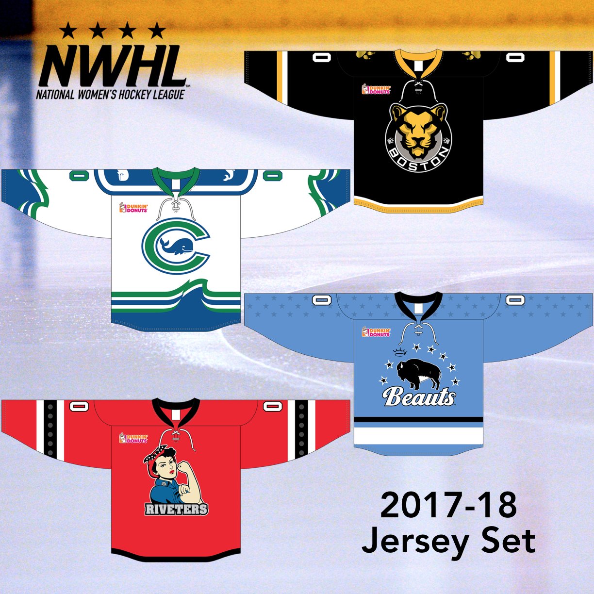
(via NWHL official Twitter)
Fist up is the defending NWHL champion Buffalo Beauts:
(Via Buffalo Beauts official Facebook)
Connecticut Whale:
(via @alyssastweeting on Twitter)
The Whale bring back the wave pattern from their inaugural blue jerseys and introduce a white jersey, Leaving Buffalo as the only team yet to wear white (Riveters 2015-16, Pride 2016-17). Also new is their shoulder logo, featuring the standalone Whale found in the main crest. That logo replaces the vertical CTW script they previously had on their shoulder. Also the Whale and the Pride will be the only teams featuring alternate logos on their jerseys, and unlike in years past, they will be on BOTH shoulders, instead of all teams having one shoulder logo and the flag of the player's home country. Numbers will be green with a blue outline, and a blue colored nameplate.
Boston Pride:
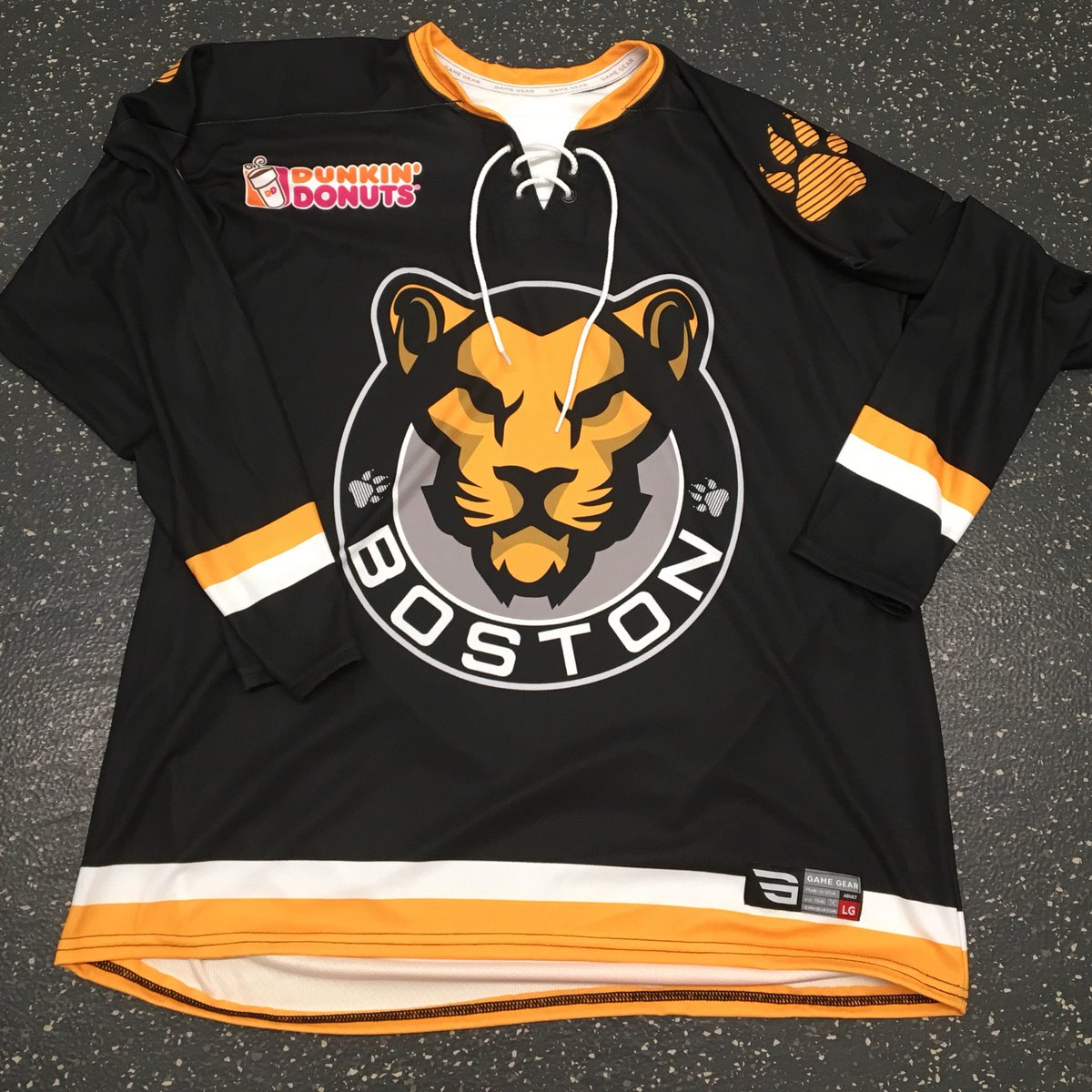
(via Boston Pride official Twitter)
The Pride's bold new logo, discussed here on HJC a while ago, is featured front and center with the paw prints, seen at each end of the wordmark portion of the primary logo, are recolored and placed on the shoulders. The striping is simple and quite low. Some photos of the jersey in action have caused the stripes to be hidden. The numbers and numbers will be solid white. Sock striping matches the sleeve pattern, though higher up and thicker so as not to be hidden by a player's skate.
Metropolitan Riveters:
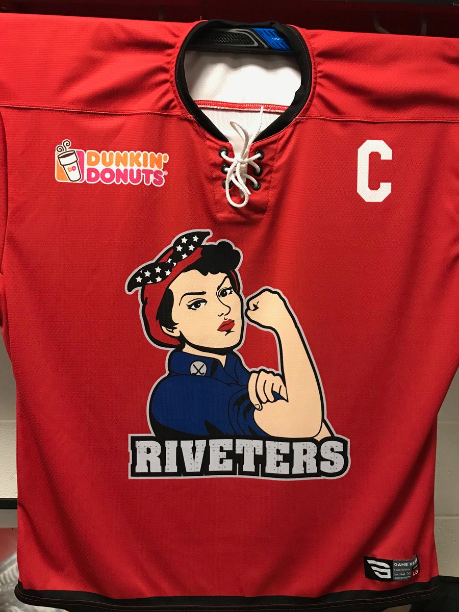
(via Metropolitan Riveters official Twitter)
With the NHL's New Jersey Devils entering into a historic partnership with the Riveters, the newly renamed Metropolitan Riveters updated their look, trading navy for black. Gone is the background of the logo, and new is more metallic detail in the wordmark below Rosie Riveter, including small black rivets and seams of metal plates fitted together. The striping is similar to the Devils' pre-Adidas look on the sleeves, with silver rivets in the striping, as has become the Riveters trademark look. The hem of the jersey is black similar to the new Devils jerseys. Sock striping is identical to the sleeve pattern.
In my opinion the only team that nailed this year's jerseys was Connecticut. The Riveters disappointed me, as their jerseys last year were top notch, and even better before then. Boston's striping is too low for it not to look like a practice jersey. Their inaugural yellow jerseys were the best they've had, though their matching whites from last year were good too. Buffalo has never had a good jersey in my opinion. And Connecticut's jerseys this year improve upon their inaugural jerseys with the matching white jersey.
What do you think? Who nailed their new looks? Who disappointed you? Comment below. And for those of you in the New York Metropolitan Area, October 28th will feature a historic game for the Riveters as they take on the Pride at Prudential Center at 1 PM, instead of their usual home at Barnabas Health Hockey House, the Devils' practice facility adjacent to the Rock. This game will be treated as a doubleheader with the Riveters and the Devils, who take on the Coyotes at the Rock at 7 PM that night. Visit NWHL.zone for more information.
Third Season, Third Year of New NWHL Jerseys
![]() Reviewed by Unknown
on
October 20, 2017
Rating:
Reviewed by Unknown
on
October 20, 2017
Rating:


1 comment:
Connecticut looks gorgeous. Easily the best of the four.
Post a Comment