Tuesday: Halloween Pregame Party
Happy Halloween! Before your nightly festivities of choice commence, let's pregame with our 3 concepts in today's post.
But first, let's start with our LA Kings contest. We've had three entries since yesterday:
Avi S.
Vaughn R.- AJHL 2018 All-Star Game
But first, let's start with our LA Kings contest. We've had three entries since yesterday:
Avi S.
Stephane S.
Jordan R.
Looks good! The Kings have been in a Halloween-festive mood all month, posting a scary good record. But do their threads match their level of success? Think you can do better? Send us your best by Friday at noon!
COTW Oct 20-26 vote (ends Friday @ noon EST)
LA Kings ReDesign Comp entries (due Friday @ noon EST)
On to our daily concepts!
___________________________________________________________________________________
Joe D.- Dallas Stars
Joe starts us off in the Lone Star State with an alternate for Dallas. In keeping with the Halloween theme, the "grey for grey's sake trend" belongs in a graveyard. What makes it particularly gruesome for Dallas is the shading in the primary logo are getting drowned out, not acting as the highlight it should. The color balance is thrown off even worse by the green. There's so little of it, it's questionable why it's there at all. The other jersey elements seem to be working against each other. The numbers on the back, TV numbers, and stars on the arms don't have the outlines the sleeve stripes do, and together they're quite awkward. The solid black equipment was probably the best way to handle it, as it best complements what's going on with the jersey.
Grade: D+
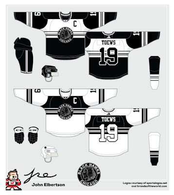
John E.- Chicago Blackhawks
John's Blackhawks concept ditches the red for a scheme Wednesday Adams would approve. While I think the Hawks look better with red, I'm glad you totally committed to its removal and didn't try to throw it in "just because." The dual scheme is creating a problem at the logo, however. A thicker white outline around the edges would keep the logo from retreating in to the black elements behind it, much like how you handled the numbers on the back. The block of white on the black jersey is creating a massive imbalance. There's no other equal element of importance, and it's not an important enough element to justify having that much attention drawn there. It's not as much an issue on the white, where the pants would balance the look out. The equipment was well designed, which always improves a concept. Overall, this is a good take on bringing creativity into a traditional look.
Grade: C+
Vaughn R.- AJHL 2018 All-Star Game
Vaughn wraps up our pregame party with an All-Star game for the juniors league of Alberta. This concept is missing a plethora of citations; you need to credit where the team logos, provincial flag, and sponsor logo are from. The AJHL main logo is fine, but these smaller ones you can't leave up in the air. I'm also at a lack of understanding as to why the jerseys are so similar; it seems that you couldn't commit to either making unique looks or making color inverses of the other. They're not bad designs, but they're mundane, unsure if they're color inverts or unique, and worst of all, using uncredited images.
Grade: F
That's it for today's Halloween special. Enjoy the rest of the holiday, and keep your stick on the ice.
Tuesday: Halloween Pregame Party
 Reviewed by Ben Shaffer
on
October 31, 2017
Rating:
 Reviewed by Ben Shaffer
on
October 31, 2017
Rating:


No comments:
Post a Comment