
Friday: Birds, Bison, and... Big Things?
Hey y'all, and welcome to another Friday post here at HJC. In a bit of semi- hockey jersey news, the Los Angeles Dodgers have announced that next Saturday, August 25, they will be giving away special fan jerseys for their LA Kings night.


This jersey seems to be based off of the Kings' 50th anniversary alternates from two seasons ago, with the grey base and double black striping on the arms paired with a single stripe on the hem. I have to say, as far as the Kings are concerned, this is probably the best route that the Dodgers could have gone, as this design lends itself to a baseball jersey far more easily than anything the Kings have ever worn. As far as crossover jerseys go, I'm usually more of a fan of hockey taking the guise of other sports, but given that this is merely a fan giveaway, I think that it actually works well and is a good way for the Dodgers to pay the Kings back for the Dodger Appreciation Night warmups that they wore four years ago.
In voting news, we have the regular COTW vote for August 10-16, with polls closing Friday at noon EDT.
COTW August 10-16 vote (ends Friday @ noon EDT)
Jersey Nerds Podcast (New episode every Monday)
-----------------------------------------------
Now on to today's concepts!
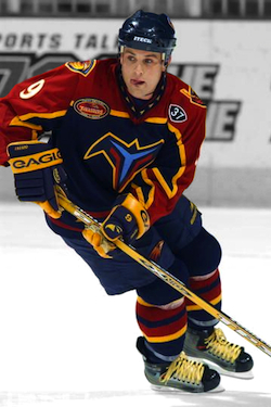
Burkus Circus- Atlanta Thrashers

Our first concept of the day is Burkus Circus' design for my dearly beloved, dearly departed, Atlanta Thrashers. If there's one thing that can be said about the Thrashers, it's that they were never afraid of unorthodox jersey designs. Burkus continues that trend with this unique design for the Thrashers. The arm design seems to be inspired by the baby blue jerseys, but without the text and utilized on both arms. Without the text and with it not extending all the way up, I think it loses a lot of the charm of that jersey. That one got a lot of flack, but also a lot of love because it was unique. This one just looks like a full length yoke design that just stops abruptly at the shoulders. The hem stripe does a good job of mirroring the arm striping design, but it's strange to see the Thrashers use a hem stripe without their trademark beak design on the hem. The font choice is okay, but the Thrashers had such an iconic font that it's hard to see why anyone would pick a different one. I like what Burkus did with the back of the collar matching the striping, but I wish he'd extended it all the way around. I do like the new personal logo, though, it's a lot sharper than his old one. Final verdict: I still believe in Blueland, but I don't believe in these jerseys. 7/10
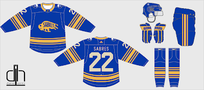
Dan H.- Buffalo Sabres

Next up is Dan H. with a design for the Buffalo Sabres. I really like the alternate logo from last year's Winter Classic, and definitely think that it could be utilized as a main crest on an alternate. I like the striping on the hem based off of the original Buffalo design, but the extra stripes on the arms and socks don't really do it for me. It's like a mashup of the original and current striping pattern, but it ends up just being a little too busy. The numbers on the back look a little too big, and the choice of vintage white while the logos use just white muddles up the design. As for execution, there's a lot to be desired. The shoulder patches are too far forward on the front of the jersey, and the inside of the back of the jersey should be filled in. The rear hem stripe almost matches the curve of the hem, but doesn't, which is almost more frustrating than if no attempt had been made. Finally, I'm not quite sure what Dan is using to fill in his concepts, but it ands up with a lot of loose pixels and just looks a little sloppy. Final verdict: an okay design, but execution really drags this one down. 5.5/10
Jay S.- Tennessee Titans

Our next concept is Jay S.'s design for the Tennessee Titans. Once again, with my own NFL series in the works, I know how difficult it is to design for some of these teams, so I commend you for your attempt. I really like the use of the three stars from the Tennessee flag in the striping, it's a clever way to work in the team's identity into the striping. The minimal color blocking below that is a good call, as the stars should be the main focal point of the striping pattern. I like the hem design for both jerseys, but I wish you'd picked one and stuck with it, especially since the arm striping is consistent and the baby blue on the away sort of throws off the color balance. I like the lighter blue yoke on the home jersey, as well as the yoke stripe, but I wish it had a matching stripe on the back. I'm normally not a fan of italicized numbers, but I think it actually kind of works here. I would have liked to have seen gear with this set, just to get a better idea of the overall look. Once again, the Adidas branding on the Edge template confuses me, given that the Adizero template is readily available nowadays. Final verdict: a good looking design for the Titans, and a solid entry in this series. 8/10 and my COTW NOMINEE!!!!!
Noah B.- Anaheim Ducks

Our final concept of the day is Noah B.'s fix for the Ducks' new alternate. Here, Noah eliminated the yoke, ditched the tie down and shoulder patch, and used the original logo coloring. It's definitely an improvement, but doesn't really have the kind of creativity that we've come to expect from Noah. Final verdict: a better option for the Ducks, but with your talent you could be doing so much more. 5/10
That's all for me this week, see y'all next Friday!!!!!
Friday: Birds, Bison, and... Big Things?
 Reviewed by TC Moore
on
August 17, 2018
Rating:
Reviewed by TC Moore
on
August 17, 2018
Rating:
Reviewed by TC Moore
on
August 17, 2018
Rating:


1 comment:
I'll 2nd Jay S for COTW
Post a Comment