
Monday: Red Black Baron
Welcome to the Monday post!
Congrats to Jeff T. on winning the HJC Open!
This week's voting is simple enough, with the COTW vote going on until Friday at noon EST as per usual that can be done on the side of the blog.
Furthermore we are hosting our first straight up design competition in almost a month, it is the Michigan Wolverines Redesign JUST FOR FUN (cannot emphasize that enough) competition. Submit your designs to the HJC Contest email (hjccontest@gmail.com) and show us what you think the definition of classic NCAA teams should wear. Also if any OSU fans submit a photo of a turd or something, that will be counted as your entry.
Click the contest page on the side or above in the tab to learn the rules and have your entries in!
On with today's concepts!
New Jersey Devils Concept (By: Dan H.)

With New Jersey shedding their classic jerseys, why not break the alternate virgintiy with a long awaited black alternate. The striping is similar to their classic striping, but with the yoke and hem piping closer to Adidas style jerseys. The muted red New Jersey uses looks really good against the black, and the addition of mainly red gloves looks awesome! The one issue I have with this jersey comes from the numbers and NOB. The NOB is hard to read in between the red numbers and red yoke. The logo has enough white in it I think making the NOB white isn't a bad idea. I would keep the numbers red, but white may be more legible.
8/10
Cleveland Barons Concepts (By: BurkusCircus)
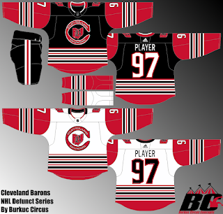
We just discussed the relatively good looking jerseys the NHL Barons wore in their two seasons in the pros (which you can hear on the Podcast), but this does beg the questions, what would the Barons look like in the Adidas era? For one, Burkus switches the main colour from red to black, introduces an early Sabres or classic Leafs sock stripe style pattern, with Detroit style arms and Colmbus's numbers. I like much of this, but there are several design choices I question. For one the jerseys look identical with the main body being swapped from black to white. I'm not a fan of designs like this, as the colour balancing is thrown off greatly and there not being enough black on the white jersey to really balance. Don't get be wrong it doesn't look bad but it irks me a bit. The hem stripes might be a bit thick, but my next main concern is the socks on the black jersey, I get what Burkus is going for, but making them all red would only work if only the cuffs and hem were red and not the upper arms too. The pants don't have enough black for that to really work. I will say though the logo choice and the use of Columbus's numbers work really well here.
7.5/10
Cherepovets Severstal KHL Concept (By: John E.)

Up until today, I only knew this team as "the guys with the flames and the rounded triangle logo. However the team is known as the Steelmen or Steelers depending on who you ask, but a black and yellow colour scheme fits this team way better. the striping you could call a mix of Eastern Europe, Pittsburgh and Anaheim, and overall it works really well. The squared off numbers lend themselves well to being industrial looking, as does that primary logo. The jerseys overall have a really nice squared off industrial feel to them. The script on eh pants only adds to that, as does the usual primary done in all black where the TV numbers normal are but instead on the shoulders. One thing that might hurt this jersey is how simple the logo is, and of course I respect it is an original design, but in order for it to really work it would need some refining (no pun intended)
9/10 COTW Nom from me!
Seattle Seahawks NFL Crossover Concepts (By: Jay S.)

I really like how Jay connects Seattle's famous logo tailing to the jersey, with a one sided chest stripe similar to what Pittsburgh did in the 90s with that classic alternate. The curved up parts on the arms match the pattern seen on Minnesota's jerseys, but not that of Seattle. Instead I think this was done to work a pattern in that would work better with the logo than the very football centric design of Seattle. The numbers look good but again they aren't Seattle's numbers, they are either Vancouver or San Jose's, point being that while they don't look bad, they don't pull the crossover look off particularly well. Finally, there's the lack of Neon Green, which truthfully wouldn't bother me too much on the white, but the main colour of a Seattle navy jersey for the past 6 years has been great and neon, no white.
6.5/10
Congrats to Jeff T. on winning the HJC Open!
This week's voting is simple enough, with the COTW vote going on until Friday at noon EST as per usual that can be done on the side of the blog.
Furthermore we are hosting our first straight up design competition in almost a month, it is the Michigan Wolverines Redesign JUST FOR FUN (cannot emphasize that enough) competition. Submit your designs to the HJC Contest email (hjccontest@gmail.com) and show us what you think the definition of classic NCAA teams should wear. Also if any OSU fans submit a photo of a turd or something, that will be counted as your entry.
Click the contest page on the side or above in the tab to learn the rules and have your entries in!
COTW August 10-16 vote (ends Friday @ noon ET)
Michigan Wolverines Competition Entry Phase (Ends August 31st @Noon EST)
Jersey Nerds Podcast (new episode every Monday)
On with today's concepts!
---------------------------------------------------------------
New Jersey Devils Concept (By: Dan H.)

With New Jersey shedding their classic jerseys, why not break the alternate virgintiy with a long awaited black alternate. The striping is similar to their classic striping, but with the yoke and hem piping closer to Adidas style jerseys. The muted red New Jersey uses looks really good against the black, and the addition of mainly red gloves looks awesome! The one issue I have with this jersey comes from the numbers and NOB. The NOB is hard to read in between the red numbers and red yoke. The logo has enough white in it I think making the NOB white isn't a bad idea. I would keep the numbers red, but white may be more legible.
8/10
Cleveland Barons Concepts (By: BurkusCircus)

We just discussed the relatively good looking jerseys the NHL Barons wore in their two seasons in the pros (which you can hear on the Podcast), but this does beg the questions, what would the Barons look like in the Adidas era? For one, Burkus switches the main colour from red to black, introduces an early Sabres or classic Leafs sock stripe style pattern, with Detroit style arms and Colmbus's numbers. I like much of this, but there are several design choices I question. For one the jerseys look identical with the main body being swapped from black to white. I'm not a fan of designs like this, as the colour balancing is thrown off greatly and there not being enough black on the white jersey to really balance. Don't get be wrong it doesn't look bad but it irks me a bit. The hem stripes might be a bit thick, but my next main concern is the socks on the black jersey, I get what Burkus is going for, but making them all red would only work if only the cuffs and hem were red and not the upper arms too. The pants don't have enough black for that to really work. I will say though the logo choice and the use of Columbus's numbers work really well here.
7.5/10
Cherepovets Severstal KHL Concept (By: John E.)

Up until today, I only knew this team as "the guys with the flames and the rounded triangle logo. However the team is known as the Steelmen or Steelers depending on who you ask, but a black and yellow colour scheme fits this team way better. the striping you could call a mix of Eastern Europe, Pittsburgh and Anaheim, and overall it works really well. The squared off numbers lend themselves well to being industrial looking, as does that primary logo. The jerseys overall have a really nice squared off industrial feel to them. The script on eh pants only adds to that, as does the usual primary done in all black where the TV numbers normal are but instead on the shoulders. One thing that might hurt this jersey is how simple the logo is, and of course I respect it is an original design, but in order for it to really work it would need some refining (no pun intended)
9/10 COTW Nom from me!
Seattle Seahawks NFL Crossover Concepts (By: Jay S.)

I really like how Jay connects Seattle's famous logo tailing to the jersey, with a one sided chest stripe similar to what Pittsburgh did in the 90s with that classic alternate. The curved up parts on the arms match the pattern seen on Minnesota's jerseys, but not that of Seattle. Instead I think this was done to work a pattern in that would work better with the logo than the very football centric design of Seattle. The numbers look good but again they aren't Seattle's numbers, they are either Vancouver or San Jose's, point being that while they don't look bad, they don't pull the crossover look off particularly well. Finally, there's the lack of Neon Green, which truthfully wouldn't bother me too much on the white, but the main colour of a Seattle navy jersey for the past 6 years has been great and neon, no white.
6.5/10
---------------------------------------------------------------
Got a concept for us? Send it to concepts@hockeyjerseyconcepts.com
Got a question for the Podcast crew? Stuff it in our mailbag on the side of the blog.
Monday: Red Black Baron
 Reviewed by winnipegjets96
on
August 20, 2018
Rating:
Reviewed by winnipegjets96
on
August 20, 2018
Rating:
Reviewed by winnipegjets96
on
August 20, 2018
Rating:


No comments:
Post a Comment