
Sunday: My Love-Hate Relationship
Hi everybody. Steve back here at his normal Sunday spot. If you saw that our most recent story on the team that's failing to win us over, the Quad City Storm, then you've seen the jerseys. While TC gave my initial reaction of Meh, QC's numerous choices made me wonder why us here at HJC get so mad at them for it.

 Positives: For a baseball team that's been around for over a century, you've done a really good job of keeping the jersey as classic as possible. The Detroit script is really nice on the navy jersey and the Old English D is great on the white jersey.
Negatives: My negatives are that you only made this a two color jersey on both. I'd really like you to use orange as an accent on the white and white for the navy. It would really give these jerseys a ton of improvement in design.
Overall: 7/10
 Positives: Ah yes, the only Philly team that I somewhat tolerate. This is a really nice design you put together. The yoke on each jersey with the Bruins style color looks great as well as the arm striping pattern. Good Job overall.
Negatives: My only negatives are the hem. I wish you would've done more to the hem than just a trim stripe.
Overall: 8/10

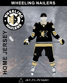 Positives: While there are slight differences to these, I'm going top rope them in the same category just because they are so similar that they could pass as a home and away. On Both jerseys, the half striping actually works well on these. it's not something that's bothersome because you really wouldn't tell watching on the ice. Also, the hem striping works really well and the pants are great. As for the yoke on the Gold jersey, I like that you added that tiny white stripe to break up all that black.
Negatives: The vegas gold numbers with the white boarder are too much light coloring on the jersey. They would blend in together and it would just be a bad thing. Make the numbers one color and you'd be solid. Also, Please show us a back of the jerseys.
Overall: 8.5/10 COTW NOMINEE


Maybe it's the fact that we had a close relationship with the QC Mallards that makes us slightly bitter towards these guys. The Mallard brand was a strong brand no matter what league or level the played at. They played with color changes, kept the logo current with the styles throughout the years, and were very supportive of our community and our design ideas for them.
Maybe it's the fact that a team at that level is trying to pass off mediocrity as good enough for a professional team when they had the opportunity to make a great brand. While I can't speak for the rest of the writers, I will say that I miss the mallards and, while I get that the QC Storm is a different team and can do what they want, I just wish the Storm took the time to make a better logo and made there jerseys better.
Congrats to Jeff and Chris on moving to the finals of the HJC Open. You guys have until Monday at noon to get your final concepts in! Also, don't forget to vote for the COTW.
Let's get to the concepts!
Ben S- Detroit Tigers

Negatives: My negatives are that you only made this a two color jersey on both. I'd really like you to use orange as an accent on the white and white for the navy. It would really give these jerseys a ton of improvement in design.
Overall: 7/10
Jay S- Philadelphia Eagles

Negatives: My only negatives are the hem. I wish you would've done more to the hem than just a trim stripe.
Overall: 8/10
Jay S- Wheeling Nailers


Negatives: The vegas gold numbers with the white boarder are too much light coloring on the jersey. They would blend in together and it would just be a bad thing. Make the numbers one color and you'd be solid. Also, Please show us a back of the jerseys.
Overall: 8.5/10 COTW NOMINEE
Jay S- Wheeling Nailers

Positives: I like the tie to the old "Andy Warhol" gradient jerseys. The black to vegas gold looks awesome on the chest and putting to match onto the sleeves was a great idea. Also, the Vegas numbers were a good choice with the black background.
Negatives: This is the big issue with going with the half and half gradient on a jersey. It's fine on the front of the jersey but when you reach the back of the jersey you have to decide how it's going to merge together and, in most cases, it doesn't turn out good. It's a good striping decision you made on this but the fact that you didn't show us how you would do the back of the jersey gives me the thought that you were unsure how to do so.
Overall: 7.5/10
Okay everybody that's all I have this week. Thanks for stopping by and I'll see you all this time next week!
Sunday: My Love-Hate Relationship
 Reviewed by Steve Marc
on
August 12, 2018
Rating:
Reviewed by Steve Marc
on
August 12, 2018
Rating:
Reviewed by Steve Marc
on
August 12, 2018
Rating:


No comments:
Post a Comment