
Friday: Flames and Fauxbacks
Hey y'all, and welcome to another Friday post here at HJC. The other night, it was reported that the Canucks have confirmed that the Spaghetti Skate jersey that they held a fan vote for is not going to be their actual alternate for the 2019-2020 season, because Vancouver has no idea what they're doing.


COO Jeff Stipec has announced that the Spaghetti Skate jersey that handily won the fan vote will not be the Canucks' actual third jersey for the 2019-20 season, which can mean one of two things. Either the Canucks will be using it as a special event, one-and-done jersey, or they will be moving the timetable, either pushing it up to this season or moving it back yet another season. No matter the reason, it begs the question: What the heck was the front office thinking? Why would you build such great fan interaction by allowing them to choose what they think is going to be the alternate for their team, only to dash their hopes by saying you're going to go in another direction with it? The fans have spoken, they want the Spaghetti Skate, and yet you still want to do your own thing? Our regular readers and listeners of the podcast will know that it's no secret that I am not a fan of the Canucks' ownership group, whose ineptitude I find is only matched by their self-serving nature, and this move doesn't really do much to help their case in my eyes. They had such a good thing going, and then decided to throw it all away because they wanted to make their own design, relegating the fan favorite to a special event jersey rather than the alternate that the fans so desperately want. The only solace I can find in this is that the hockey gods seem to agree with me, and have relegated the Canucks to a lifetime of mediocrity as penance for their crimes.
In voting news, we have the regular COTW vote for August 17-23, with polls closing Friday at noon EDT. We are also in the middle of the Michigan Wolverines ReDesign Competition, so be sure to get your entries in before Friday at noon EDT.
COTW August 17-23 vote (ends Friday @ noon EDT)
Michigan ReDesign Competition (entries due Friday @ noon EDT)
Jersey Nerds Podcast (new episode every Monday)
----------------------------------------
Now on to today's concepts!
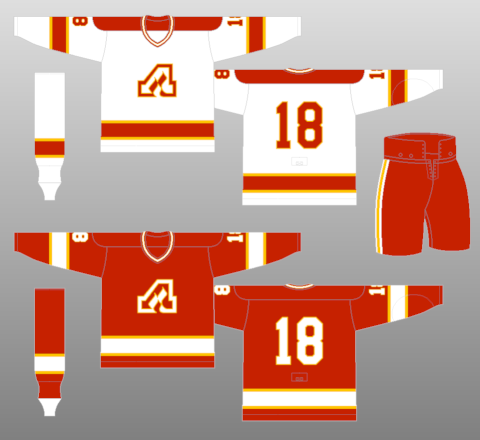
Burkus Circus- Atlanta Flames

Our first concept of the day is Burkus Circus' latest design in his Defunct NHL Series, this one for the late Atlanta Flames. As anyone who listened to the last podcast knows, while I am the only remaining Thrashers fan, there are still plenty of people who wear Atlanta Flames gear around town, and that's due to the more iconic look of the Flames. I like that Burkus stayed true to the Flames here, using that classic Flaming A logo and the simple red, white, and yellow color scheme. The only issue with that is that he falls more towards the original Flames set, where yellow-on-white syndrome was more of an issue, and if anything, the thinner stripes here make it worse. I like the idea of the flame rising up in the striping, but I think it might have worked better with just one of the flame designs. As it is now, the second one seems to crowd the numbers, even with them being moved up to the shoulders. Gear looks solid, and I especially like that Burkus fixed the mismatched striping on the breezers. Final verdict: a bold take on the Flames, but it falls a bit short. 7.5/10
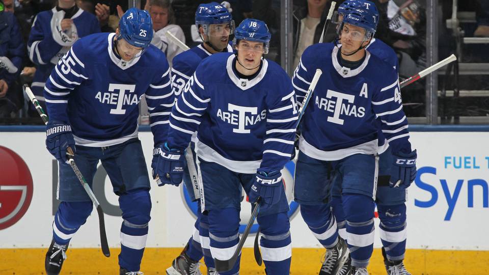
Dan H.- Toronto Maple Leafs

Next up is Dan H. with an alternate design for the Maple Leafs. I have to say, as much as I like this design, it's fairly predictable, as it's just an inversion of the Arenas tributes that they already wear. Additionally, the name and numbers on the back are enormous, just stick with putting names in the name bar and work from there in the future. Same execution errors I always have for Dan. Final verdict: not a bad design, but nothing I haven't seen before. 5/10
Noah B.- Pittsburgh Penguins

Our next concept is Noah B.'s design for the Pittsburgh Penguins. Here, Noah seems to go for a more streamlined look for the Pens while still preserving the upper arm fill on the light jersey, and I have to say that it pays off big time. I love the simplistic striping pattern that looks so different on two jerseys despite being the same basic design. Doubling up the yellow on the arms of the white jersey is a great call, and the single hem stripe actually makes it an exact fit to the hem stripe of the black jersey. As much as I love the Pens' current uniforms, the white jersey leaves an ambiguous answer to whether black or yellow is the primary color, and this set fixes that. There is no doubt here that black is the dominant color. Final verdict: an elegant, simple, and yet somehow also complex, design that I would love to see the Pens adopt. 9/10 and my COTW NOMINEE!!!!!
Sook- BC Rail

Our final entry of the day is Sook's design for BC Rail. Now I know I've been with the site too long, as we've now had multiple artists choose series based on railroad lines. Sook chooses a simple full body color blocking scheme here that fits relatively well with the logo. The split color numbers are a little confusing at first, but I think with a white outline they could actually work pretty well as a solution to the color blocking issue. That being said, the name and numbers are way too small on the body and arms, they'd be nearly indistinguishable on the ice. I really like the research that went into this project, I love to see people put a lot of time and effort into creating a design, so kudos for that. Finally, I would have liked to have seen the gear for this set, as that can really make or break a set.
Final verdict: an interesting design, and I like the idea behind it, but execution holds this one back 7/10
That's all for me this week, see y'all next Friday!
Friday: Flames and Fauxbacks
 Reviewed by TC Moore
on
August 24, 2018
Rating:
Reviewed by TC Moore
on
August 24, 2018
Rating:
Reviewed by TC Moore
on
August 24, 2018
Rating:


No comments:
Post a Comment