
Monday: Civic Concepts For Civic Holiday
Welcome to the Monday post!
Happy Civic Holiday to all Canadians!
If you haven't already, listen to episode 42 of the Jersey Nerds Podcast, powered by yours truly at HJC. We discussed the Growlers' jerseys, made our no trade lists based solely on jerseys, and the usual goodies with Ryan, TC, and I having a grand ol' time! Remember that we have been approved and have uploaded by all episodes up to episode 14 on Spotify.
Congrats to Jeff, Avi, Lucas, and Chris, who moved on to the HJC Open Semi Finals! The guys have their entries in, and look out for the voting page to open up again. Good luck!
We also have the usual COTW vote, due as always until Friday @ Noon EST!
On with today's 4 concepts!


Happy Civic Holiday to all Canadians!
If you haven't already, listen to episode 42 of the Jersey Nerds Podcast, powered by yours truly at HJC. We discussed the Growlers' jerseys, made our no trade lists based solely on jerseys, and the usual goodies with Ryan, TC, and I having a grand ol' time! Remember that we have been approved and have uploaded by all episodes up to episode 14 on Spotify.
Congrats to Jeff, Avi, Lucas, and Chris, who moved on to the HJC Open Semi Finals! The guys have their entries in, and look out for the voting page to open up again. Good luck!
We also have the usual COTW vote, due as always until Friday @ Noon EST!
COTW July 27 - August 2 vote (ends Friday @ noon ET)
HJC Open Semi-Finals entries (due Monday @ noon ET)
HJC Open Semi-Finals vote (Tuesday - Friday @ noon ET)
Jersey Nerds Podcast (new episode every Monday)
On with today's 4 concepts!
----------------------------------------------------------------
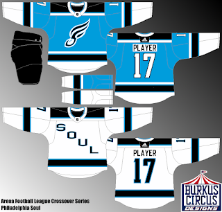
Philadelphia Soul AFL Concepts (By: BurkusCircus)

Being one of the three original AFL franchise pre-shutdown left, John Bon Jovi's Soul have a solid identity that if the AFL ever went under, I hope another league picks it up. The colour scheme and even the logos work well on a hockey jersey, perhaps more so with the script jersey, I love how the S resembles a stunted football. The striping is okay, I'm not a huge fan of the idea of "let's have both jerseys with the same pattern but because of the main colour of the jersey, and here the white jersey I think you can make a solid set around with the blue as an alternate. I'm not sure if this is an AFL/NHL crossover that the NHL shield of the AFL logo should be in the collar insert, but I might prefer neither. Also a shoulder patch or arm logo might make these a bit more interesting.
7/10
Toronto Maple Leafs Comic Sans Logo (By: BPoe)
I won't go into much reviewing this, it' s supposed to be funny, and it really is. A team whose font is huge part of their identity having it stripped for something notoriously immature, I love it!
fun/10
Moscow Migs Concepts (By: Jordan R.)

Call them the Flyers of the Fictional Soviet League, because this is PEAK 1970s. The striping itself is very simple, but the red stars and colour scheme on the arms look perfect for the era and even today would work as a throwback in the KHL. The custom logo is fantastic! Does the job well and is a simple, dare I say utilitarian identity. The presentation is fantastic! I have a large amount of early 1970s hockey cards, namely O Pee Chee 1969-70 to 1972-73! I love every part of this, especially the player models. If you did this as a Maritime Hockey League for Nova Scotia, you'd have COTW noms on every concept, and as is, this will get mine!
9/10 COTW Nom from me!
Maine Mariners ECHL Concepts (By: Jay S.)


As is, Maine has...okay jerseys, however, these are a vast improvement. Similar to Jordan's concept about the presentation is fantastic, though I do wish both concepts were on the same image. The striping is fantastic, particularly the not so subtle curve to the arms and the angle of the hem wave. The sock stripes are a little odd, reminds me of the Thrashers motocross socks. I like the classic yoke and the phantom laces, and the Hartford recoloured patch. I do wish the pentagon logo was still in the collar insert or on the top of the curves. Also would like to see some silver on both jerseys, but mainly the navy one.
8/10
----------------------------------------------------------------
Monday: Civic Concepts For Civic Holiday
 Reviewed by winnipegjets96
on
August 06, 2018
Rating:
Reviewed by winnipegjets96
on
August 06, 2018
Rating:
Reviewed by winnipegjets96
on
August 06, 2018
Rating:


No comments:
Post a Comment