
Monday: August Thanksgiving Classic
Welcome to the Non-Thanksgiving Thanksgiving post!
You'll see why I called it that in a moment, but first let's go through the voting reminders
We're also recording a podcast tonight! So get your questions into the mailbag, and listen to last week's so you stay all caught up on the latest inside jokes, black jerseys, memes, and fence sitting.
On with today's 4 concepts!


You'll see why I called it that in a moment, but first let's go through the voting reminders
COTW August 3-9 vote (ends Friday @ noon EDT)
COTW July vote (ends Friday @ noon EDT)
HJC Open Finals (entries due Monday @ noon EDT)
HJC Open Finals vote (ends Friday @ noon EDT)
We're also recording a podcast tonight! So get your questions into the mailbag, and listen to last week's so you stay all caught up on the latest inside jokes, black jerseys, memes, and fence sitting.
On with today's 4 concepts!
--------------------------------------------------------------------------
Washington Redskins NFL-NHL Crossover Concepts (By: Jay S.)

I for one love the colour scheme of the Redskins, and when they want to, using the spears and feathers that they did in the mid 1960s. The home reminds me of what the team wore under Mark Brunell and Jason Campbell, with less of the classic yellow and more white. The away uses a pretty sweet arrow pattern, on that the team hasn't used in any form since the pre-AFL merger days. I would like to see more maroon on the the white jersey, and a look at the gear, as when the 'Skins entered the RGIII-McCoy-Cousins era and now the Alex Smith era, they've opted for the Super Bowl winning yellow pants; something I really like!
8/10
Nashville Predators Concepts (By: BurkusCircus)

There are quite a few things to like this concept. The biggest part of it is the triangle behind the logo, something from the original Preds look I really like. The yoke is done much better here, and more importantly the colour balancing is. Despite there being less actual blue on the yellow jersey, this does a better job of the "working the colour balancing into the whole look" jersey, whiles still looking good on its own. The shoulder patch looks solid and thankfully on both shoulders. The numbers look decent here, but I would have liked to see white numbers on the home jersey.
8.5/10
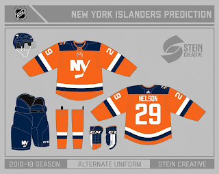
New York Islanders Concept (By: Avi S.)

HJC Open semifinalist and HJC Super-Veteran Avi brings us an orange Islanders alternate that does something I thought not possible- making it subtle. The striping is simple, the yoke is simple, the numbers are simple, and even the logo is simpler. The thing about it though is it isn't boring. There's nothing here that makes me surprised like the original orange alternate, but nothing that makes the jersey rely on being patched up like the 2nd black alternate. It's a solid jersey, with the best parts of the BKLN alternate being carried over. One thing that would be nice to see would be some navy on the logos and maybe the numbers? Obviously not a lot but enough to make it noticeable.
9/10 COTW Nom from me!
Detroit Lions Concepts (By: Ben S.)

Okay so here's something I like, the Lions Columbia blue and grey together. While the team has dropped black, Ben keeps it and to me, at least on a home jersey it really works better. I like the grey sleeves tying in the Red Wings to the Lions, but I would have preferred the sleeves on the white jersey be blue. i will say I love the shoulder numbers and the arched script over the logo in the newer Lions font. Solid crossover with lots of litter detailed for hardcore design fans.
8/10
Got a concept for us? Send to us concepts@hockeyjerseyconcepts.com
Monday: August Thanksgiving Classic
 Reviewed by winnipegjets96
on
August 13, 2018
Rating:
Reviewed by winnipegjets96
on
August 13, 2018
Rating:
Reviewed by winnipegjets96
on
August 13, 2018
Rating:


No comments:
Post a Comment