
Friday: A Series of Series
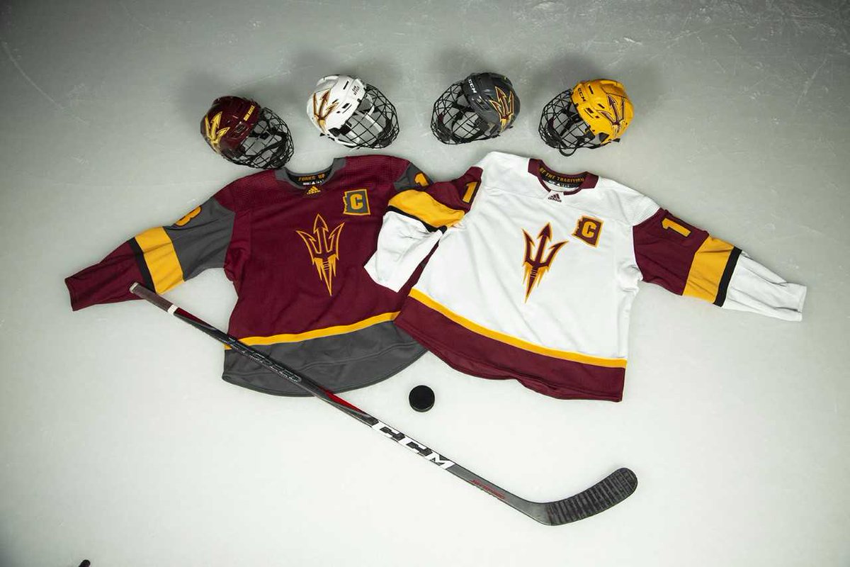
Hey y'all, and welcome to another Friday post here at HJC. Last night, we got a look at the new uniforms for the only NCAA D-I team in the Southwest, the Arizona State Sun Devils.


Twitter
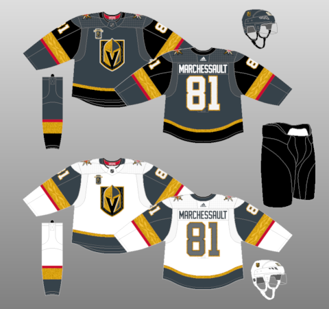
The Sun Devils seem to be capitalizing on the success of another desert based team, the Vegas Golden Knights, by adopting their uniform template in the Sun Devils' traditional maroon and gold. I actually kind of like the white jersey, it has a nice use of the team's great color scheme, as the maroon takes precedence over the striking gold, which I think is still bold enough to avoid the dreaded yellow-on-white syndrome on the hem. I will say, however, that this design shows me how crucial the Golden Knight's golden leaf pattern in the striping is, as the design looks a little plain without something to liven up that big stripe. The maroon jersey, on the other hand, is kind of a mess. It follows the same template, but inexplicably thrusts grey into the secondary color slot, despite the fact that it is completely absent from the other jersey. My best guess is that they wanted to draw further comparisons to the Golden Knights, because there is no real reason to add yet another color to the already busy palette. The football team has tried using grey in previous years, but at least then it was used as an alternate uniform and it is still absent on the main set. The best way I can think to fix this jersey is to make the upper arm gold, the big stripe black, and the bottom thinner stripe white. This fixes both the grey issue and the problem of the black stripe blending in with the maroon too much. I like the trident logo as a primary, and I love the Arizona state outline captain's patch, but I would have liked to have seen a shoulder patch of some sort. Most likely they would have to use the interlocking AS logo, but I would have loved to have seen the return of Sparky. Overall, I would say it's a step in the right direction, as the return to maroon is much better than their previous black jerseys, but there's still a long way to go.
In voting news, we have the regular COTW vote for July 27-August 3, with polls closing Friday at noon EDT. We are also heading into the Semifinal round of the HJC Open, so advancing entrants be sure to get your designs for the next round in by Monday at noon EDT, because voting starts on Tuesday and runs through Friday at noon EDT.
HJC Open Semifinal entries (due Monday @ noon EDT)
HJC Open Semifinal Vote (ends Friday @ noon EDT)
COTW July 27- Aug 3 vote (ends Friday @ noon EDT)
Jersey Nerds Podcast (new episode every Monday)
-------------------------------------------
Now on to today's concepts!
Brendan P.- Ottawa Senators

Our first design of the day is Brendan P.'s Ottawa Senators entry in his Comic Sans series. Once again, a great use of a comical font to lampoon a team's logo, and I think this is another solid entry into this series.
Jordan R.- Kiev Tridents

Our next concept is Jordan R.'s latest entry in his fictional ISHF series, coming in this time with a design for the Kiev Tridents. I have to say, I have loved this series, the presentation is spectacularly unique and looks exactly like an ad I would expect to see in a Soviet era hockey magazine. The choice of the name Tridents for the Ukrainian team is a great choice, and the logo looks fantastic. The Blues-esque color scheme looks great, and the simple striping with the dark cuff and hem on both jerseys works really well. I will say that I'm glad you included pictures of the jerseys in the corner, as I 'm not really a fan of how this template portrays the jersey, it tend to cut off the hem stripe. Final verdict: a great entry in a fantastic series, keep up the good work. 9/10
Noah B.- Northwest Territories

Next up is Noah B. with the long awaited latest entry in his Canadian Province series, this one for team Northwest Territories. I've got to say, what Noah has done here with that chest stripe is spectacular, it really gives the feeling of looking out over a mountain range and uses the negative space of the jersey wonderfully. The number treatment on the back works well too, he gives it just enough space that it should be distinguishable from the striping. The use of the coat of arms for the main logo is the obvious choice, and the elimination of the crest at the top is the right call, using just the escutcheon makes it a stronger, more viable hockey logo. Final verdict: a great entry in a great series, and one of the best uses of negative space that I've ever seen on this site. 9.5/10 and my COTW NOMINEE!!!!!
Phil B.- Semiahmoo Ravens

Our final concept of the day comes to us from our very own Phil B., who has sent us his design for the Semiahmoo Ravens peewee team. I really like the raven as the main crest rather than the roundel logo, and it works surprisingly well without an outline on the white jersey. I also like the use of orange as the base rather than black, as it pops a lot better. The yoke striping looks good, but I think the striping on the rest of the jersey is a little too bulky. Numbers, gear, and presentation are all good. Final verdict: a decent design, but the thick striping kind of kills it for me. 7/10
That's all for me this week, see y'all next Friday!
Friday: A Series of Series
 Reviewed by TC Moore
on
August 03, 2018
Rating:
Reviewed by TC Moore
on
August 03, 2018
Rating:
Reviewed by TC Moore
on
August 03, 2018
Rating:


1 comment:
Second Noah B's NW for COTW.
Post a Comment