NWHL Newcomers Unveil New Logo
The Minnesota Whitecaps have unveiled a new logo for their inaugural season in the National Women's Hockey League.
(via The Ice Garden on SB Nation)
A nice logo what uses waves to shape the letter M, standing for Minnesota. In case you didn't get that, it says Minnesota in the bottom part of the circle formed by the trail end of the wavy "M".
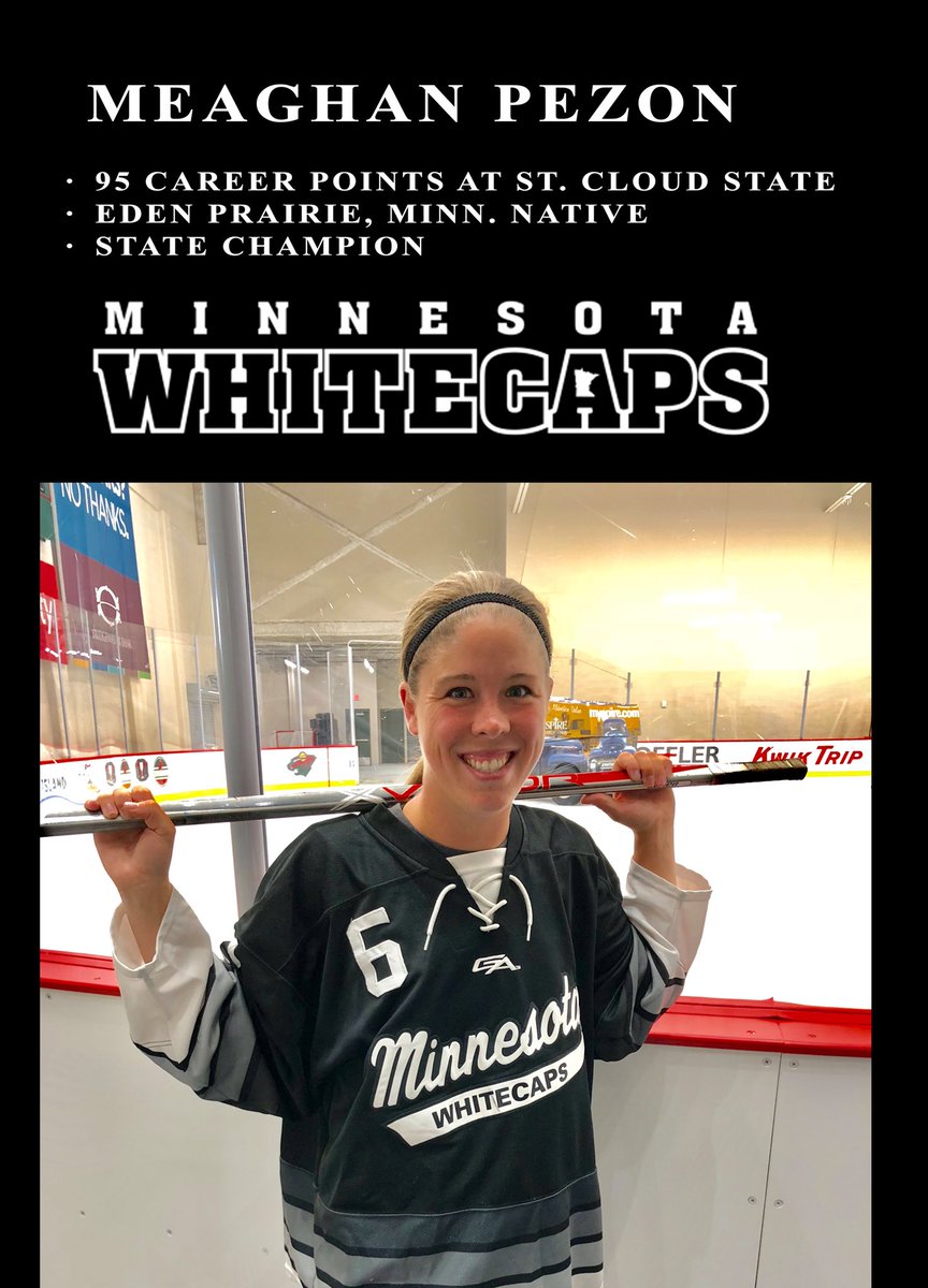
The Whitecaps had a logo that predates the NWHL, as they previously played as an independent women's hockey team, as well as the Western Women's Hockey League, which folded in 2011. The logos were both script logos and can be seen here:

(via @WhitecapsHockey on Twitter)
One of them is a more traditional baseball-like script logo, as seen on the jersey, and the other is block lettering with the shape of Minnesota in the "A". So clearly having a crest like this is an improvement. How much of one? That is still to be seen when the jerseys get unveiled, alongide the rest of the NWHL, because with this unveiling, don't expect the Boston Pride to keep their black jerseys.
Personally it reminds me of the Music Choice logo, in case bars were too lazy to play their own music so they leave the TVs on and change it to one of their channels and it'll play a certain kind of music. Others have compared it to the Michigan Tourism logo. You be the judge.
NWHL Newcomers Unveil New Logo
![]() Reviewed by Unknown
on
August 21, 2018
Rating:
Reviewed by Unknown
on
August 21, 2018
Rating:

/cdn.vox-cdn.com/uploads/chorus_image/image/60970633/whitecaps_logo.0.jpg)


No comments:
Post a Comment