
Friday: Feel Good Friday
Hey y'all, and welcome to another Friday post here at HJC. As y'all know, we like to talk about hockey on this site, and everybody loves a feel-good story, so we're delighted to report on events where these two intercede. With that being said, I'd like to introduce you to the newest member of the New York Rangers organization.
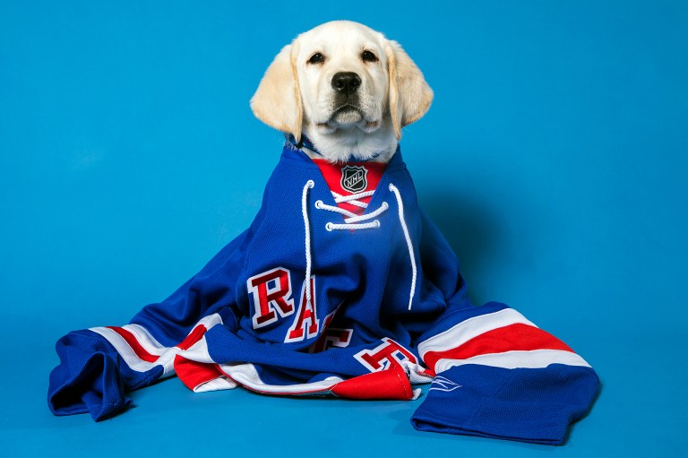


Meet Ranger, a six-month-old yellow lab who will be part of the Rangers organization for one year. Beyond the obvious perks of having an adorable puppy in the locker room, this move has a more poignant purpose. The Rangers have partnered with nonprofit BluePath to train Ranger for his future career as a service dog for a child with autism. The Rangers organization has agreed to care for the pup and provide him all of the training necessary for him to attain certification as a service dog before handing him over to a child who needs him.
Stories like this remind me of why I love the sport of hockey so much. To see a team giving back to those in need warms my heart, especially when their aid is going to help children. I know that there will be naysayers who claim that it's only a PR stunt, that having a cute dog with a twitter account is just a way to garner fan and media attention. Personally, I'm saddened by that kind of cynicism, wherein one can see a charitable act like this and claim that there must be some kind of ulterior motive. One thing can be sure, however, and that is that those naysayers are not hockey fans. True fans of the sport will recognize that this is more than a mere PR stunt, this is the hockey community giving back, something that it has done time after time after time. For many this seems like a great instance of charity on the part of the Rangers, but for true fans, they know it's just part of the game.
In voting news, we have the regular COTW vote for Aug 3-9, as well as the COTW July vote, with both polls closing Friday at noon EDT. We are also heading into the Final Round of the HJC Open, so competitors be sure to get your entries in by Monday at noon EDT and readers be sure to vote by Friday at noon EDT.
COTW August 3-9 vote (ends Friday @ noon EDT)
COTW July vote (ends Friday @ noon EDT)
HJC Open Finals (entries due Monday @ noon EDT)
HJC Open Finals vote (ends Friday @ noon EDT)
-------------------------------------------
Now on to today's concepts!
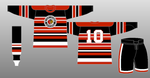
Burkus Circus- 2019 Winter Classic

Our first concept for the day is Burkus Circus' design for the 2019 Winter Classic. Seeing as there are two different teams on this concept, I'll attend to each individually. The Blackhawks jersey seems to be inspired by the design on the jerseys they wore from 1937-1951, adapting the barberpole style to a chest stripe. Burkus has done this quite well, as it does give a nod to the past without being a direct copy of an old design, something I've always liked in a Winter Classic jersey. I like the striping on the yoke, it helps to break up the red of the yoke from the black of the jersey. While I do like the idea of the alternate logo patch in the arm striping, I think it blends in a bit too much and might have worked better if he'd used the alternate coloring of that logo. Gear and numbers look solid, but I would have liked to have seen a helmet choice. The Bruins jersey seems to be based off of their 1926-32 design, but with the brown in the color scheme updated to their current black. While I like the idea behind it, I think this design sort of loses its charm in this color scheme, and as we've seen before, overuse of black and gold stripes tends to make one resemble a bumblebee. I'm also not a fan of the elimination of the bear from the main crest, the numbers make it look more like an amateur team than an NHL special event uniform. Part of the brilliance behind hockey jerseys is their ability to showcase the main logo front and center on the chest, so replacing that with a number kind of defeats the purpose. I like the yoke striping, but cutting it off on the back is one of my biggest pet peeves. Numbers look good, and you did a good job matching the font from the Bruins wordmark, but if you're going with black on the jersey I would use black breezers. The tan pants would only really work if you'd kept the original color scheme. Final verdict: That Blackhawks jersey is great, and I wouldn't mind seeing something similar on the ice, but the Bruins one just falls flat for me. 7.5/10
Chevalier Daniel C. Boyer- Copper County Christian School

Next up is a very... unique concept, coming to us from "contemporary artist" Chevalier Daniel C. Boyer. Via a quick google search, I discovered that Copper County Christian School is a private Christian school in upper Michigan who uses a crimson and white color scheme and a Warrior mascot for their four sports teams (none of which are hockey). Off the bat, I'd say I don't really see anything here that makes me think of the team, as their color scheme isn't used here and there is no logo or wordmark that makes me think "Warriors". Instead, the chevalier appears to use alternating wordmarks on the home and away, with one reading "Demons Murmur" and the other stating "Angels Whisper". The only real logo that I can see is a sort of devil cat, which might explain why there is cat feces smeared at the bottom of this concept. I don't really see much of a striping pattern, but I do like the captain's C patch. Many of you will probably be wondering why we bothered to include this concept, and the reality is simple. It is in our mission statement to post every concept we receive, regardless of our personal feelings about it. That's our policy, and it's part of what makes this site so great. Yes, I know that this entry is unorthodox and most likely satirical. I have no doubt that the artist will show my review to his art buddies and guffaw at the philistine who didn't "pick up on the undertones explaining the frailty and futility of human existence," and I'm okay with that. I don't pretend to know modern art, but to (nearly) quote Senator Lloyd Bentsen, "I know hockey jerseys, hockey jerseys are a friend of mine. Chevalier, that is no hockey jersey." Final Verdict: 0/10
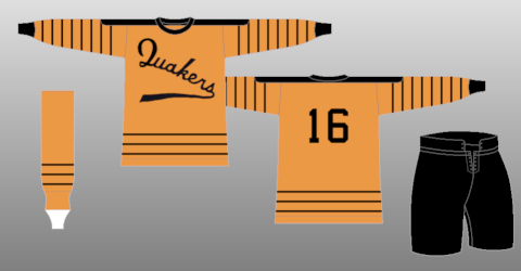
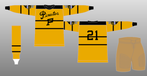
Dan H.- 2019 Stadium Series

Our next concept is Dan H.'s design for the 2019 Stadium Series between the Flyers and the Penguins. The Flyers design seems to be a direct copy of the old Philadelphia Quakers design. I like the idea of a Quakers design for the Flyers, but I think it'd be better suited for a Winter Classic game than a Stadium Series, as the WC is the more throwback appropriate event, while the SS is usually a forum for more modern and futuristic designs. Furthermore, I think there's a better way to eliminate white from the Flyers' logo, it just looks kind of odd here. The Penguins design here seems to be inspired by the original 1925-28 Pittsburgh Pirates design, with a few tweaks here and there. I like the use of the enlarged P logo rather than the P and the Pirates wordmark. I also think that the treatment of the logo and numbers with the chest stripe was done quite well, and the striping pattern looks good with the little update. Once again, though, I feel like this design would work much better as a Winter Classic jersey, especially with the use of vintage white. I think it might have worked as a Stadium Series jersey in white, but that beige gives it an antique feel that makes it an undeniable fauxback. As for execution, I have a few notes for you. The failure to fill in the back of the jersey inside the collar is a glaring mistake, jerseys aren't just blank white on the interior. Same applies for the white on the helmet. Furthermore, the striping on the breezers should stop at the panel above the one you stopped it at, and flipping the second glove is unnecessary, especially since the flip of the original isn't a reflection of how the glove would actually look. Final verdict: good designs, but wrong for the event in question, and execution errors are a killer here. 7/10
Jay S.- New England Patriots

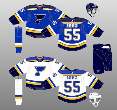
Our final concept of the day is the latest entry in Jay S.'s NFL crossover series, this entry for the New England Patriots. I have to admit, I was a little dismayed to see this series premier, as I am currently in the process of designing an NFL series of my own. That being said, I really like this concept. The simple striping pattern works really well here for the Pats, as they use a simple single stripe and piping design for their actual uniforms. I like that Jay didn't feel the need to shoehorn silver into the striping on the white jersey, and instead opted to put it in the collar. The blue yoke looks great on the away, and I really like the yoke striping that doesn't quite go all the way around, it's like a thinner, more subtle version of the Blues' design. Name and numbers look good, but I would have liked to have seen some gear to get a better idea of the set. As for execution, I would have liked to have gotten a better look at the shoulder patch, and the Adidas branding on the Edge style template is a bit puzzling. Final verdict: a good looking set for the Pats that makes me wish I'd gotten my series out sooner. 8.5/10 and my COTW NOMINEE!!!!!
That's all for me this week, see y'all next Friday!
Friday: Feel Good Friday
 Reviewed by TC Moore
on
August 10, 2018
Rating:
Reviewed by TC Moore
on
August 10, 2018
Rating:
Reviewed by TC Moore
on
August 10, 2018
Rating:


2 comments:
Burkus's Winter Classic for COTW.
I'll 2nd Burkus's 2019 WC concept for COTW....damn that Boston jersey
Solid concept by Dan H. too!
Post a Comment