
Friday: A Series of Series
Hey y'all, and welcome to another Friday post here at HJC. With the NHL season fast approaching, we're entering the time of year when goalies begin to unveil their new masks for the upcoming campaign. While it's always an exciting time of year, the masks that have debuted so far have been more notable for their tributes than for flashy visuals. The most notable NHL mask to debut so far has been Oscar Dansk's new mask, designed by famed mask artist David Gunnarsson.


While this mask seems pretty straightforward at first, it provides a touching tribute to the victims of the Las Vegas shooting. At the top of the mask, closest to heaven per the artist, Dansk has placed 58 Golden Knights helmets, one for each victim of the shooting. It also depicts the Vegas strong logo on the chin, a spot usually reserved for the goalie's nickname. Also coming out of Gunnarsson's paint barn is a design for Canucks prospect Michael DiPietro, no relation to Rick, which features a tribute to the Humboldt Broncos. Personally, I like these moves by goaltenders. While a bucket is a great way to bring some originality and personal style to the ice, it's nice to see that guys are also harnessing it as a way to pay tribute to some of the tragedies that have struck their communities as of late.
In voting news, we have the regular COTW vote for August 24-30 as well as the Michigan Redesign Competition vote, with both polls closing Friday at noon EDT. Furthermore, rumor has it that we will have a special surprise guest on the podcast this week, so be sure to keep an eye out for the premiere.
U of Mich Redesign Competition vote (ends Friday @ noon EDT)
COTW Vote Aug 24-30 (ends Friday @ noon EDT)
New Podcast every Monday!
------------------------------------------
Now on to today's concepts!
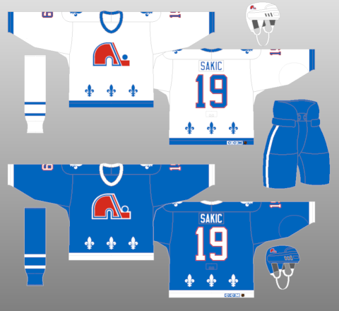
Burkus Circus- Quebec Nordiques

Our first concept of the day is Burkus Circus' latest entry in his Defunct NHL series, this one for the Quebec Nordiques. I really like the simple striping pattern on this one, it works well with the logo, and extending the hem stripe to the bottom looks good. I like the logo treatments, they do a really good job of incorporating the team's colors, and the fleur-de-lis shoulder patch is a nice nod to their old look. The white yoke on the blue jersey looks really good, but we all know that I'm a sucker for a good white yoke. I'm not a huge fan of the collar treatment, but I feel like that's exactly what Adidas would do with them, so I can't fault you much for that. Gear looks good, but I wish the striping on the breezers matched the jersey better. Final verdict: a solid update that would work well if Bettman ever allowed hockey back in Quebec (which he won't). 7.5/10
Jordan R.- HK Kapili

Next up is the first of two designs from Jordan R.'s Latvian Hockey League series, this one for HK Kapili. The simple design reminiscent of the logo is a good look for this set, I really like the use of the contrasting cuffs in combination with the single stripe. The numbers on the front, as well as their placement, is a tad unusual, but I kind of like how it looks. I love the yokes, but I wish there was a hem stripe, even just a single one to go with the arms would help. The socks puzzle me, as the striping is so dominant that it almost looks like white socks with the red jersey and vice versa. There's definitely a better way to do those socks so that the striping isn't so dominant. Final verdict: a good, simple set, but the socks throw the whole look off. 7/10
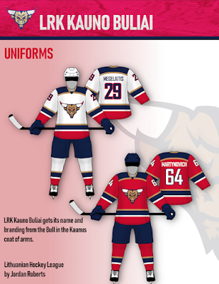
Jordan R.- LRK Kauno Buliai

Jordan R.'s next concept is for the fictional LRK Kauno Buliai. I love consistent striping when it's done well, and here it's done exceptionally well. The contrasting cuffs and hem do a great job of keeping red as the secondary color, even with the blue yoke. The yoke striping looks great as well, it does a great job of breaking up the red and blue on the dark jersey. Logo and numbers look great, and the gear all looks solid. I could honestly see this being the logical successor to the Panthers' old uniforms had they not gone for a military vibe. Final verdict: a great looking set that almost demands this league to come into existence. 9/10 and my COTW NOMINEE!!!!!
Lucas D.- Sporting Kansas City

Our final concept of the day is Lucas D.'s latest MLS crossover, this one for Sporting KC. Once again, I really like the consistent striping on this set, and the double blue color scheme looks fantastic. I love the vertical stripes in the yoke on the blue jersey, but I'm not sure that it works as well on the white jersey, it looks odd with it just abruptly stopping. Font choice, gear, and collar all look good, but I would have altered the main crest on the white jersey, as the silver gets lost on it. Either eliminate the silver or add a darker border to distinguish it. Final verdict: A great looking dark jersey, but the white one falls a little short. 8/10
That's all for me this week, see y'all next Friday!
Friday: A Series of Series
 Reviewed by TC Moore
on
August 31, 2018
Rating:
Reviewed by TC Moore
on
August 31, 2018
Rating:
Reviewed by TC Moore
on
August 31, 2018
Rating:


1 comment:
Jordan's LRK Kauno Buliai or as I'm calling them, the Bull Panthers for COTW
Post a Comment